$1,150.00 Original price was: $1,150.00.$969.00Current price is: $969.00.
Buying notes for this configuration
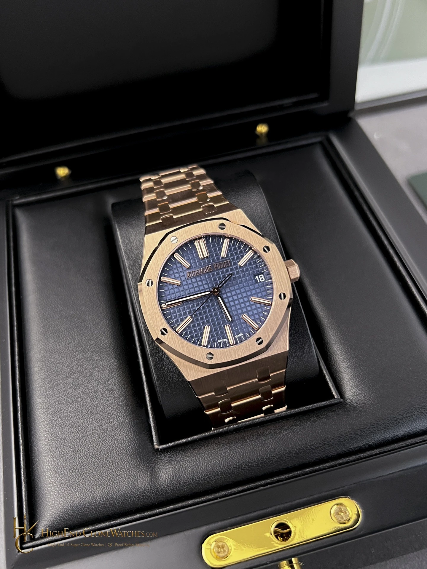
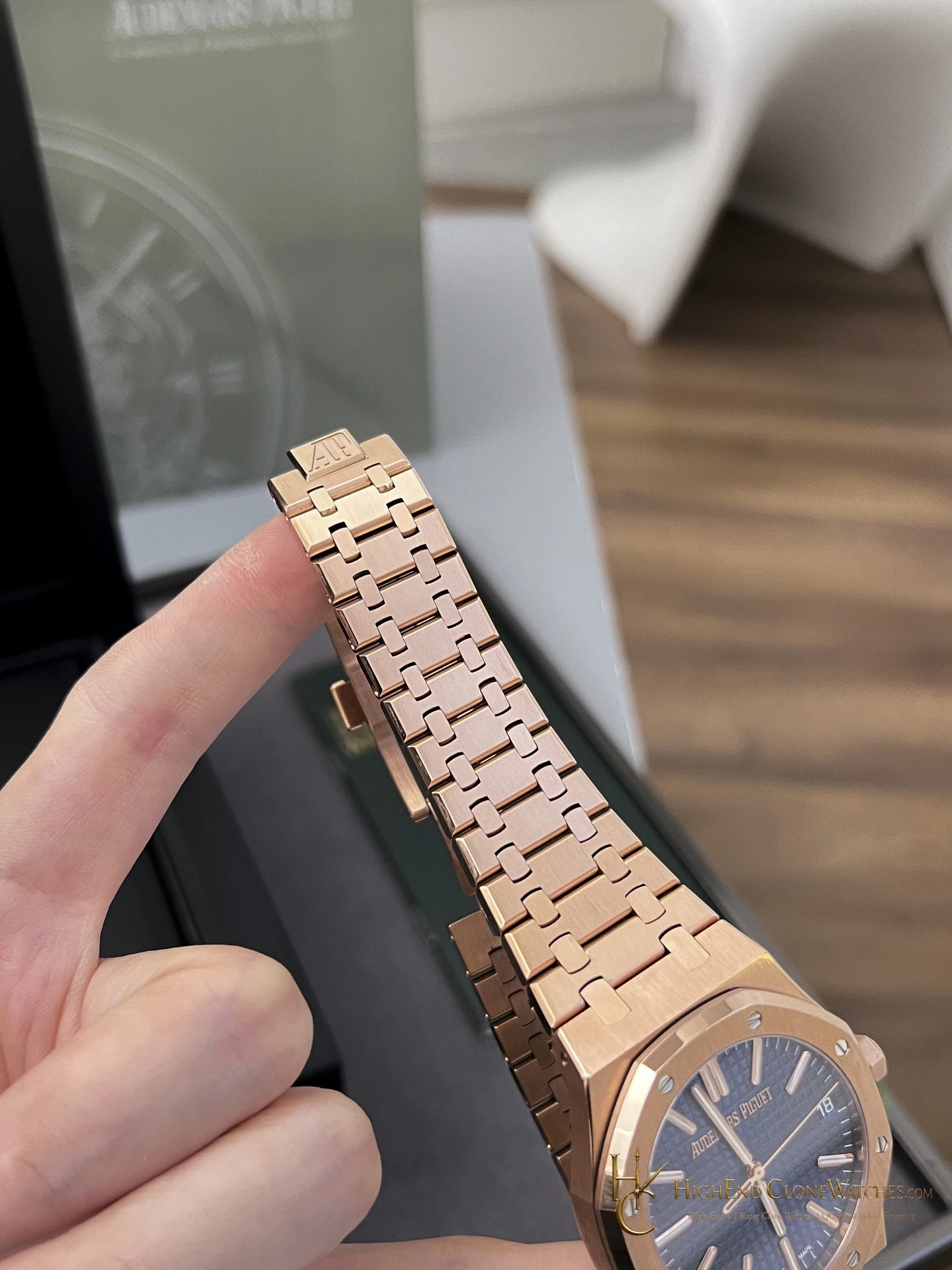
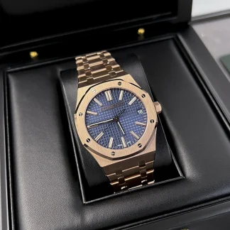
The blue textured dial creates the strongest cool-versus-warm contrast in this rose-gold-tone 15510 group. The matching bracelet keeps the silhouette continuous and prominent, while the dial gives it a more vivid focal point than the black-dial bracelet version. QC should check blue tone and texture, marker alignment, case-to-bracelet tone, bezel, clasp, and caseback.
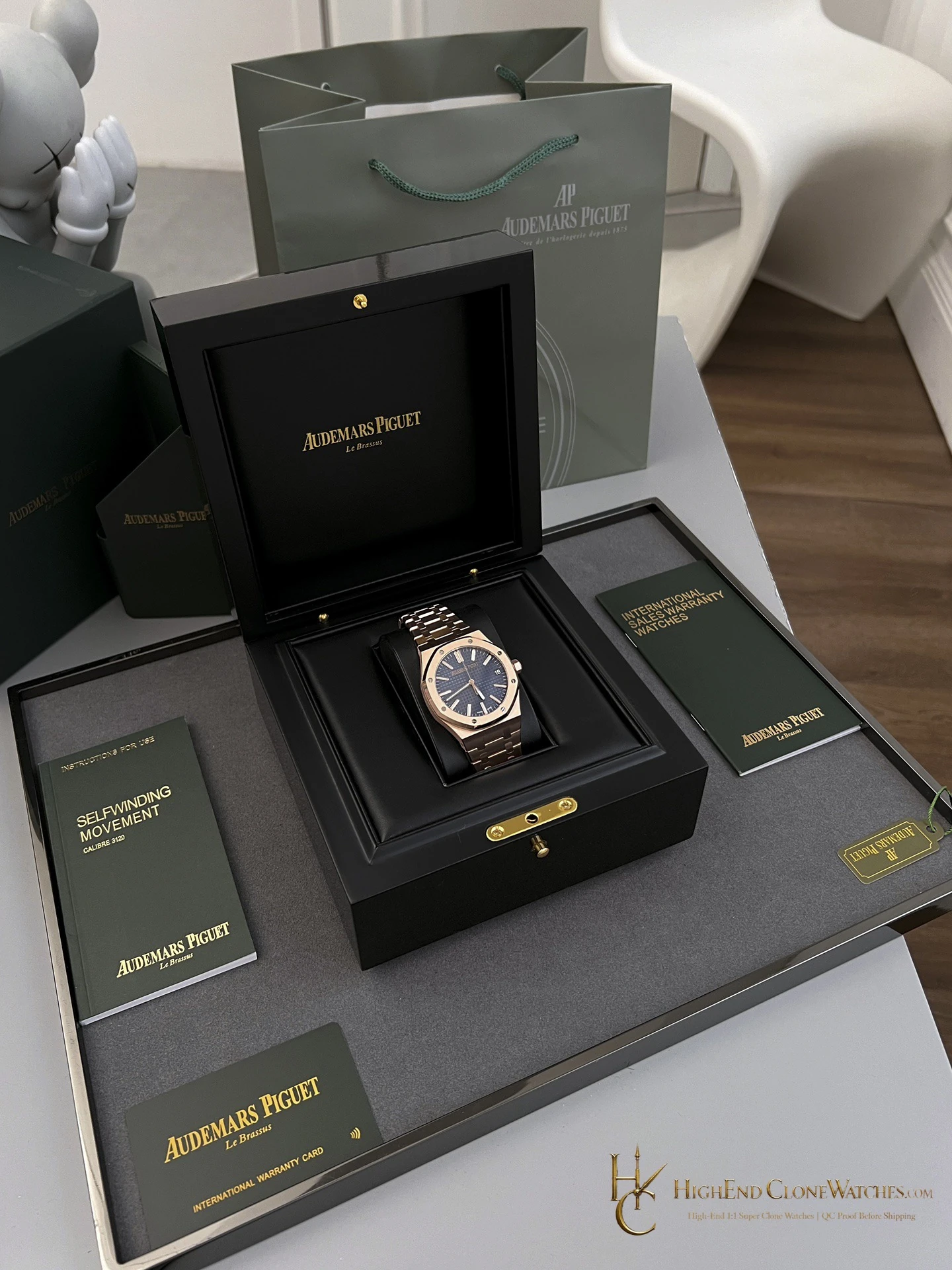
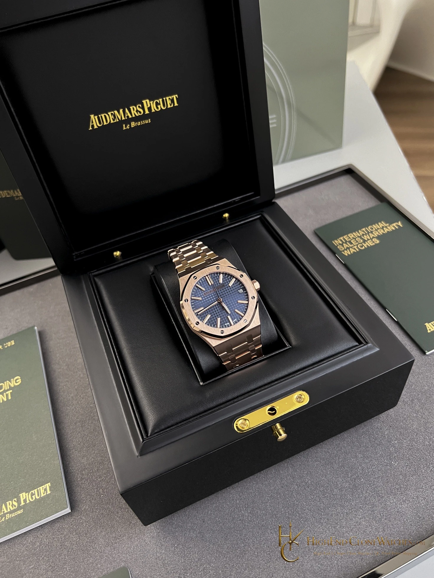
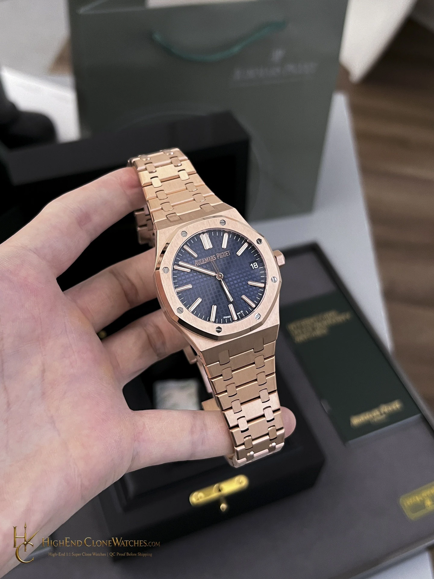
The rose-gold-tone Royal Oak 15510 with a blue textured dial is the most overtly color-driven configuration in this set. The cool blue face sits against the warmer case and matching bracelet, making the dial the first point of attention while the familiar octagonal profile keeps the design grounded. It suits a buyer who wants full-metal presence with more color separation than the black-dial rose-gold version. The gallery includes presentation, wrist, bracelet, case edge, and caseback views.
Confirmed configuration
- Bracelet
- Rose-gold-tone integrated bracelet
Cool Blue Against A Warm Bracelet
This 15510 is built around color contrast. The blue textured dial sits inside a rose-gold-tone case and matching integrated bracelet, making the face the first thing the eye meets and the warm metal the frame that holds it. The result is more expressive than the black-dial bracelet version, while still preserving the continuous full-metal profile that distinguishes this configuration from the leather-strap alternative.
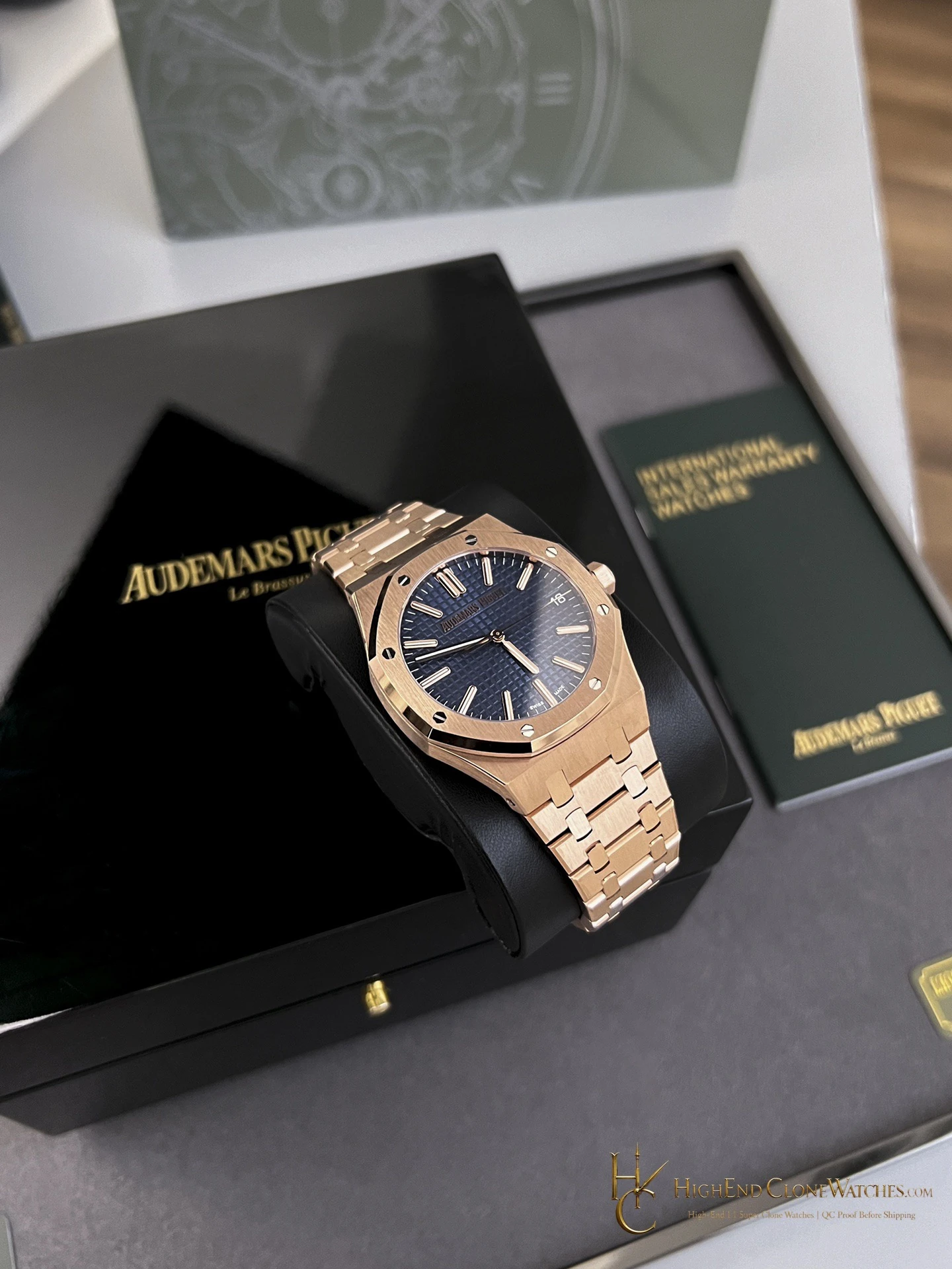
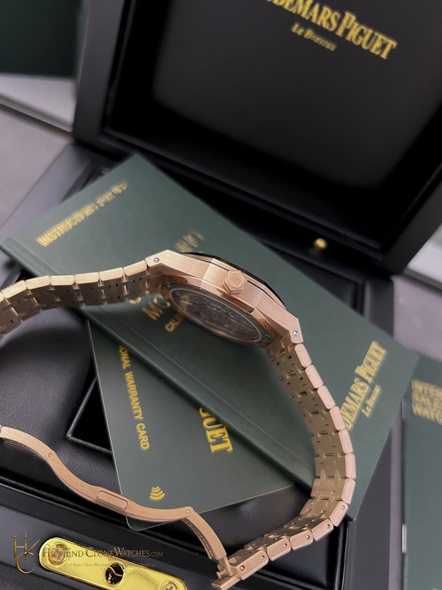
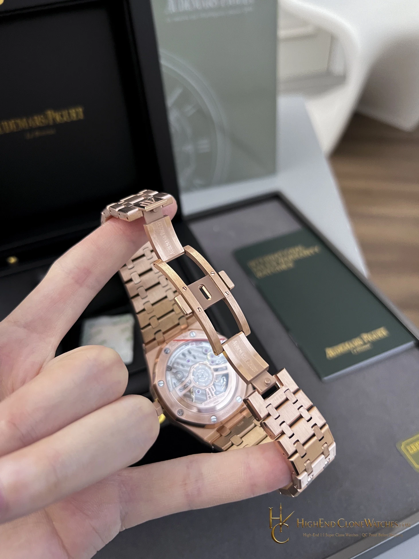
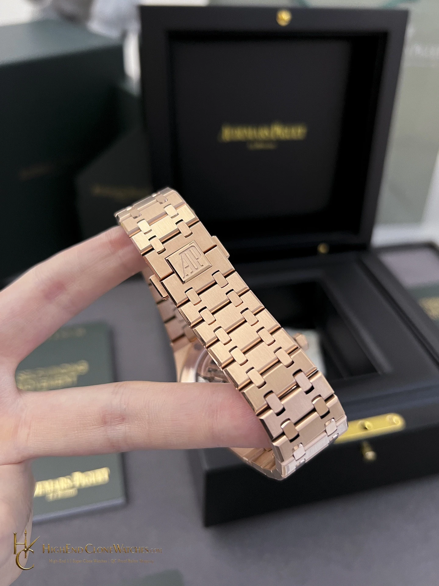
The difference is clear in the supplied views. The front and close images reveal the texture and applied markers on the blue face; the angled and bracelet images show how the cooler dial changes the way the warm case reads. Neither element works alone. The appeal comes from their contrast inside the recognizable octagonal outline.
Blue Or Black On The Rose-Gold-Tone Bracelet
The nearby black-dial bracelet version is the quieter choice. Its dark center gives the warm bracelet and bezel more visual weight. Blue reverses that emphasis: the dial becomes the focal point, while the bracelet stays present as the continuous frame around it.
Choose blue when the watch should make a color statement as well as a metal statement. It is especially suitable for a buyer who already owns black-dial watches and wants the same integrated-bracelet direction with a more vivid, cooler center.
What To Review In QC
Request a straight dial photo and an angled view to judge blue tone and textured detail under different reflections. Include close images of marker alignment, bezel screw placement, case-to-bracelet tone consistency, clasp, bracelet articulation, and the visible caseback. A wrist image complements those close views by showing whether the case and bracelet keep their intended visual balance. Those checks make sure the contrast that defines the configuration is carried through the entire watch rather than only the main image.
The Most Color-Driven Rose-Gold-Tone Choice
This is the version to select when a full-metal rose-gold-tone 15510 should not feel monochromatic. The blue dial gives it a cooler, more vivid center; the integrated bracelet keeps the overall impression substantial and connected. It is a deliberate configuration for a buyer who wants both the case presence and a dial that can hold its own beside it.
Questions to settle before ordering
What makes this the more expressive rose-gold-tone option?
The blue textured dial provides a cooler, stronger contrast against the warm case and matching bracelet than the black-dial alternative.
What deserves close inspection before dispatch?
Check the blue dial texture and color, marker alignment, case and bracelet tone, bezel screws, clasp, articulation, and caseback.
Review the exact configuration before it leaves.
Use model-specific QC proof to confirm the visible details and stated functions that informed your choice.
QC proof before dispatch