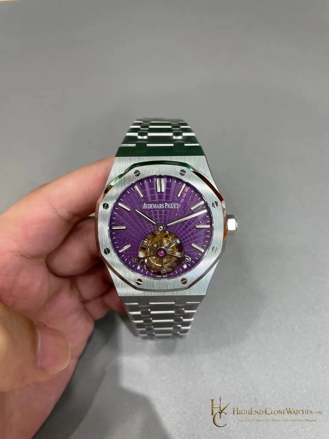
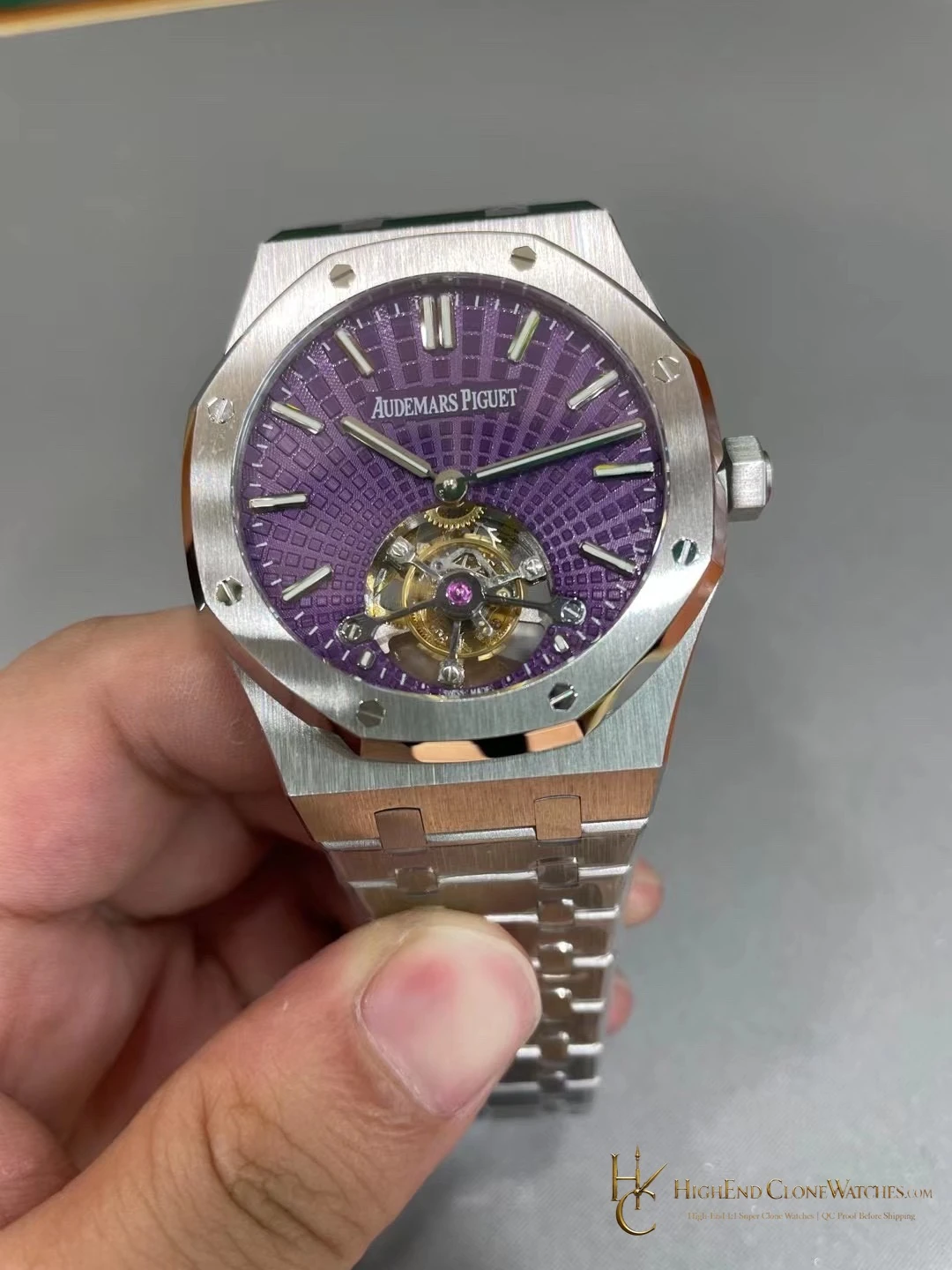
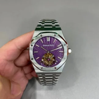
This is the right choice for a collector who will actually look at the dial during wear. The purple surface changes character with the angle of light, and the tourbillon opening supplies a focal point that a blue or black three-hand version does not. The tradeoff is visual intensity: if the goal is a discreet office watch or the easiest daily match, a plain black or blue Royal Oak is the more forgiving companion. A conventional Royal Oak 15500 is the nearby alternative when symmetry and restraint matter more than the open aperture.
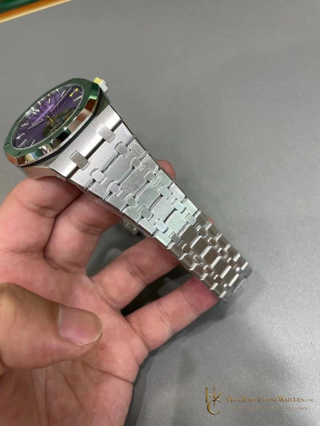
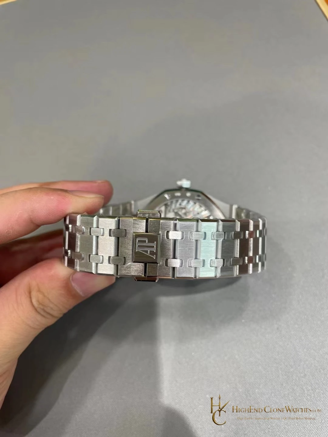
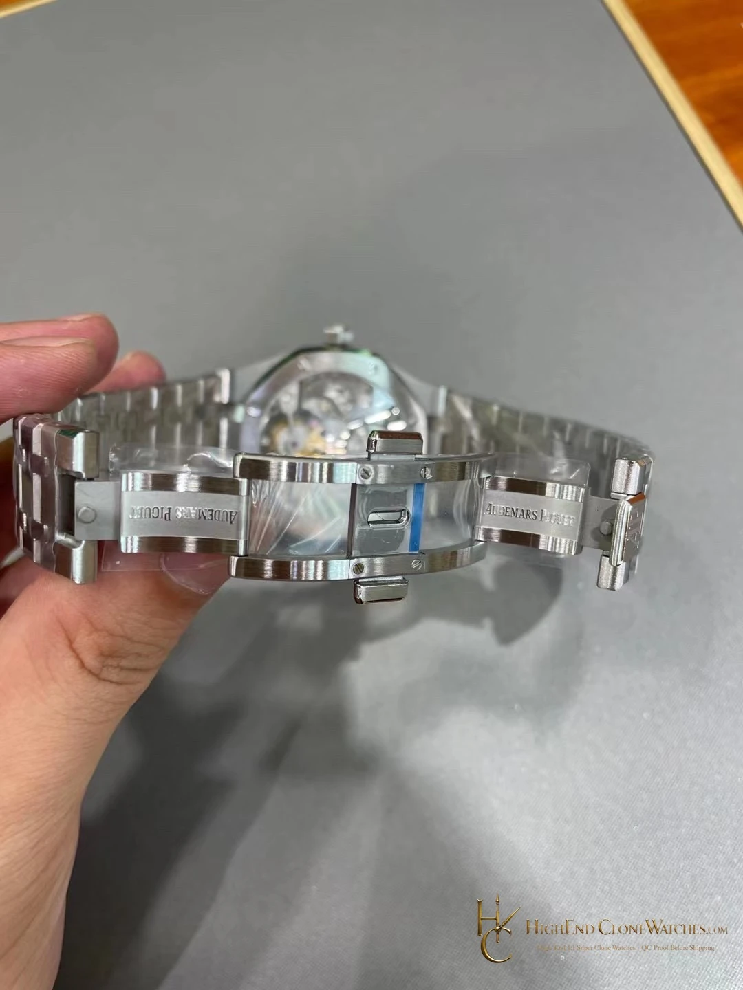
Start with the visible execution: the purple dial, the lower opening and the way the steel case contains them. QC should confirm that the aperture is centred, the dial printing and applied markers remain balanced around it, and the hands clear the opening cleanly. The case should be checked for a crisp octagonal outline, consistent brushing, even polished chamfers, and correctly seated screws. On the bracelet, inspectors should review link articulation, end-piece fit, clasp engagement, and the transition from case to bracelet. Those checks speak directly to what makes this reference desirable: a distinctive complication display carried by the disciplined geometry of a steel Royal Oak.
The gallery also makes the configuration easy to assess from several angles. Use the dial view for the purple texture and aperture, the side view for the slim profile, and the bracelet and clasp views for fit and finishing. That combination helps a buyer distinguish this exact 26522ST configuration from a generic Royal Oak listing.
The plum field is the first thing to compare against the lower-dial opening. When the light moves across the surface, the pattern should remain legible rather than becoming a single flat colour. That relationship between dial texture and aperture is what makes this steel reference different from a conventional three-hand Royal Oak.