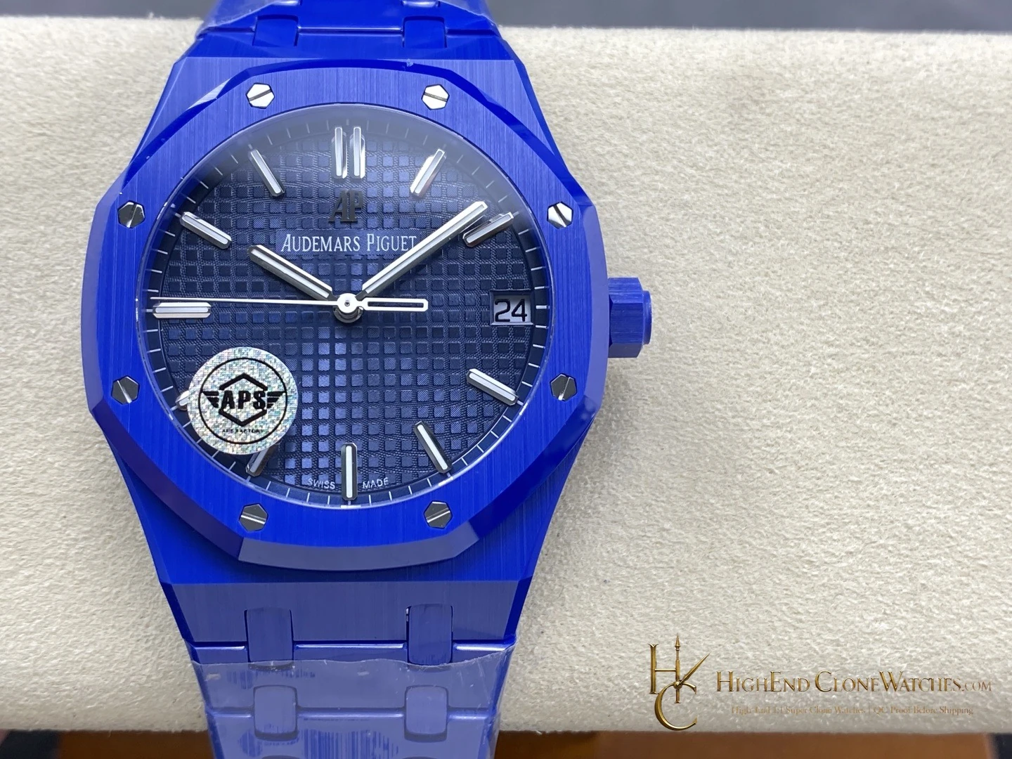
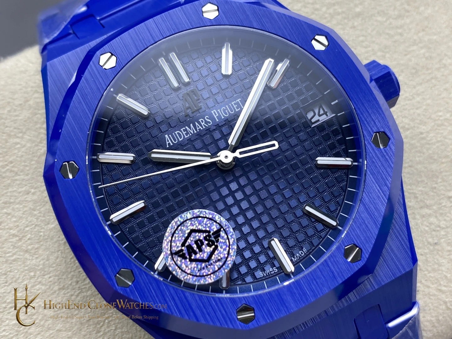
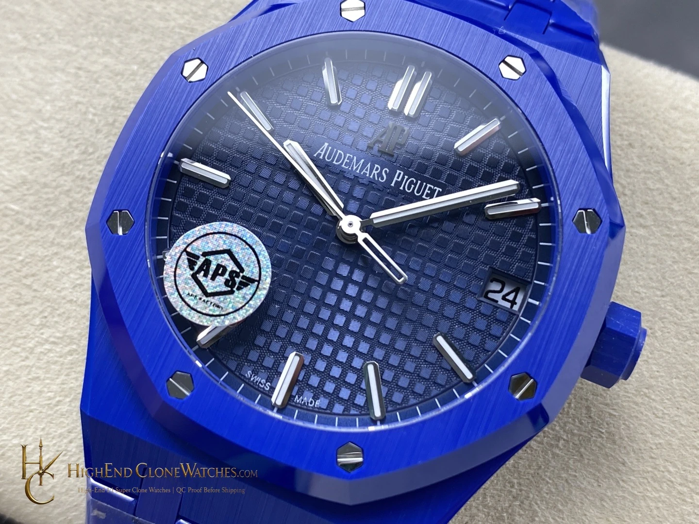
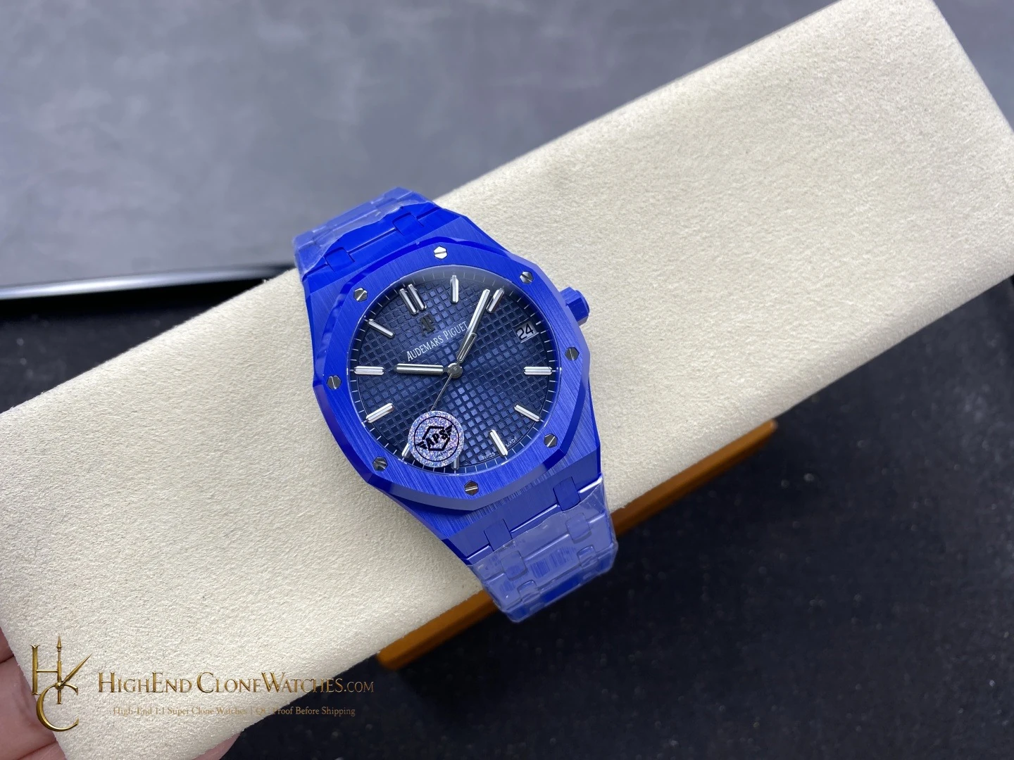
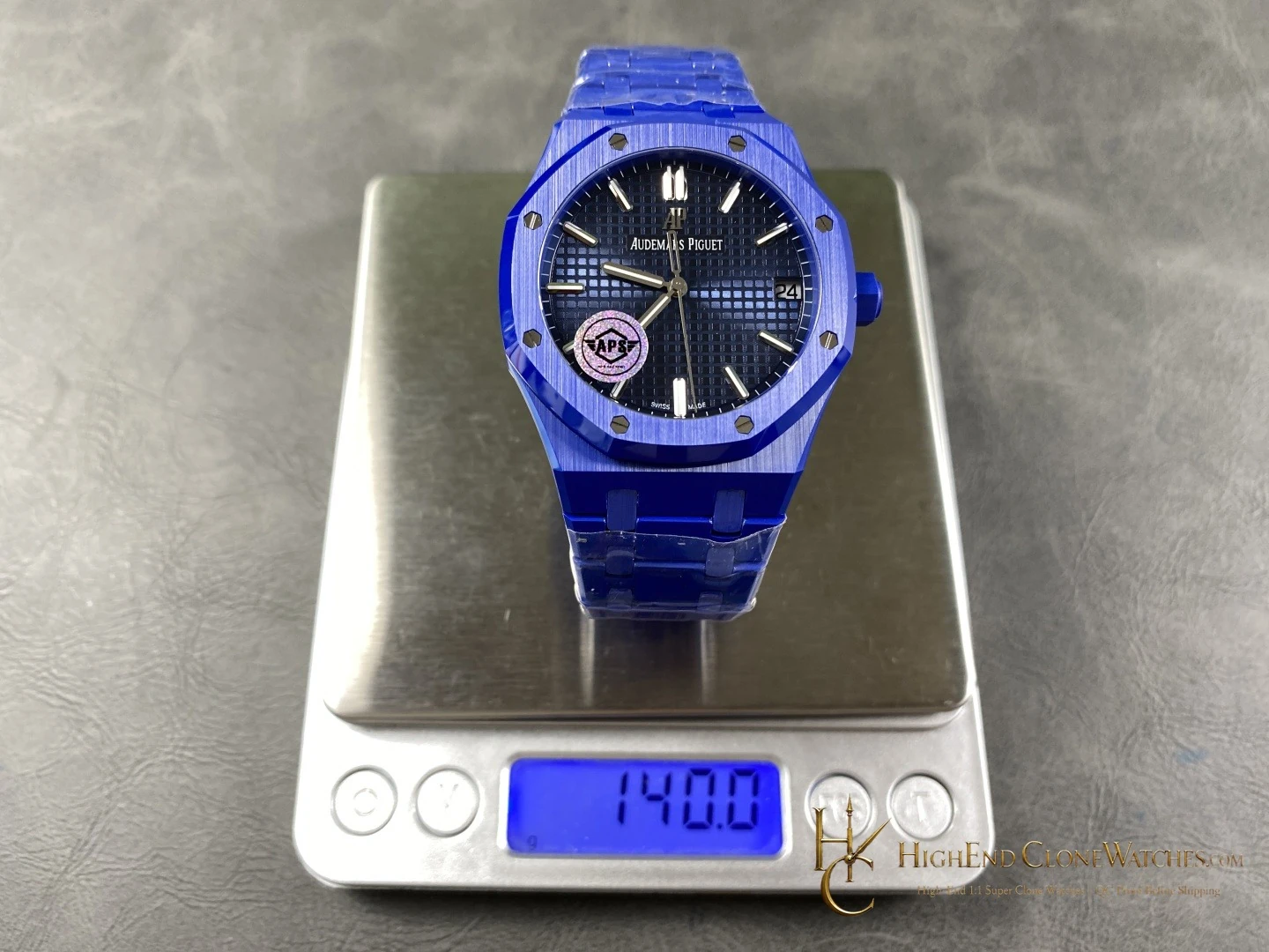
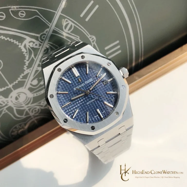
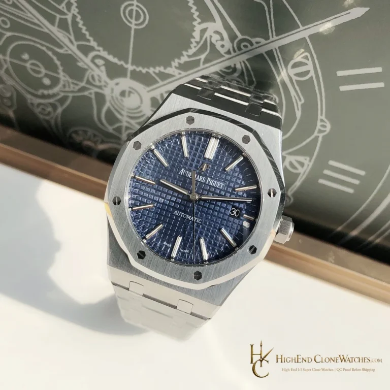
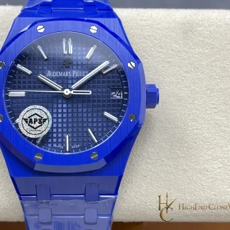
A steel 15500 with a blue dial is the nearest useful alternative. It keeps the same broad three-hand selection logic while introducing silver-toned contrast and a more familiar metal presence. Choose the ceramic version when colour continuity, a modern surface treatment, and a cohesive bracelet matter more than the reflective variation of steel.
This watch works well as a collection piece for someone who already owns black or steel and wants blue to be the organising idea rather than a small dial accent. It is also a sensible choice for a buyer who prefers the calm, symmetrical face of a three-hand Royal Oak to the busier registers of a chronograph. The tradeoff is that a coordinated ceramic surface makes finish and colour matching more visible; small inconsistencies are harder to hide than they would be on mixed materials.
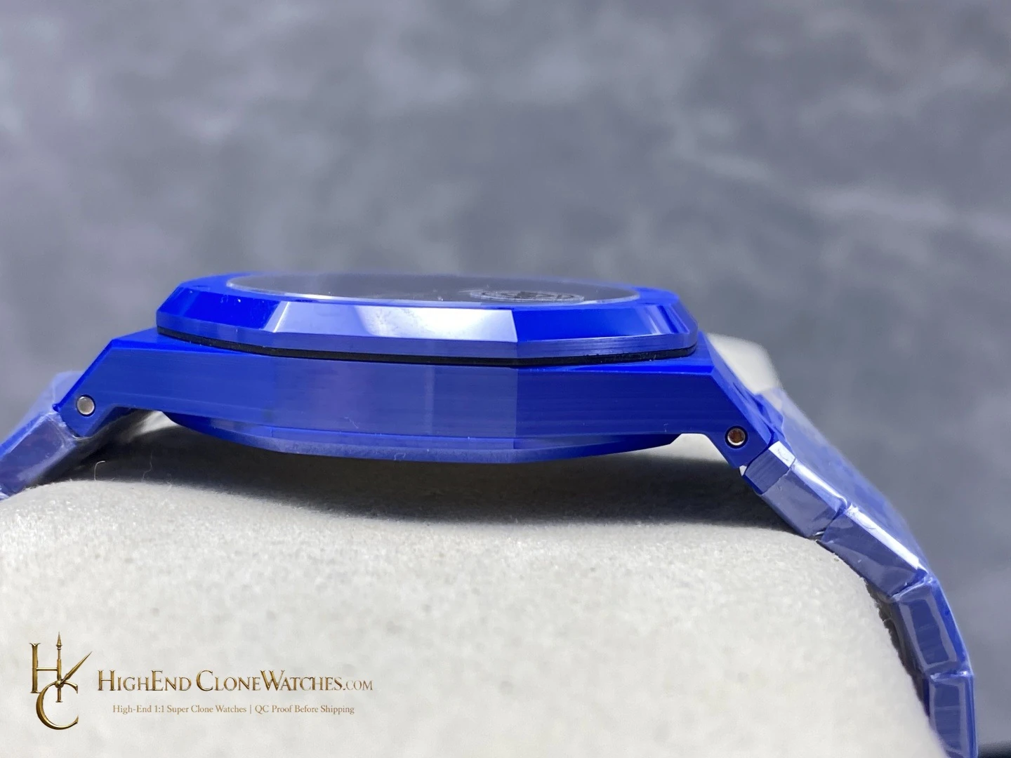
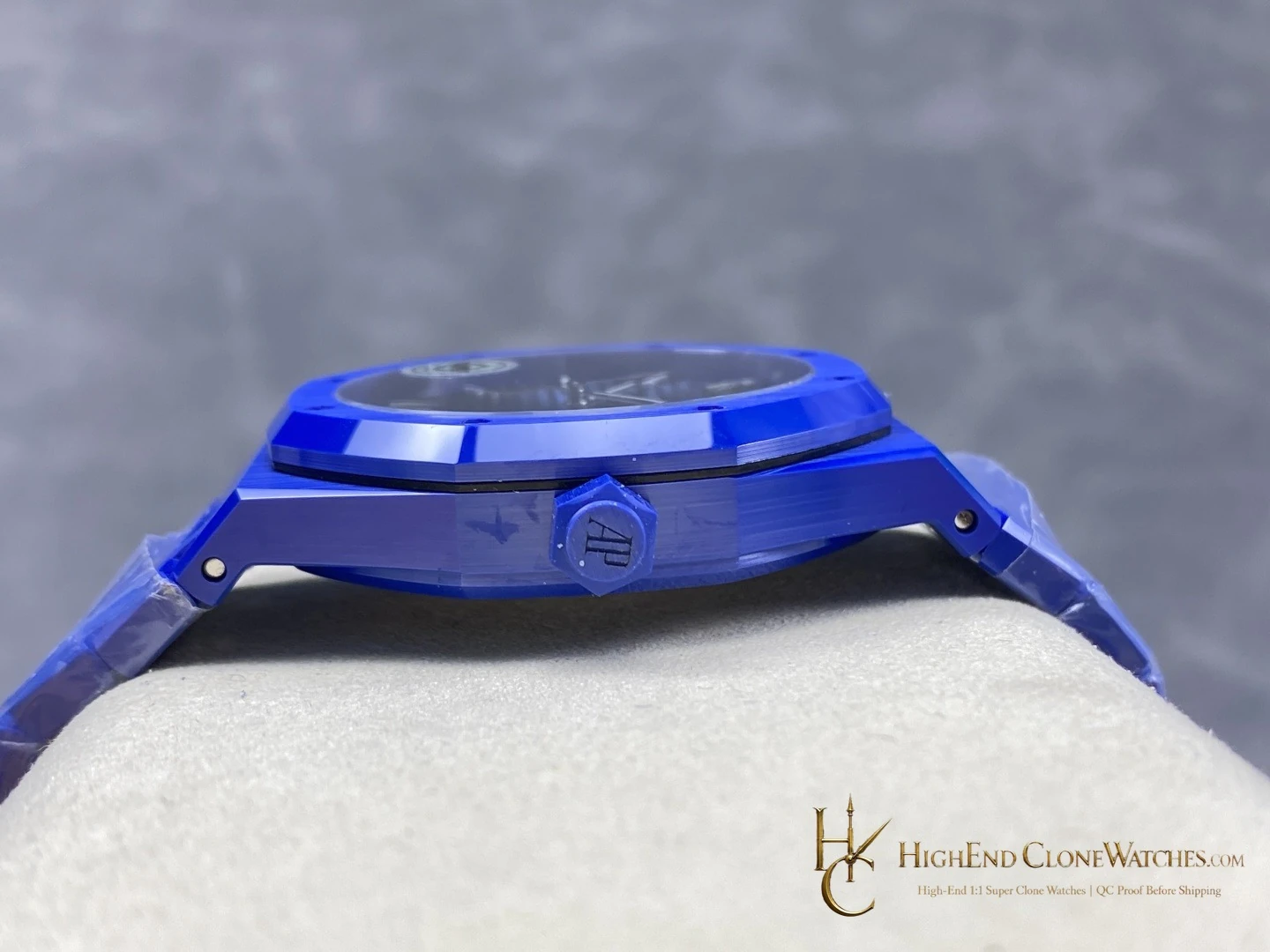
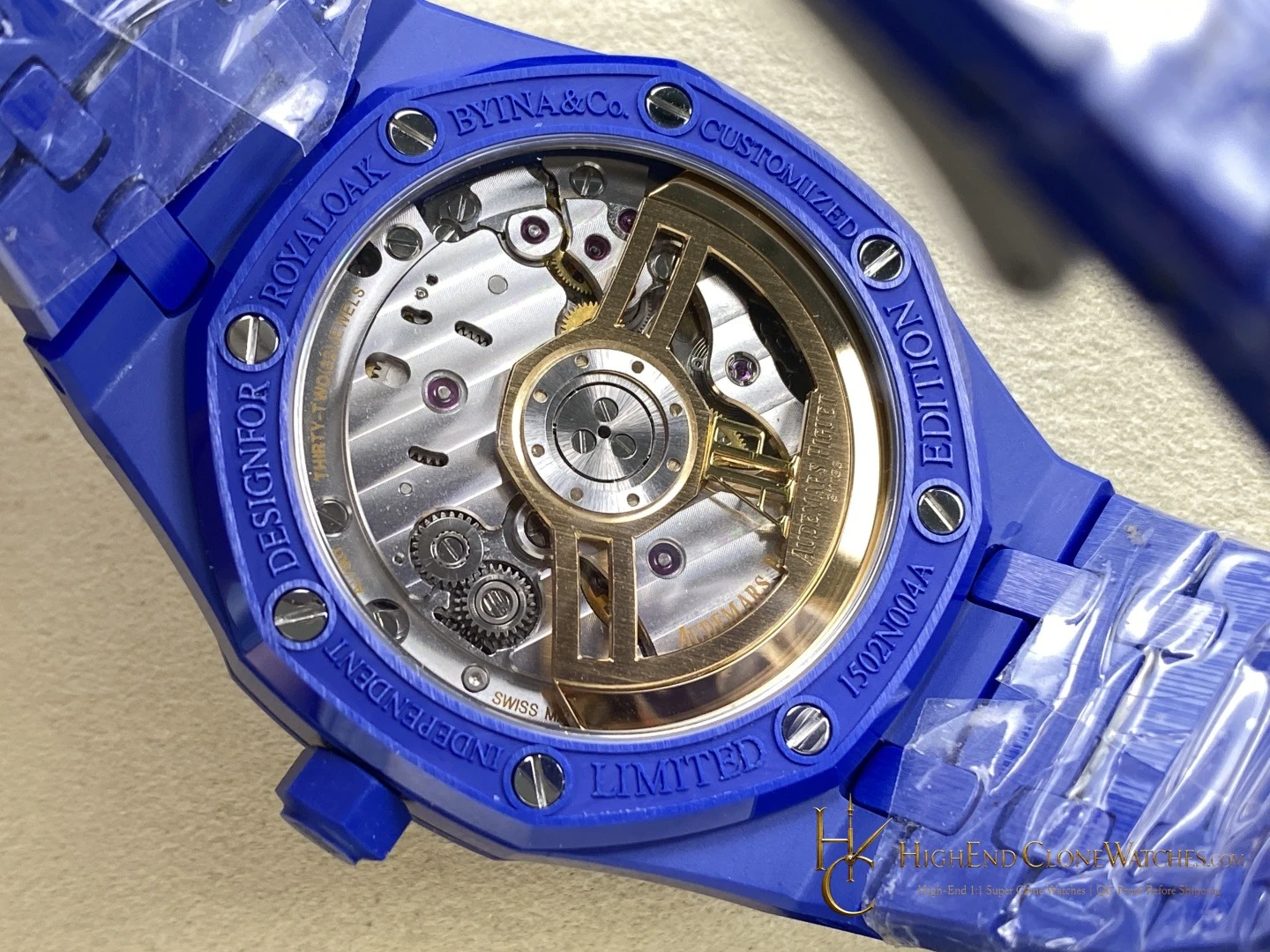
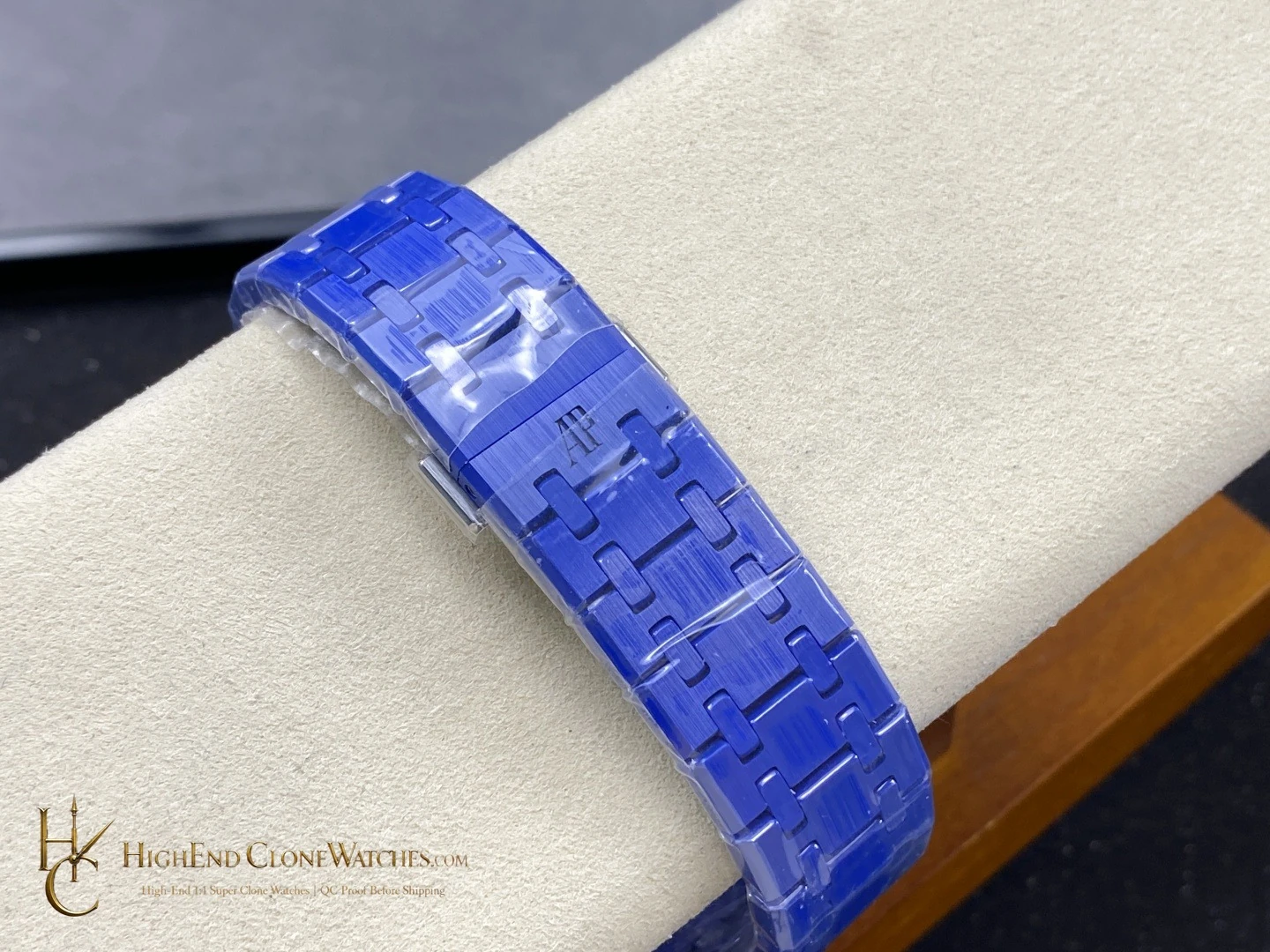
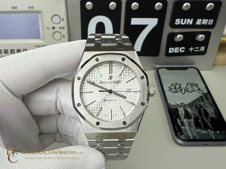
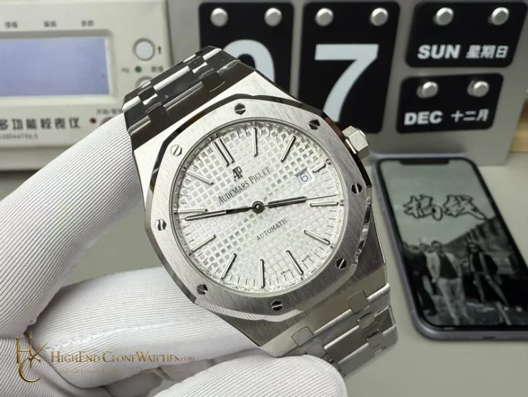
QC should compare the blue tone across case, bezel, and bracelet, then inspect the Grande Tapisserie texture and the alignment of the hands and applied markers. The bezel screws should sit evenly within the octagonal frame, and the integrated ceramic links should articulate cleanly from the lugs. Inspectors should verify clasp engagement and review the side profile for a consistent edge treatment. The gallery’s front, angled, side, and bracelet views should agree on the same blue ceramic identity before dispatch.
The blue ceramic concept should be judged as a continuous colour composition. Compare the dial, bezel, case sides, and bracelet rather than evaluating the dial in isolation. The clean three-hand face makes that continuity easy to read, and the 10.4mm listed profile keeps the result more composed than the chronograph cases.