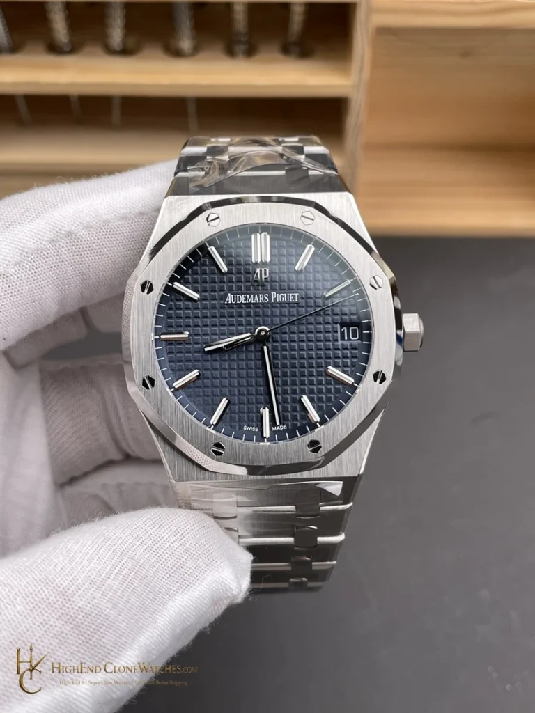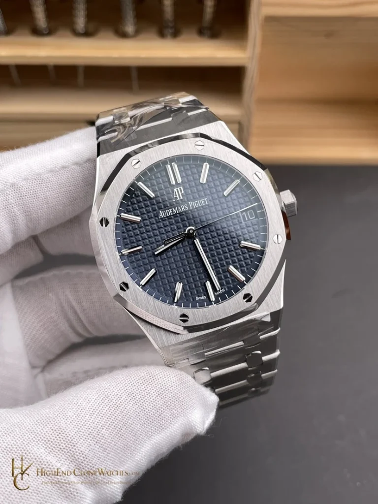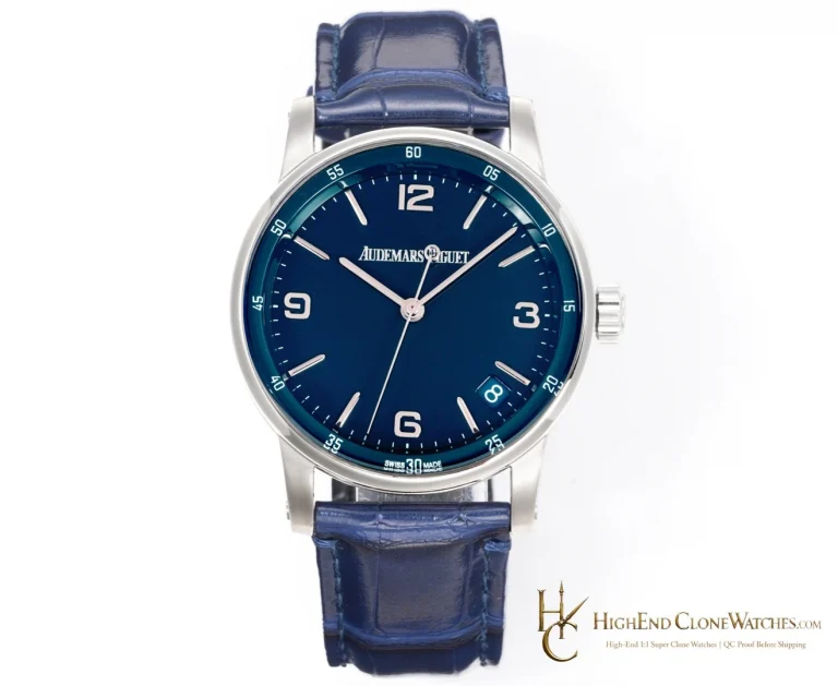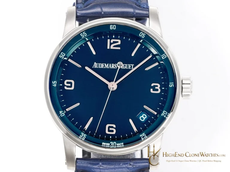
Audemars PiguetRoyal Oak15500 Custom Ceramic Concept

Audemars Piguet Royal Oak 15500 Custom Ceramic Concept Blue Dial

Original price was: $1,379.00.Current price is: $979.00.

Buying notes for this configuration

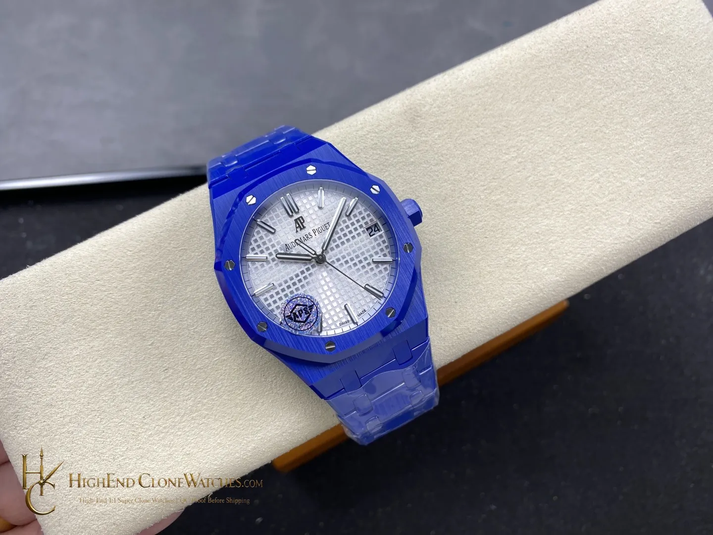
The nearby comparison is a steel Royal Oak with a blue dial. That option creates sharper metal-to-dial contrast and a more familiar everyday presence; this 15500 is for the buyer who wants the blue treatment to extend through the case and bracelet. The purchase logic is visual unity. Check the wrist view and angled images together, because the appeal depends on the blue tone staying coherent as the surfaces turn from dial to bezel, case, and links.

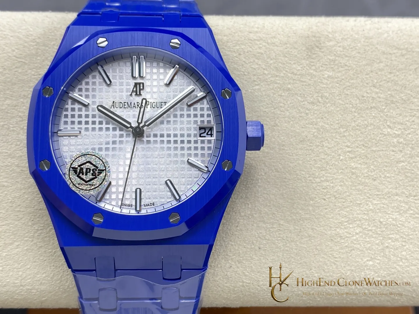
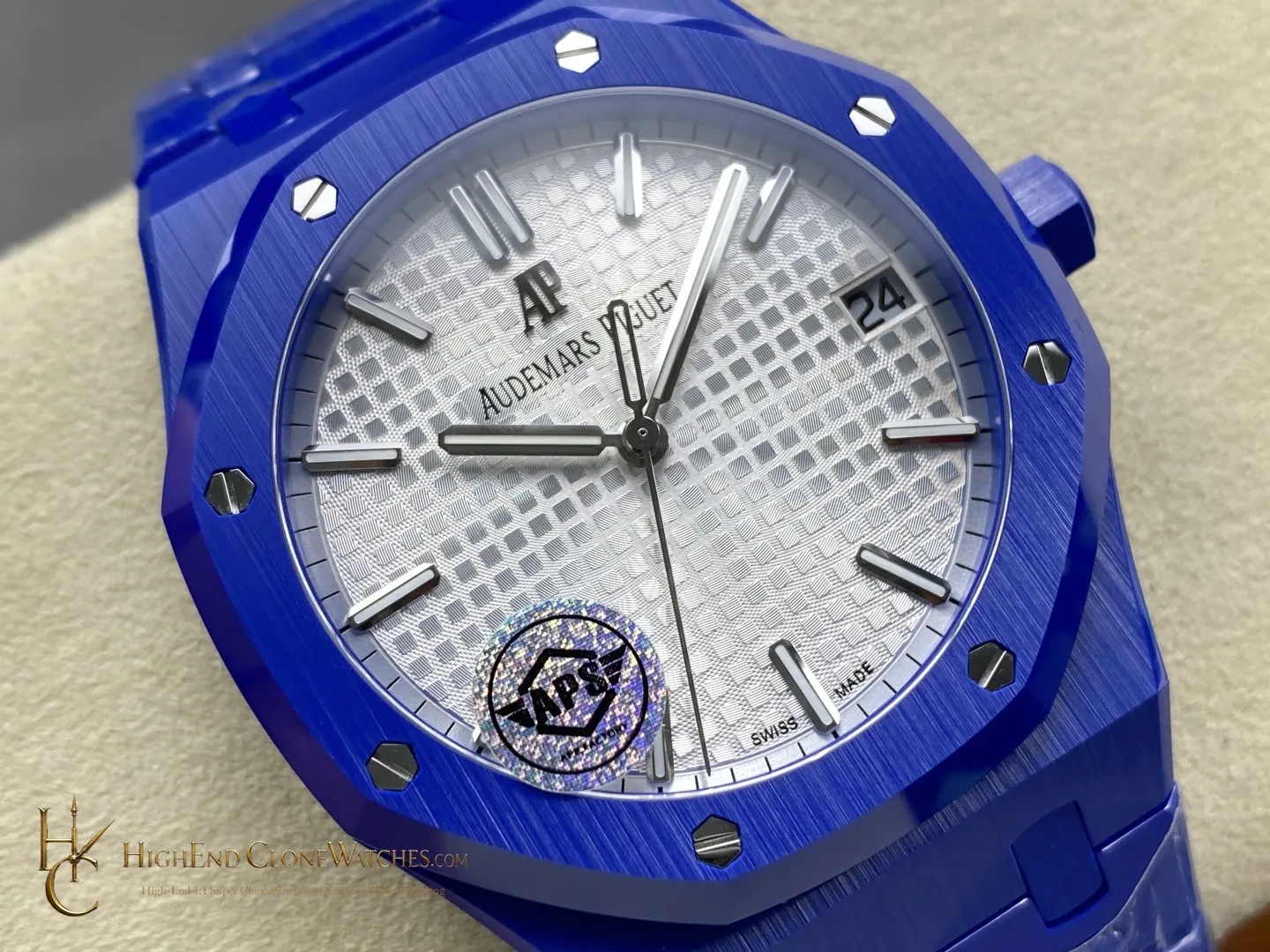
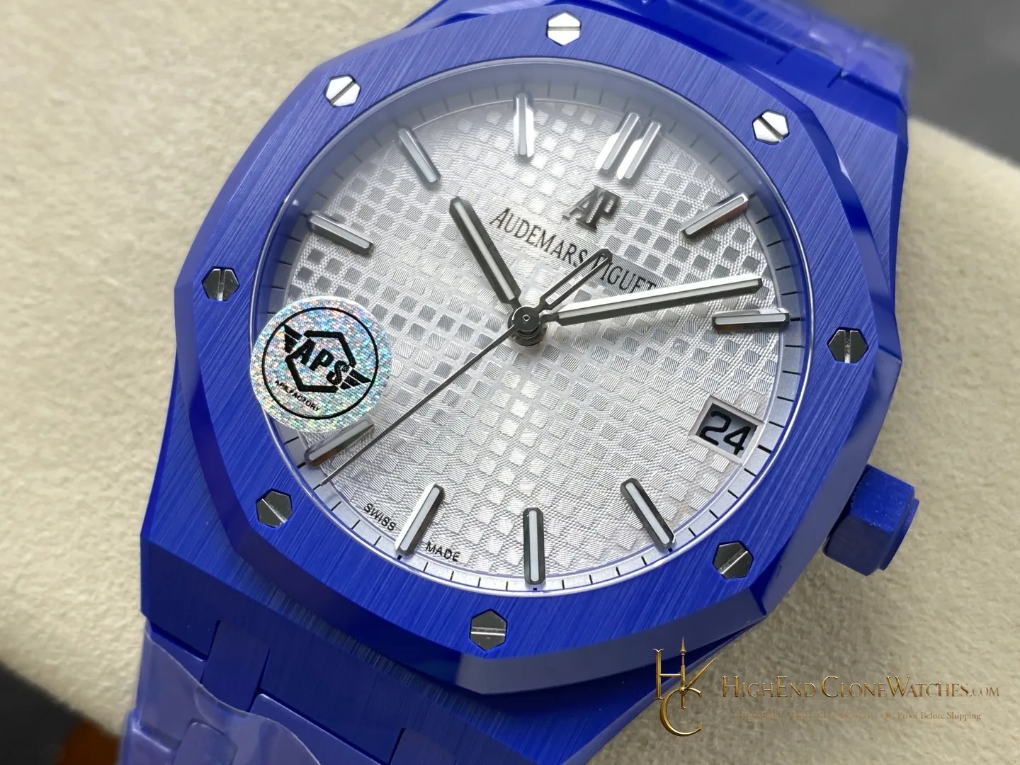
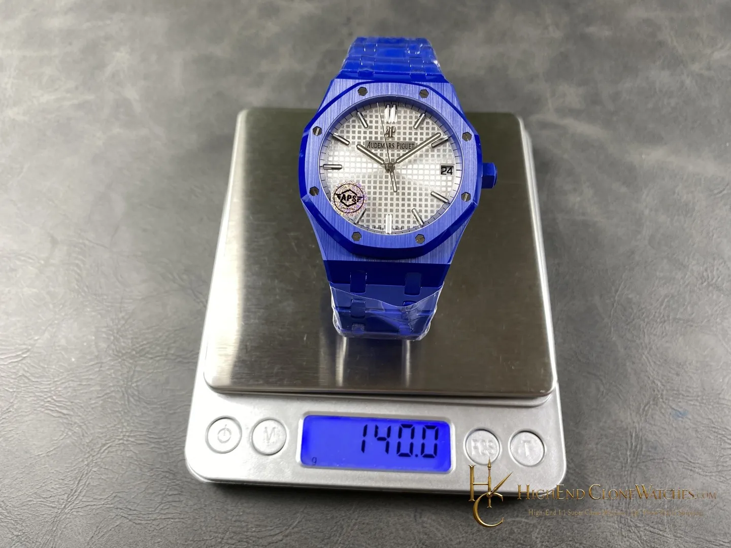
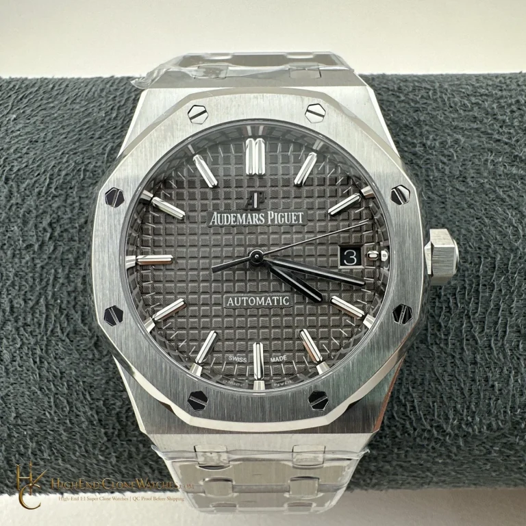
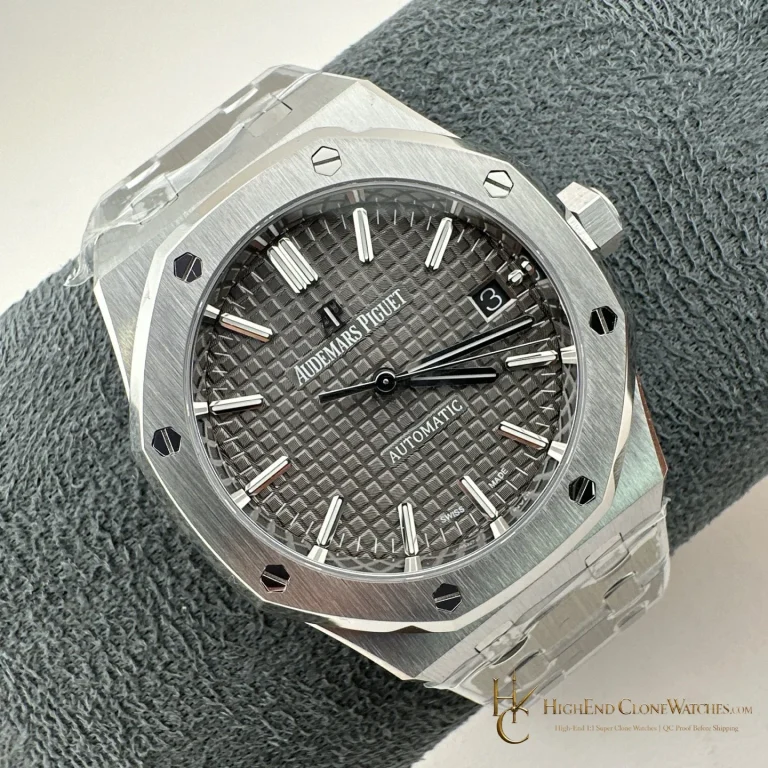
The Royal Oak 15500 Custom Ceramic Concept is built around a coordinated blue presentation: a saturated blue octagonal case, integrated blue bracelet, and blue textured dial with a date window. The color continuity is the reason to choose it. Instead of using a blue dial as a contrast against steel, this version lets the case, bracelet, and face read as one deliberate field, with the bezel screws providing small points of definition. It suits a buyer who wants recognizable Royal Oak geometry in a more graphic, monochrome direction. Front, side, caseback, bracelet, and clasp views are included for a complete configuration check.

Display estimate. Cart and checkout remain in USD.
Buy Now
QC proof before dispatchPhotos or video are prepared for the exact watch before it leaves.

Confirmed configuration

Bezel
Blue octagonal bezel with visible screws
Bracelet
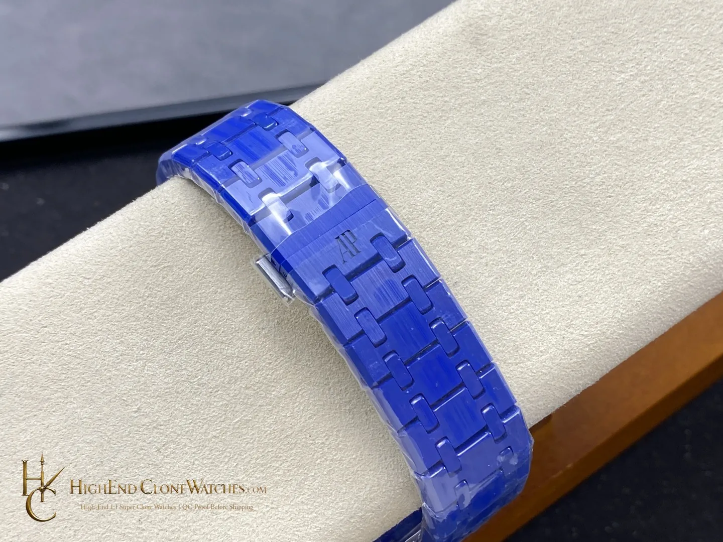
Integrated blue ceramic appearance bracelet
SKU: audemars-piguet-royal-oak-blue-ceramic-15500-white-dial-super-clone-watch Categories: , Brand:
Worldwide priority shippingQC processShipping information

Blue is carried through the whole silhouette

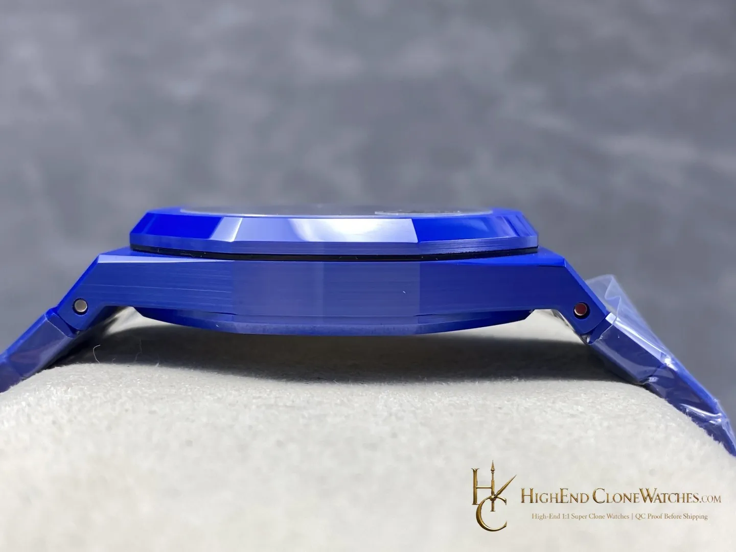
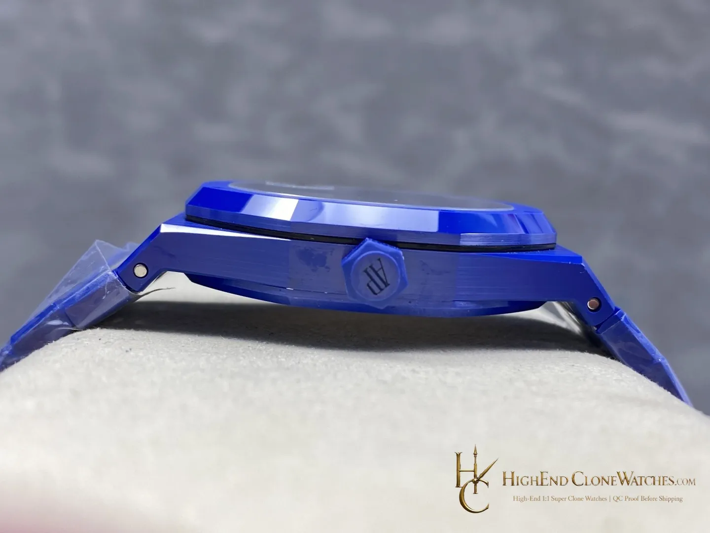
The 15500 Custom Ceramic Concept takes the Royal Oak outline and gives it a coordinated blue treatment across the octagonal case and integrated bracelet. The result is more graphic than a steel case with a colored dial: the bracelet does not act as a neutral break, and the side view continues the same visual idea. A buyer choosing this configuration is choosing color continuity as much as the collection's familiar geometry.
The textured dial keeps the front from going flat

At the center, the blue textured dial and date window add depth and a clear focal point. Applied markers and hands stand against the saturated background, while the bezel screws punctuate the octagonal frame. Look at the straight-on image first for dial balance, then use the angled views to see how the blue surfaces change with light. The combination works best when the texture remains visible and the transitions between dial, bezel, and case look deliberate.

Blue-on-blue or blue against steel

A steel Royal Oak with a blue dial is the useful nearby alternative. Its metal case creates brighter contrast and can feel more neutral beside tailoring or office clothing. The Custom Ceramic Concept makes a stronger color statement and is better for a buyer who wants the watch to be read as a single coordinated object. Neither choice is about a generic quality claim; it is a decision about contrast, wardrobe, and how much visual continuity the wrist presence should have.

Configuration points worth checking

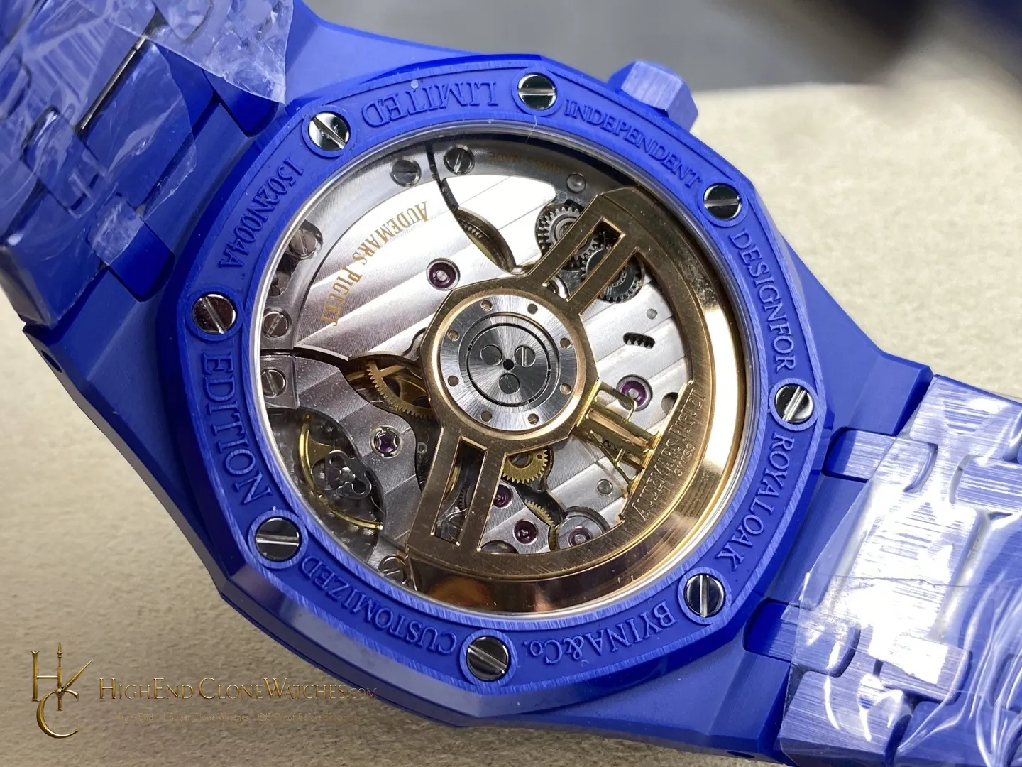
Inspect the blue tone across the case and bracelet, the texture and marker placement on the dial, the date-window position, the bezel screw pattern, and the case edge transitions. The bracelet should meet the case cleanly, with links sitting evenly and the clasp closing squarely. Side, caseback, and closure views are particularly useful here because a coordinated color treatment needs to remain consistent beyond the hero angle.

Use the gallery as a sequence rather than relying on the front view alone. Compare the dial, angled case, profile, bracelet, clasp, and caseback for a coherent blue presentation before choosing this version over a steel alternative.

Questions to settle before ordering

What makes this 15500 configuration different?

The blue dial is matched by a blue octagonal case and integrated bracelet, creating a coordinated blue-on-blue Royal Oak presentation.

Why choose it over a steel case with a blue dial?

Choose this version when color continuity matters more than the brighter case-to-dial contrast of a conventional steel presentation.

Which details deserve close review?

Check blue-tone continuity, dial texture, date-window and marker alignment, bezel screws, case edges, bracelet seating, clasp action, and the caseback view.

Review the exact configuration before it leaves.

Use model-specific QC proof to confirm the visible details and stated functions that informed your choice.

Contact Support

QC proof before dispatch