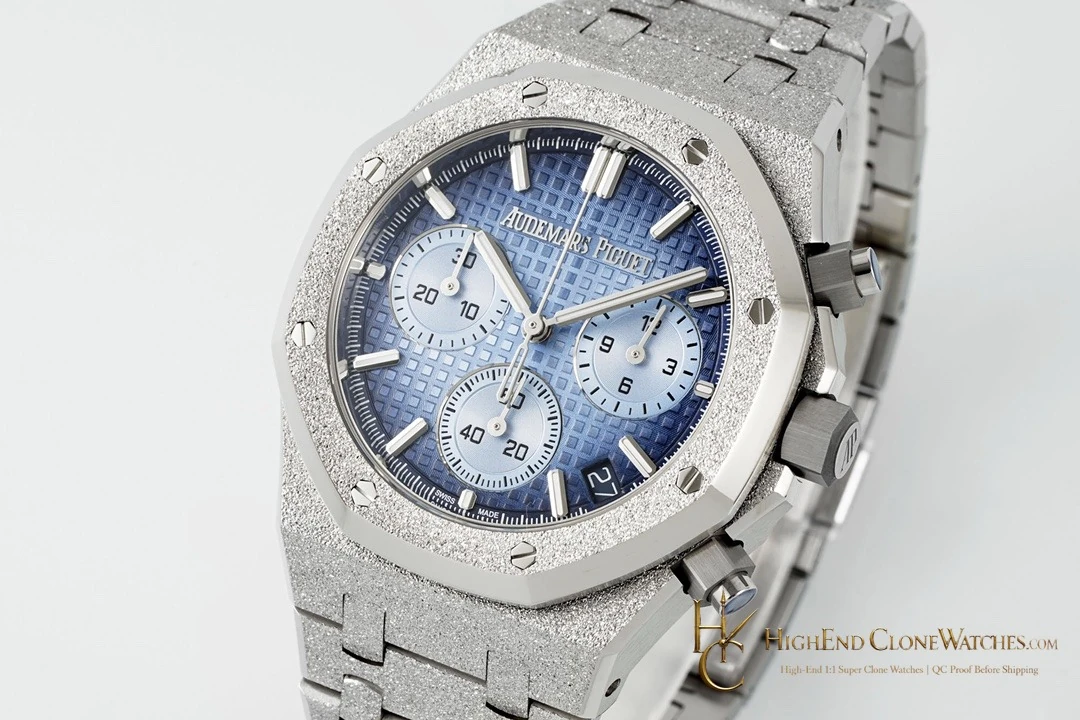
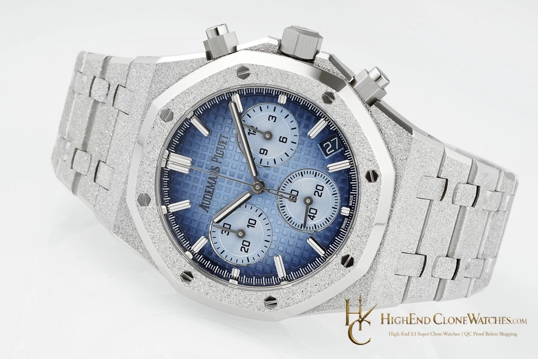
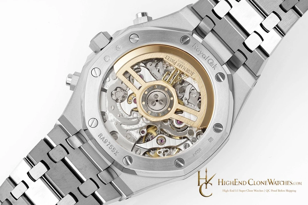
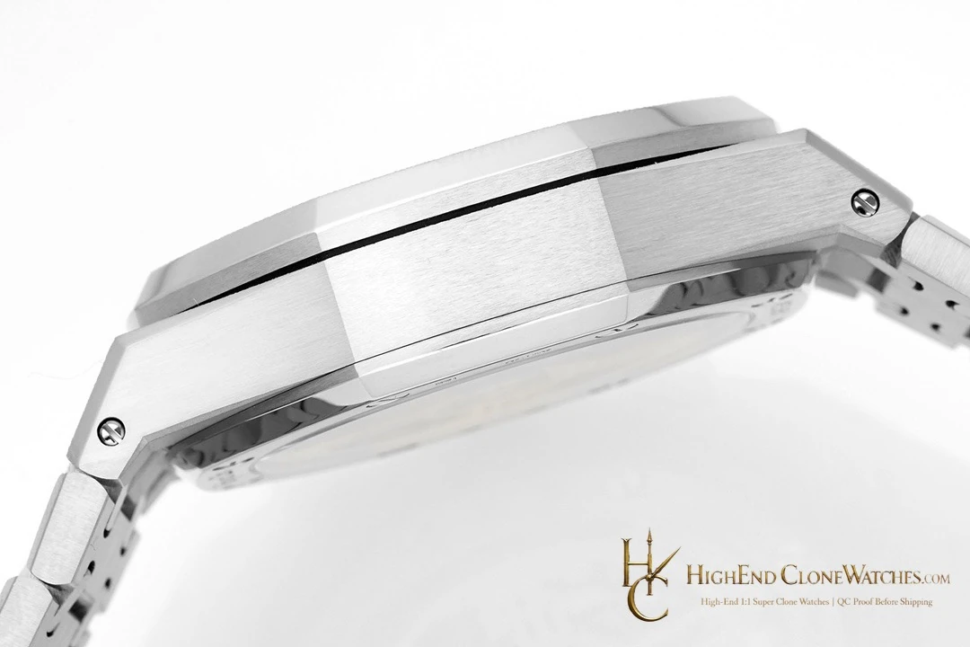
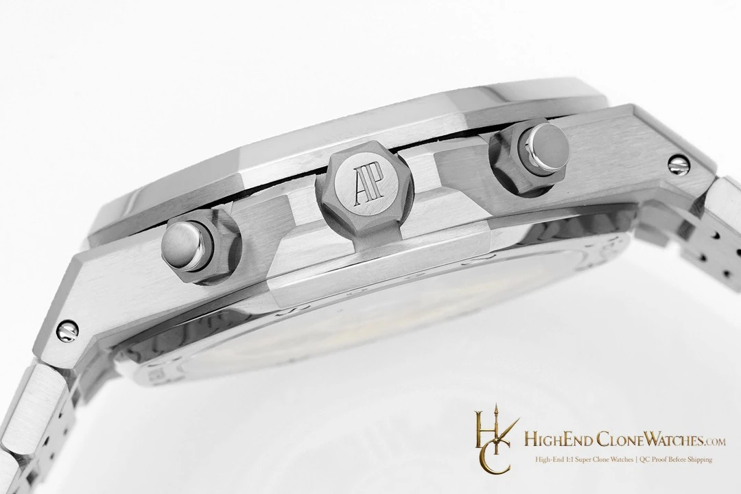
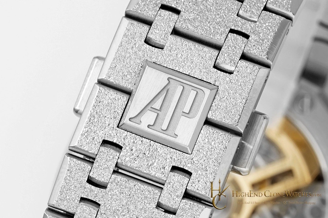
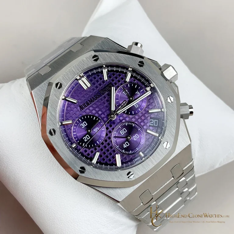
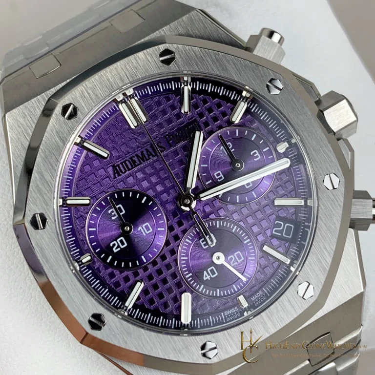
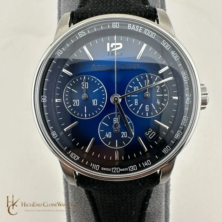
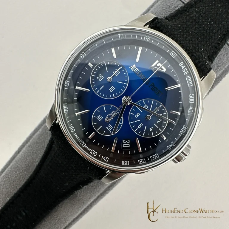
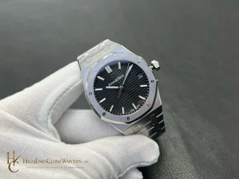
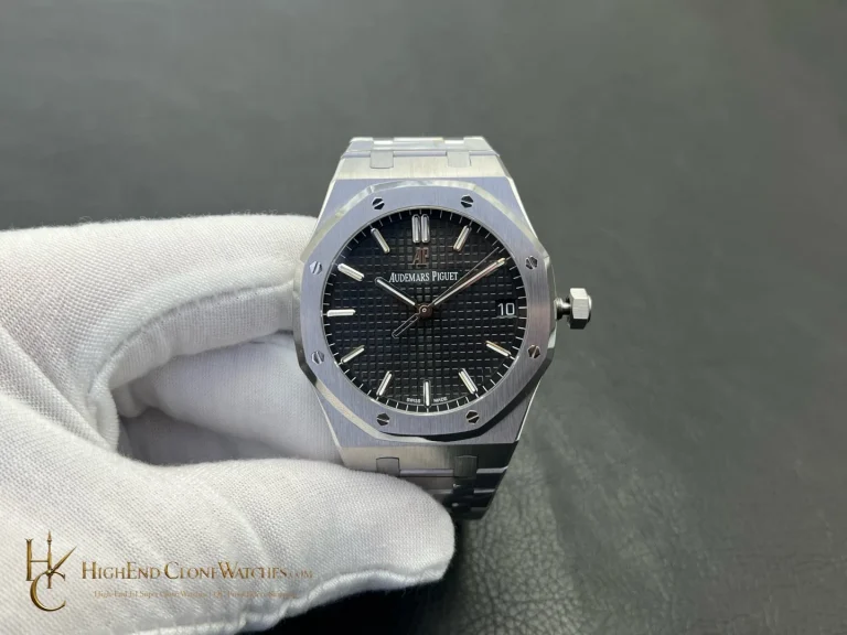
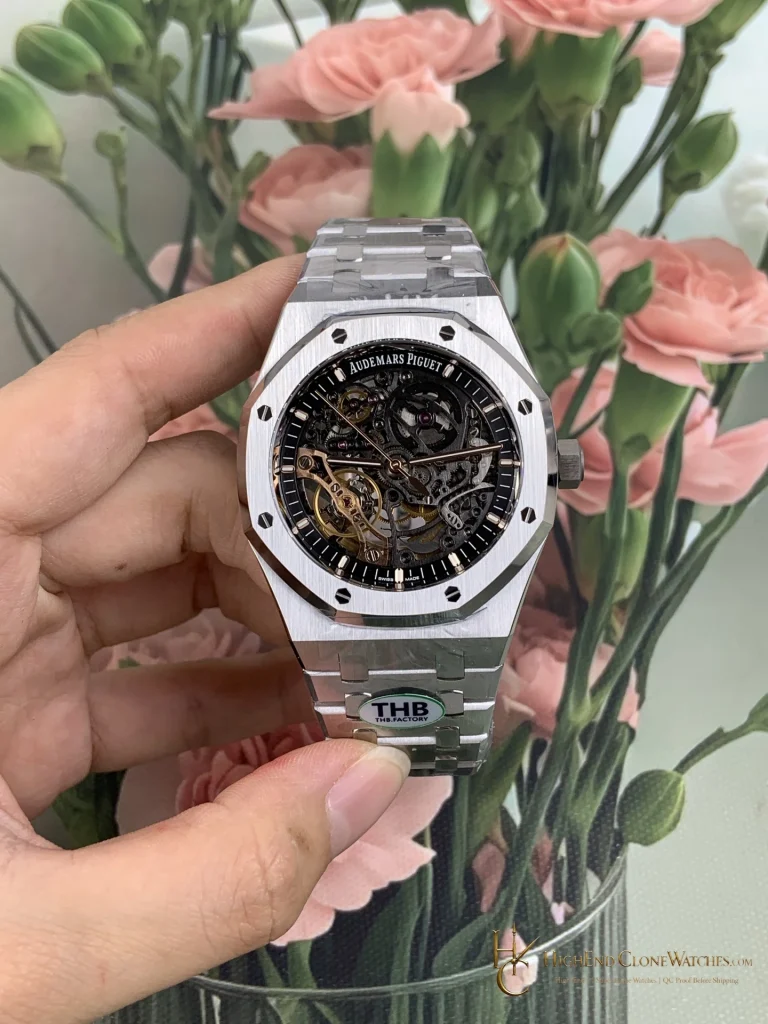
QC should review the smoky blue tone from front and angle, checking that the texture remains even and the chronograph registers stay aligned. The octagonal bezel edges, gold-tone finish, pusher spacing and bracelet articulation deserve close photographs. Hand clearance and movement behaviour should be checked before the final proof is prepared.
The smoky-blue surface makes this reference more graphic than its smoked-gold neighbour, but the gold-tone case keeps it from becoming cold. Inspect the gallery for an even transition across the dial and for clean alignment between registers, hands and bezel. The articulated links should follow the case without changing the visual direction. That combination of cool dial and warm frame is the reason to choose this version when the same chronograph architecture is available in several colours.
The cooler colour works best when the dial remains legible at a glance while the bezel supplies the warmer edge. Use the close images to compare the two finishes before choosing. The final proof should show both. The completed review should include the case edge, dial centre and bracelet junction together.