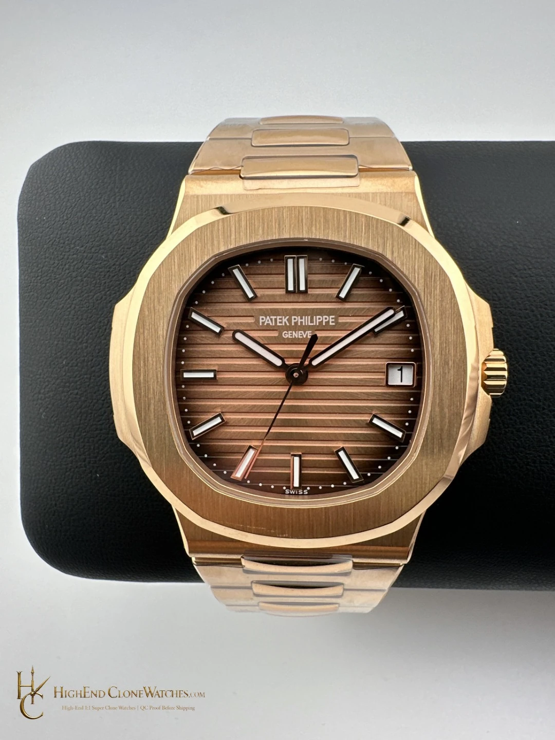
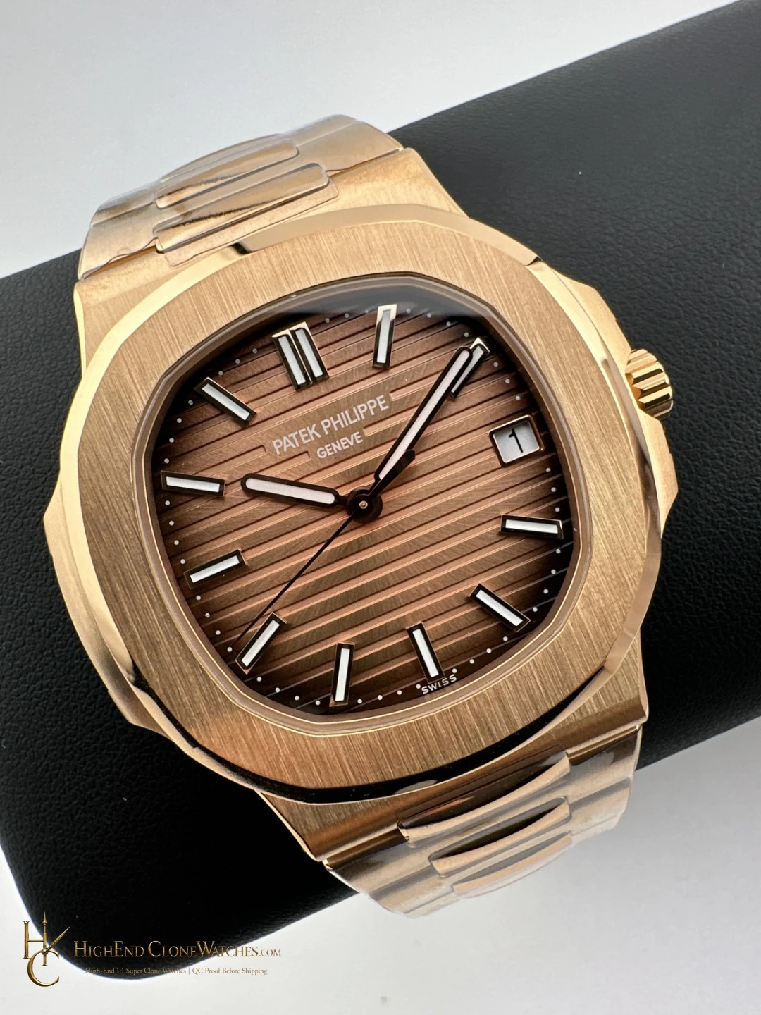
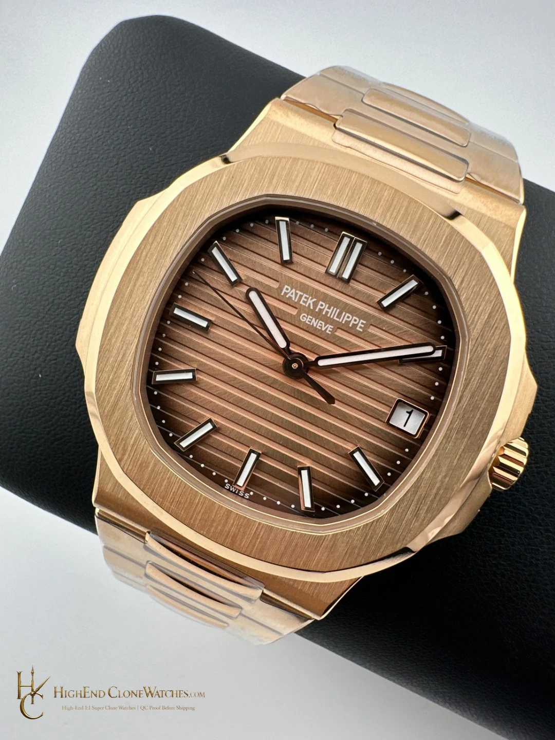
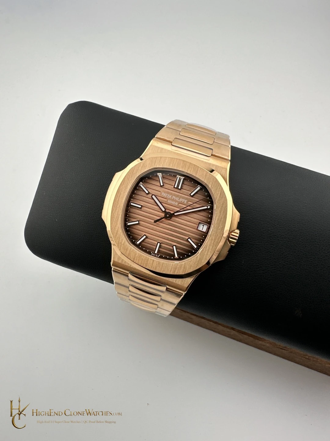
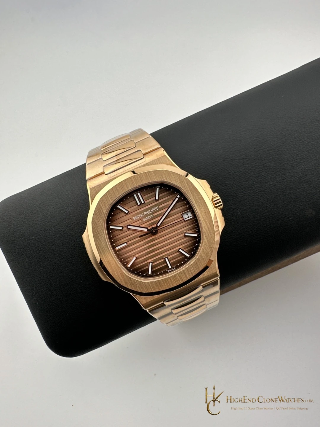
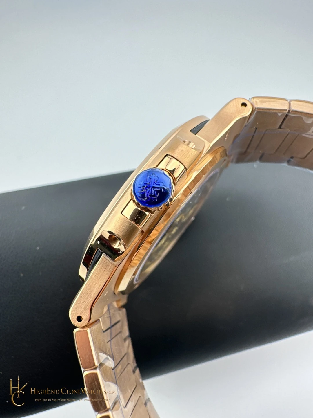
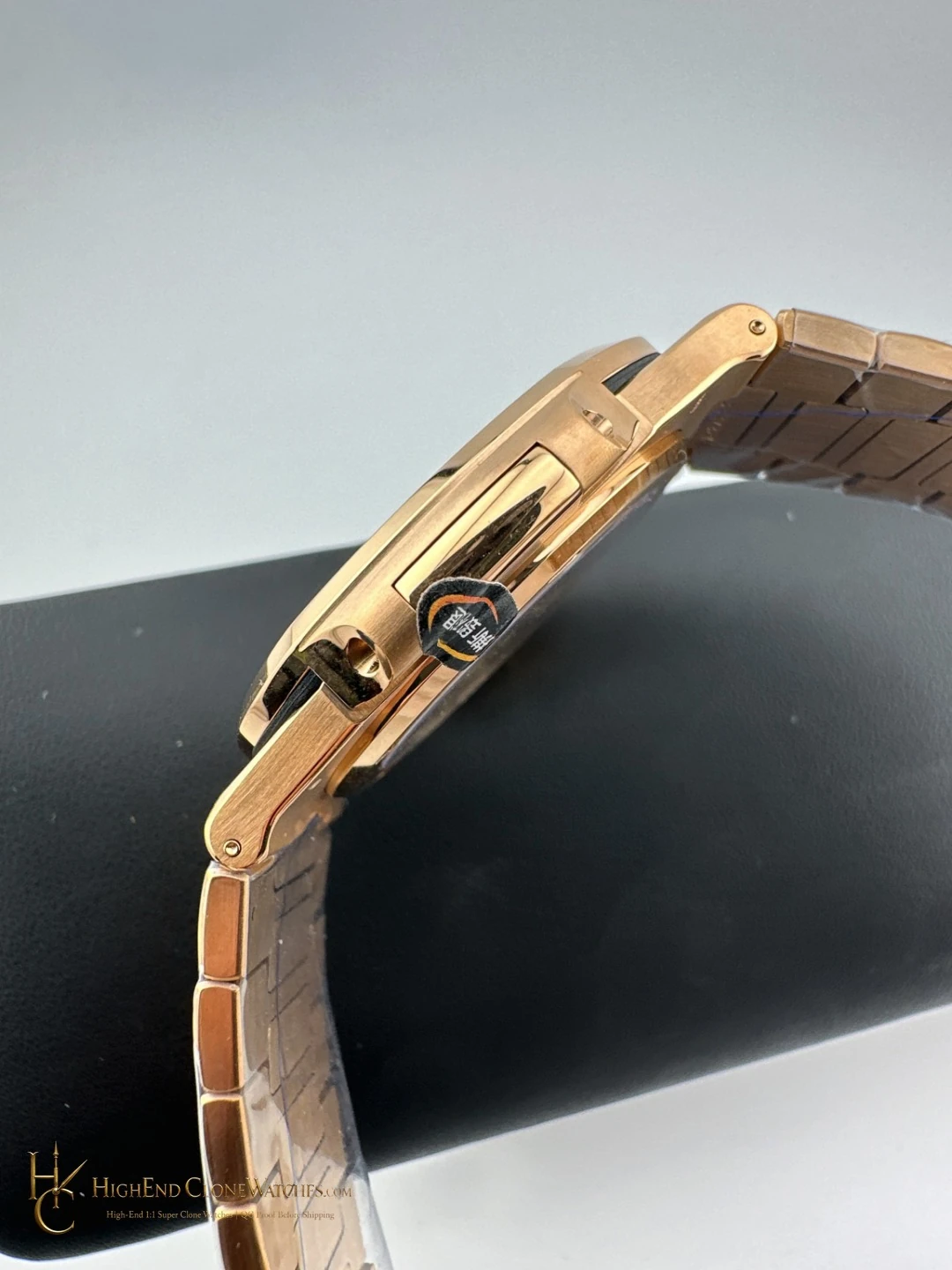
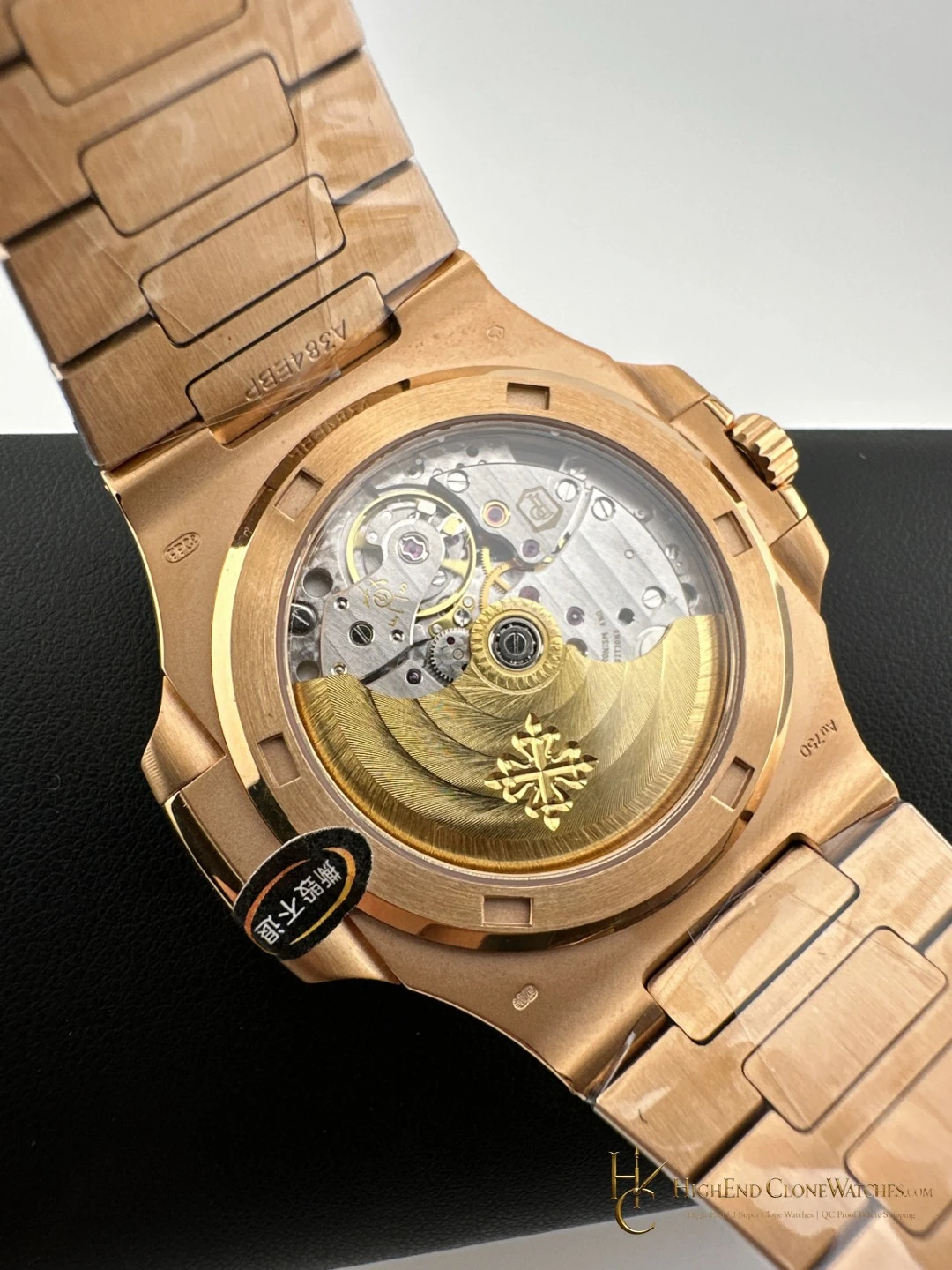
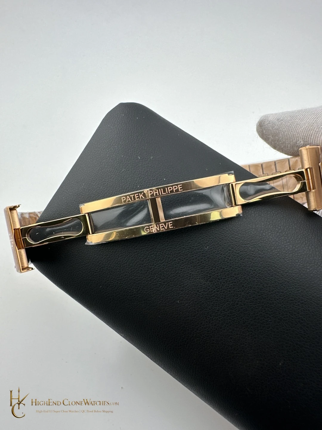
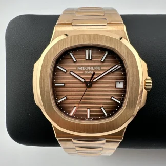
QC should focus on the sunburst dial, bezel brushing and chamfers, bracelet finish continuity, and Calatrava clasp alignment. These are the checks that preserve the warm, connected presentation that separates this version from the grey-gradient sibling.
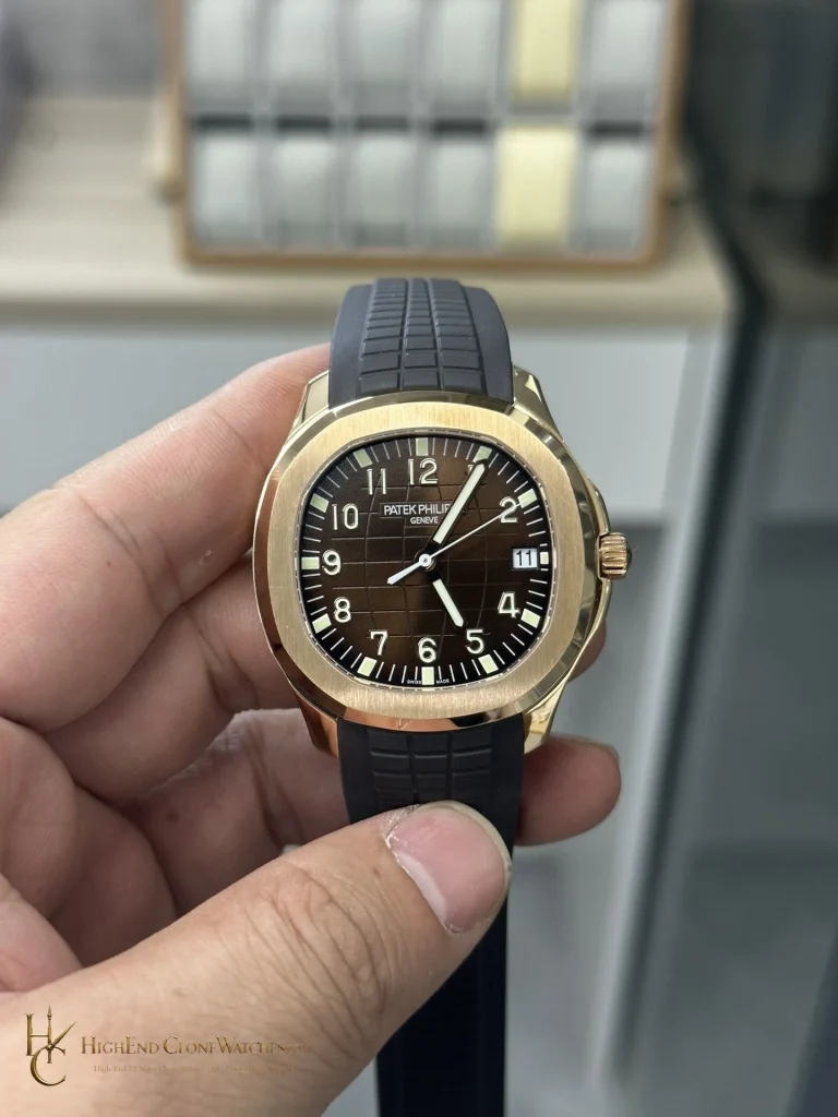
The deciding wrist question is whether the brown dial and rose-gold finish should read as one warm field. Use the wrist and rear-detail images to check that the bracelet remains consistent with the case, then compare the same views with the grey-gradient sibling if a cooler result would be easier to wear.
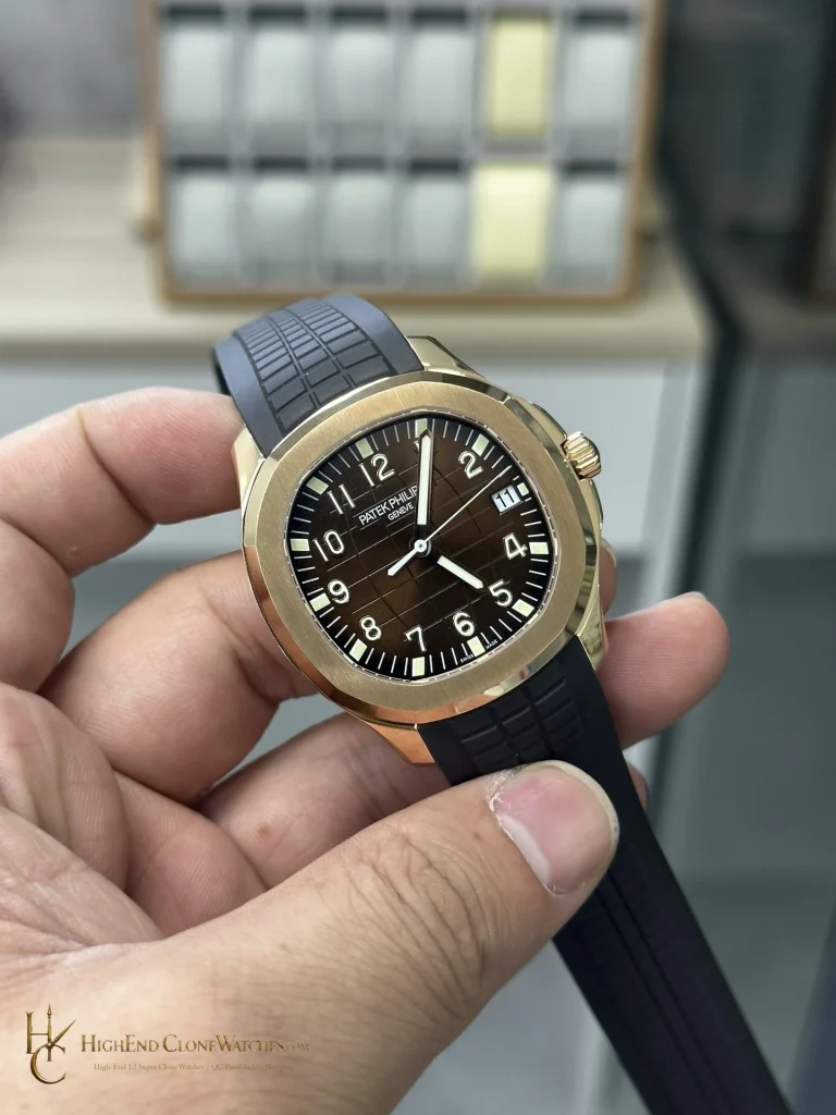
The brown version is most convincing when the dial, bezel, and bracelet keep the same warm direction without becoming visually flat. Use the three-quarter image to see whether the polished chamfers separate the brushed bezel face, then use the wrist view to judge how the chocolate tone sits against the rose-gold finish. That reading gives the grey-gradient sibling a real role in the comparison: it is the cooler answer for the same 40mm reference, not merely another color name.