$1,200.00 Original price was: $1,200.00.$989.00Current price is: $989.00.
Buying notes for this configuration
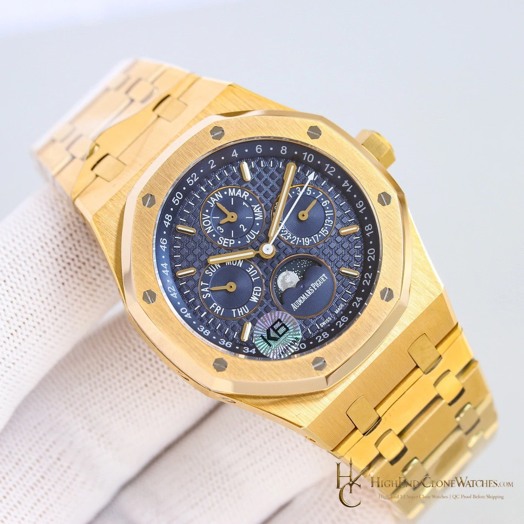
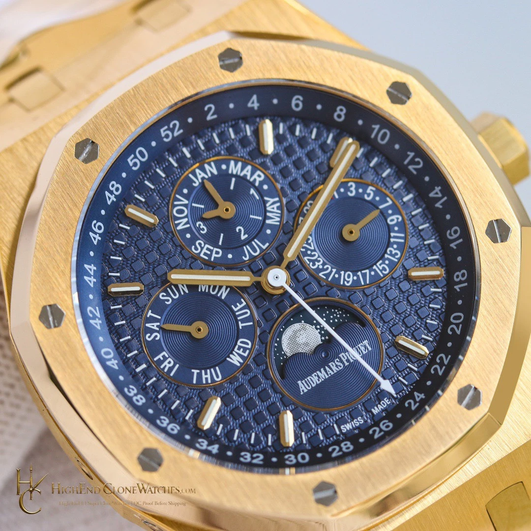
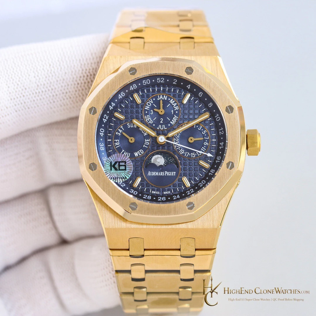
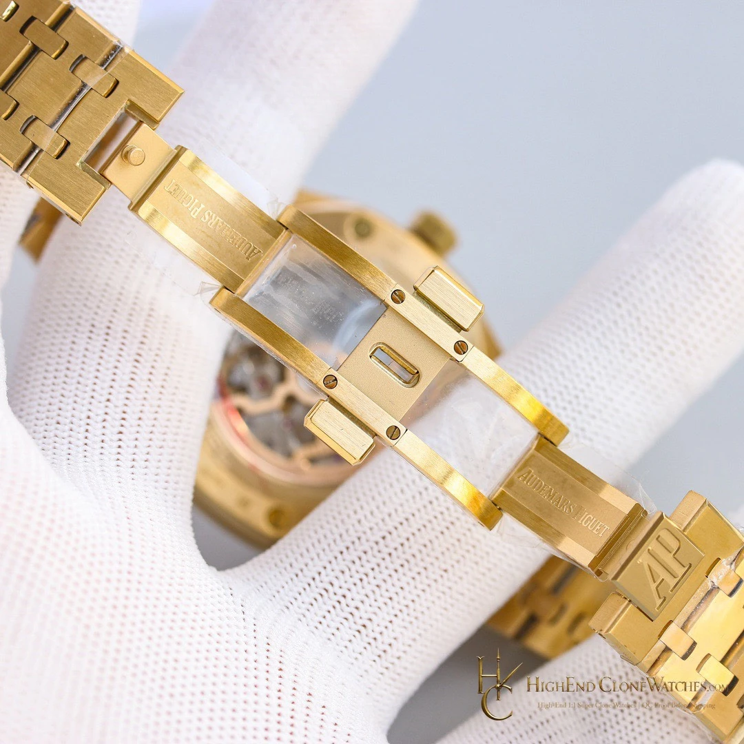
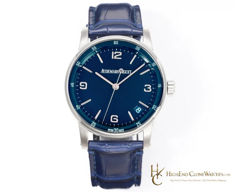
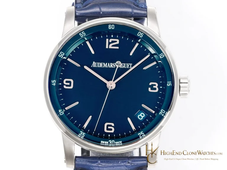
blue calendar information against a warmer gold-tone Royal Oak presentation is the defining reason to choose reference 26574BA. a buyer choosing a blue calendar face but wanting the case color to make the watch feel more occasion-oriented. The useful comparison is the steel 26574ST blue calendar when a cooler case and more restrained daily palette are preferred. The decision is about the exact relationship between dial, case, bezel, and attachment, so the gallery should be reviewed in sequence. blue dial printing, calendar-register placement, gold-tone surface consistency, bezel screw spacing, bracelet fit, and clasp closure should be visible in the pre-dispatch review.
Reference 26574BA is the calendar-led Royal Oak for a buyer who wants the blue dial to meet a warmer gold-tone presentation. The visual priority is not a technical specification list; it is the way the blue calendar face and gold-tone case read together in the gallery. Compare the steel 26574ST for a cooler, quieter result. QC should concentrate on dial printing, register placement, gold-tone consistency, bezel screw spacing, bracelet fit, and clasp closure.
Blue first, warm second
The 26574BA earns attention through the tension between a blue calendar dial and a gold-tone Royal Oak presentation. The dial supplies the color and information density; the case supplies the warmer frame. That pairing makes the watch more occasion-oriented than the steel variants, while the blue face keeps the result from becoming one-dimensional. The gallery should be read as a complete composition, not as a single dial photograph.
A calendar layout worth studying
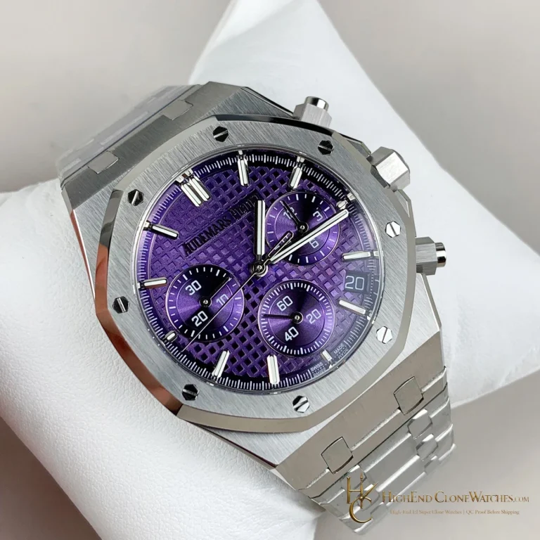
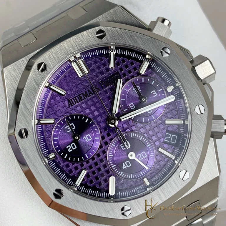
Use the front views to assess the balance between the central hands and the calendar registers. Look for even printing and a stable relationship between the indications, then move to the oblique views to judge the octagonal bezel and bracelet transition. The important decision is whether this visual concentration suits the way you dress and wear a calendar watch. Buyers who want a quieter, cooler result should keep the steel blue alternative in view.
Where the steel alternative differs
The steel 26574ST blue calendar is the useful nearby comparison. Its cooler case changes the mood of the same broad calendar idea, making it easier to pair with understated daily clothing. The 26574BA is the better-owned choice when the case color should announce the watch before the dial is read. Those are different selection outcomes, not interchangeable references.
Pre-dispatch review
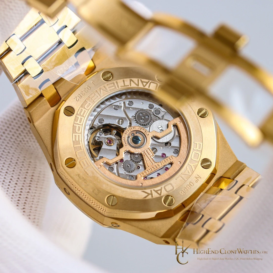
QC should concentrate on blue dial printing, calendar-register placement, gold-tone surface consistency, bezel screw spacing, bracelet fit, and clasp closure. Ask for a direct dial view, a case angle, and a bracelet-and-clasp view. The images should make the blue-and-gold relationship consistent from every angle, with no distracting shift in the visible finishing.
When the warmer frame is the point
A blue calendar dial can be selected for color alone, but the 26574BA is more specific than that. The gold-tone frame changes how the watch meets a shirt cuff, evening clothing, or a warmer palette of accessories. It also means the case and bracelet need to read as one consistent presentation. The right buyer is choosing the blue-and-warm pairing, not merely adding another calendar reference to a list. The case color remains central when viewed from the side.
Questions to settle before ordering
What is the buying reason for the 26574BA?
It places a blue calendar dial in a warmer gold-tone Royal Oak presentation, unlike the cooler steel alternatives in the same family.
What should the pre-dispatch review cover?
blue dial printing, calendar-register placement, gold-tone surface consistency, bezel screw spacing, bracelet fit, and clasp closure.
Review the exact configuration before it leaves.
Use model-specific QC proof to confirm the visible details and stated functions that informed your choice.
QC proof before dispatch