$1,200.00 Original price was: $1,200.00.$950.00Current price is: $950.00.
Buying notes for this configuration
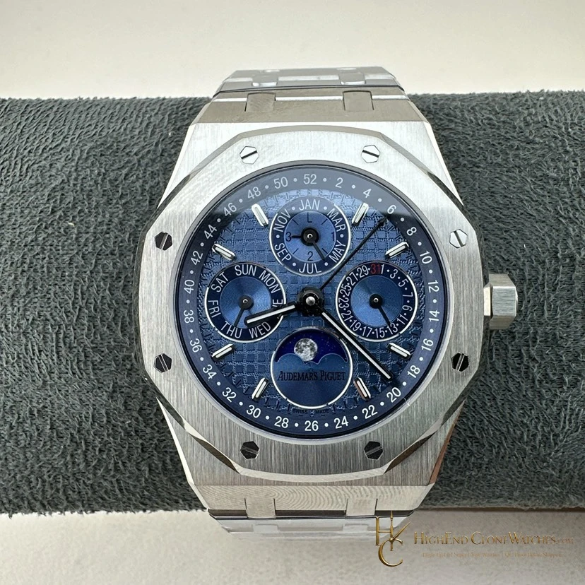
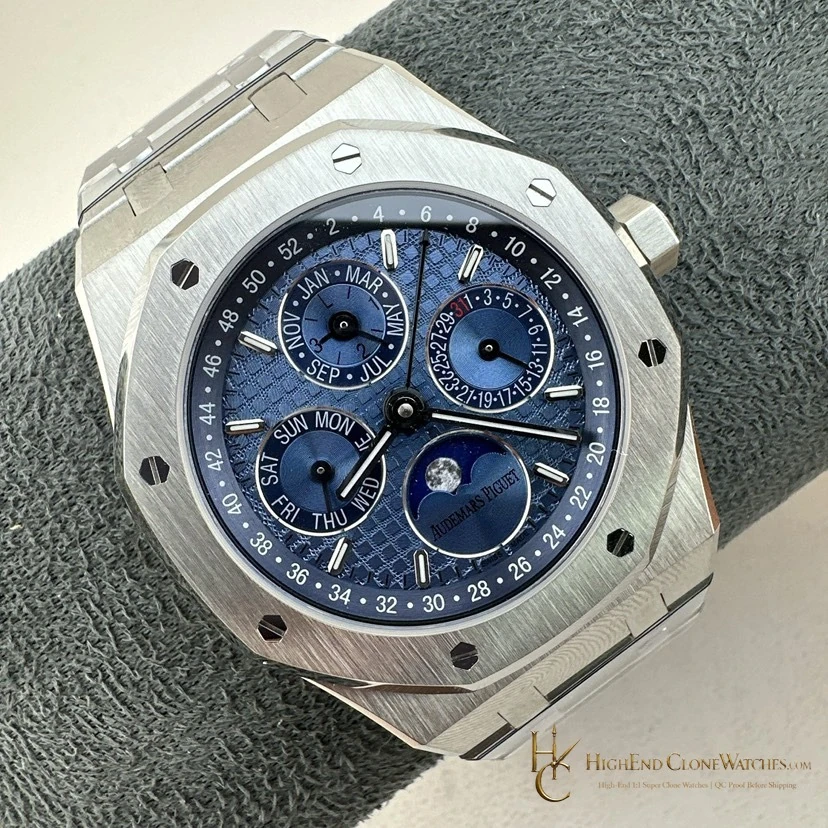
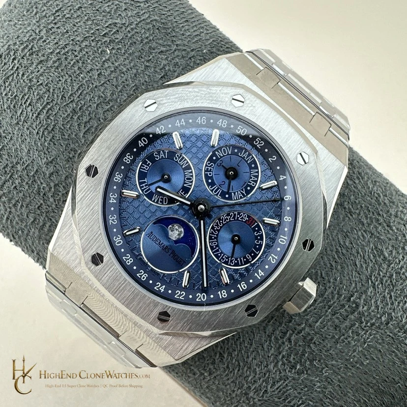
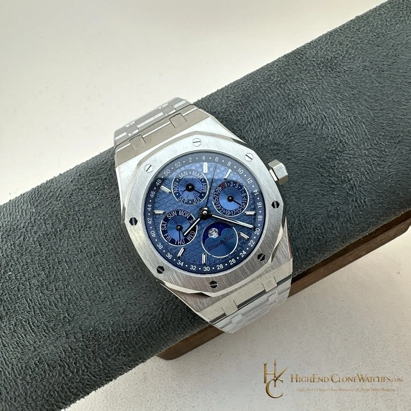
an ice-blue calendar dial for a lighter, less conventional Royal Oak palette is the defining reason to choose reference 26574PT. a buyer who wants the calendar layout to feel light and distinctive rather than dark, saturated, or monochrome. The useful comparison is the deeper blue 26574ST for stronger saturation, or the black 26607BC for higher visual contrast. The decision is about the exact relationship between dial, case, bezel, and attachment, so the gallery should be reviewed in sequence. ice-blue dial consistency, calendar-register placement, bezel and screw spacing, case finishing, bracelet fit, and clasp closure should be visible in the pre-dispatch review.
The 26574PT owns the pale end of the Royal Oak calendar palette. Its ice-blue dial creates a lighter, more reflective visual impression than the blue, green, or black alternatives, making the face rather than the case color the selection point. Compare the 26574ST for deeper blue or the 26607BC for darker contrast. QC should focus on ice-blue consistency, calendar-register placement, bezel and screw spacing, case finishing, bracelet fit, and clasp closure.
A lighter calendar palette
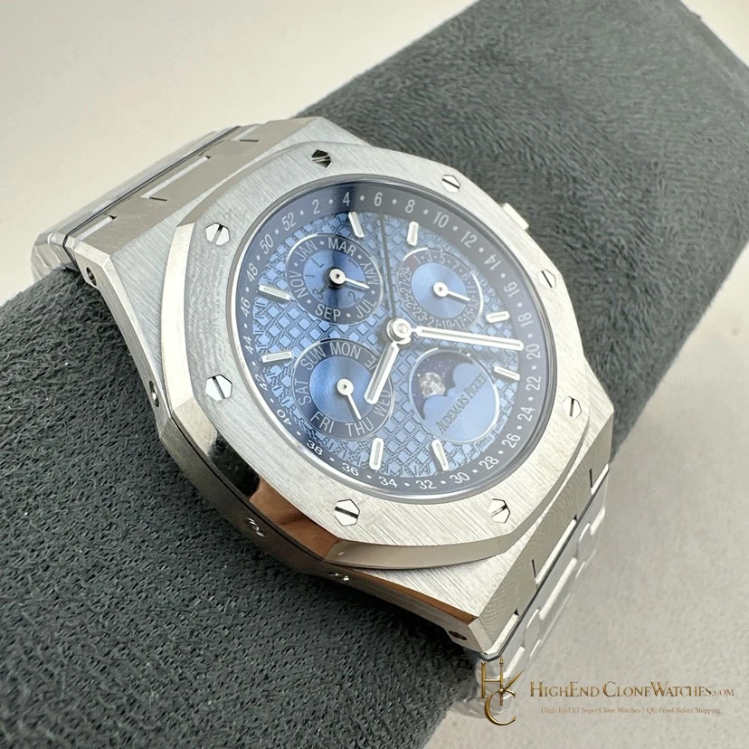
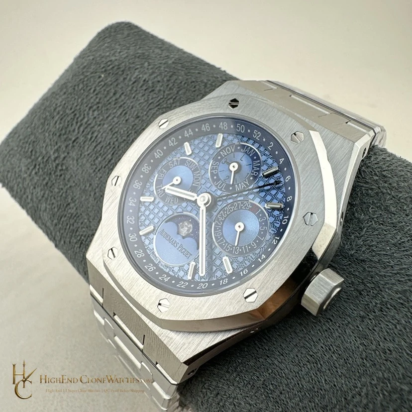
The 26574PT is selected for its ice-blue dial. That pale color changes the first impression of the Royal Oak calendar, making the face feel lighter and more open than the deeper blue, green, or black alternatives. It is a good match for a buyer who wants the complication layout to remain visible without the watch reading as dark or heavily contrasted. The dial is the ownership reason.
Use the gallery to judge the pale tone
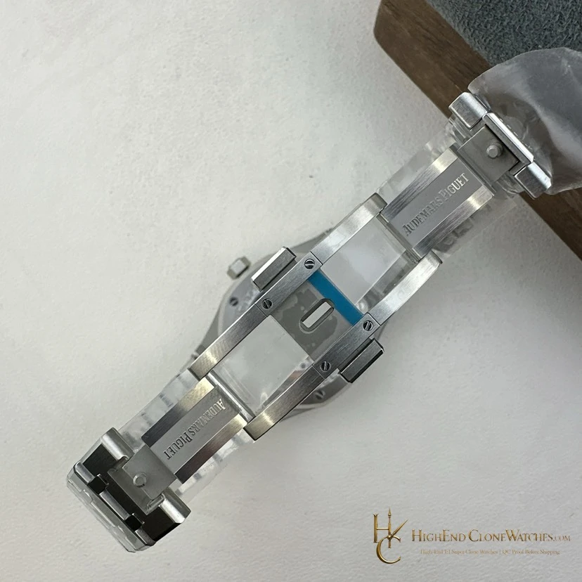
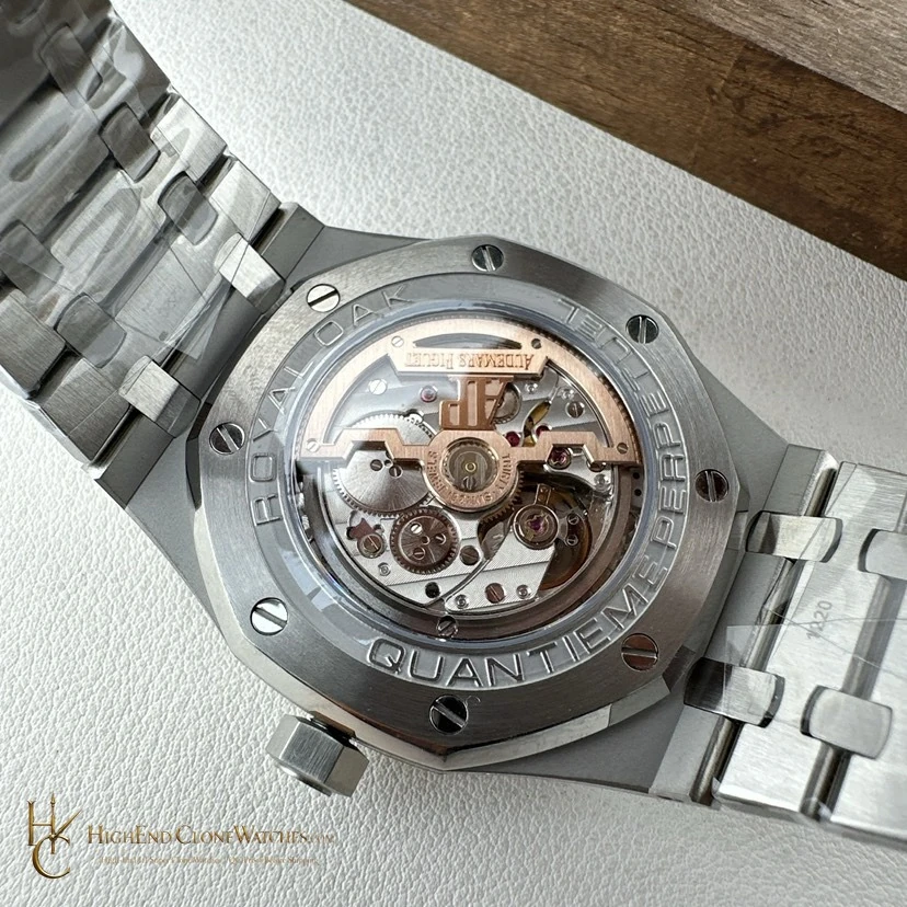
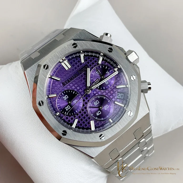
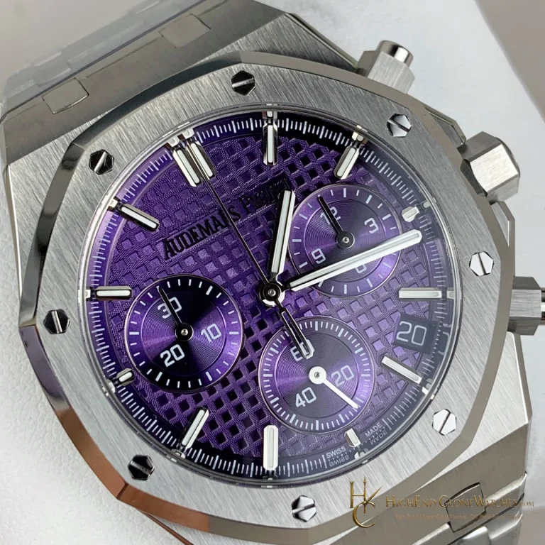
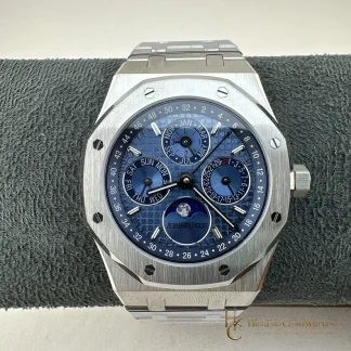
Pale dials need to be read across several views because angle and surrounding steel can alter their appearance. Start with the direct front image for calendar-register balance, then compare the angled frames for case planes, bezel spacing, and bracelet continuity. The most useful question is whether the ice-blue tone remains convincing in both close detail and full presentation. That visual consistency matters more than a generic color label.
The deeper-color alternatives
The 26574ST is the nearby choice when stronger blue saturation is preferred. The black 26607BC creates a sharper, more monochrome contrast. The 26574PT is intentionally different from both: it uses a pale dial to soften the calendar wrist presence while retaining the recognizable Royal Oak structure. Select it when that lighter relationship is the feature you want to see every day.
Inspection points for ice blue
QC should focus on ice-blue dial consistency, calendar-register placement, bezel and screw spacing, case finishing, bracelet fit, and clasp closure. Ask for straight-on, oblique, and bracelet views. The color should remain even across the set, the calendar indications should sit cleanly, and the bracelet should meet the case without a visible break in the presentation.
Lightness as a deliberate choice
The ice-blue version is not simply a paler name for the blue calendar. Its appeal is the way a light dial opens the presentation and changes the relationship between the calendar indications and the steel surroundings. This is especially useful when a darker dial feels too formal or a green dial too assertive. Inspect the pale surface at several angles, then compare the full bracelet view before settling on the colorway.
Questions to settle before ordering
What makes the ice-blue 26574PT different from the other calendars?
Its pale ice-blue dial changes the wrist impression first, giving the calendar layout a lighter character than the deeper blue, green, and black variants.
What should the pre-dispatch review cover?
ice-blue dial consistency, calendar-register placement, bezel and screw spacing, case finishing, bracelet fit, and clasp closure.
Review the exact configuration before it leaves.
Use model-specific QC proof to confirm the visible details and stated functions that informed your choice.
QC proof before dispatch