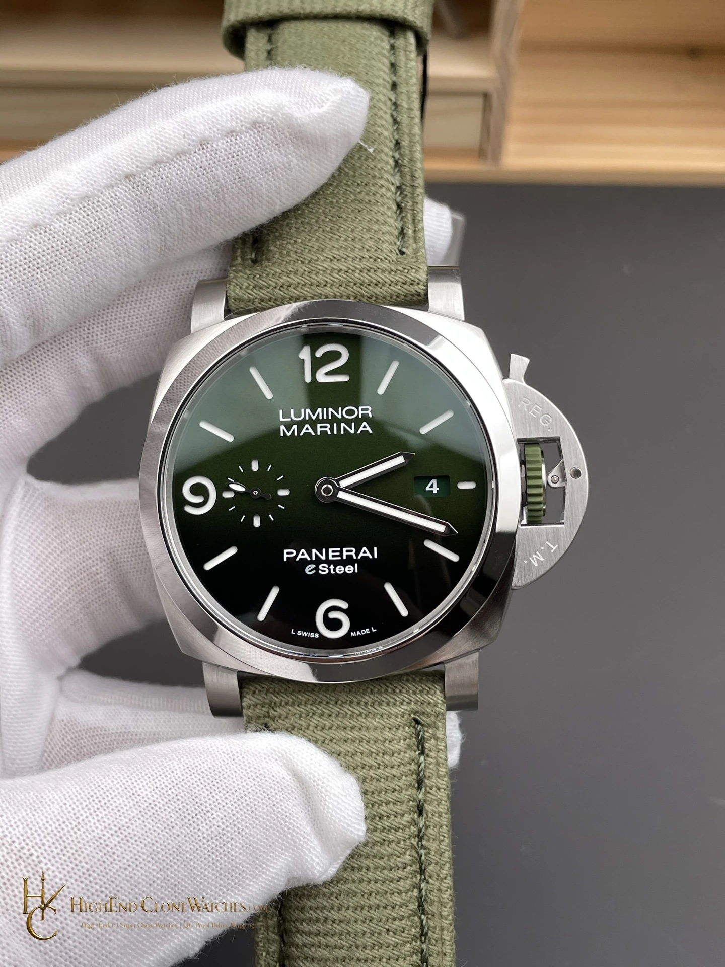
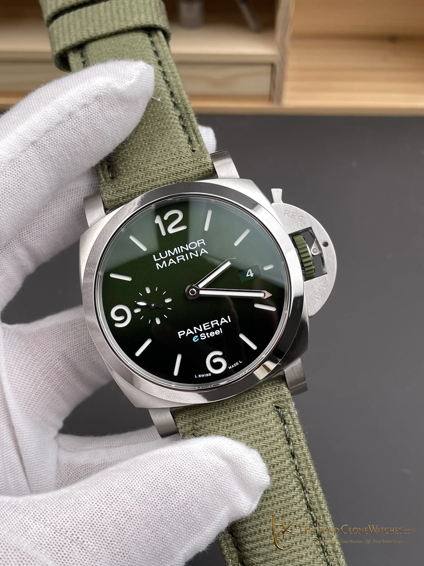
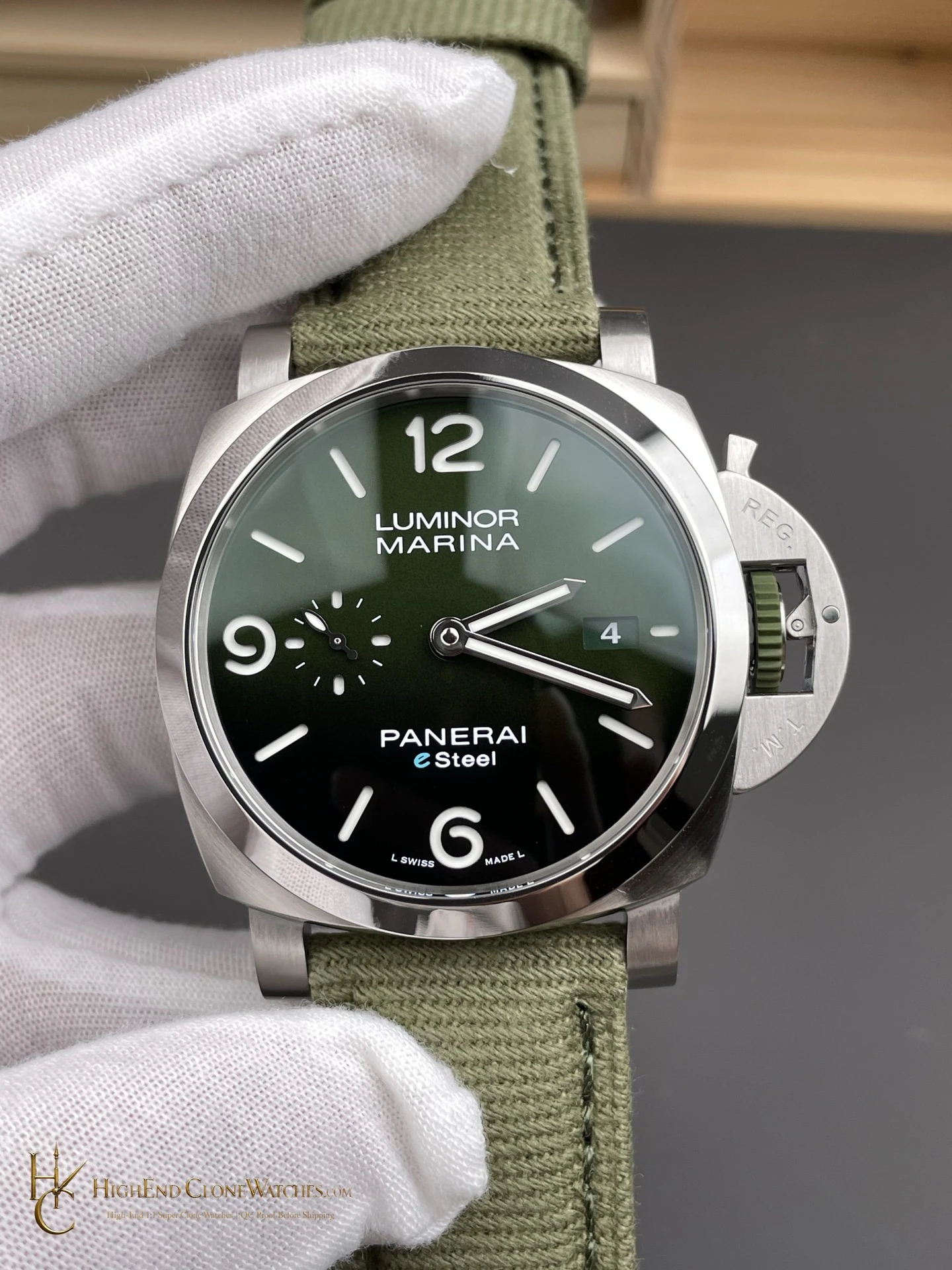
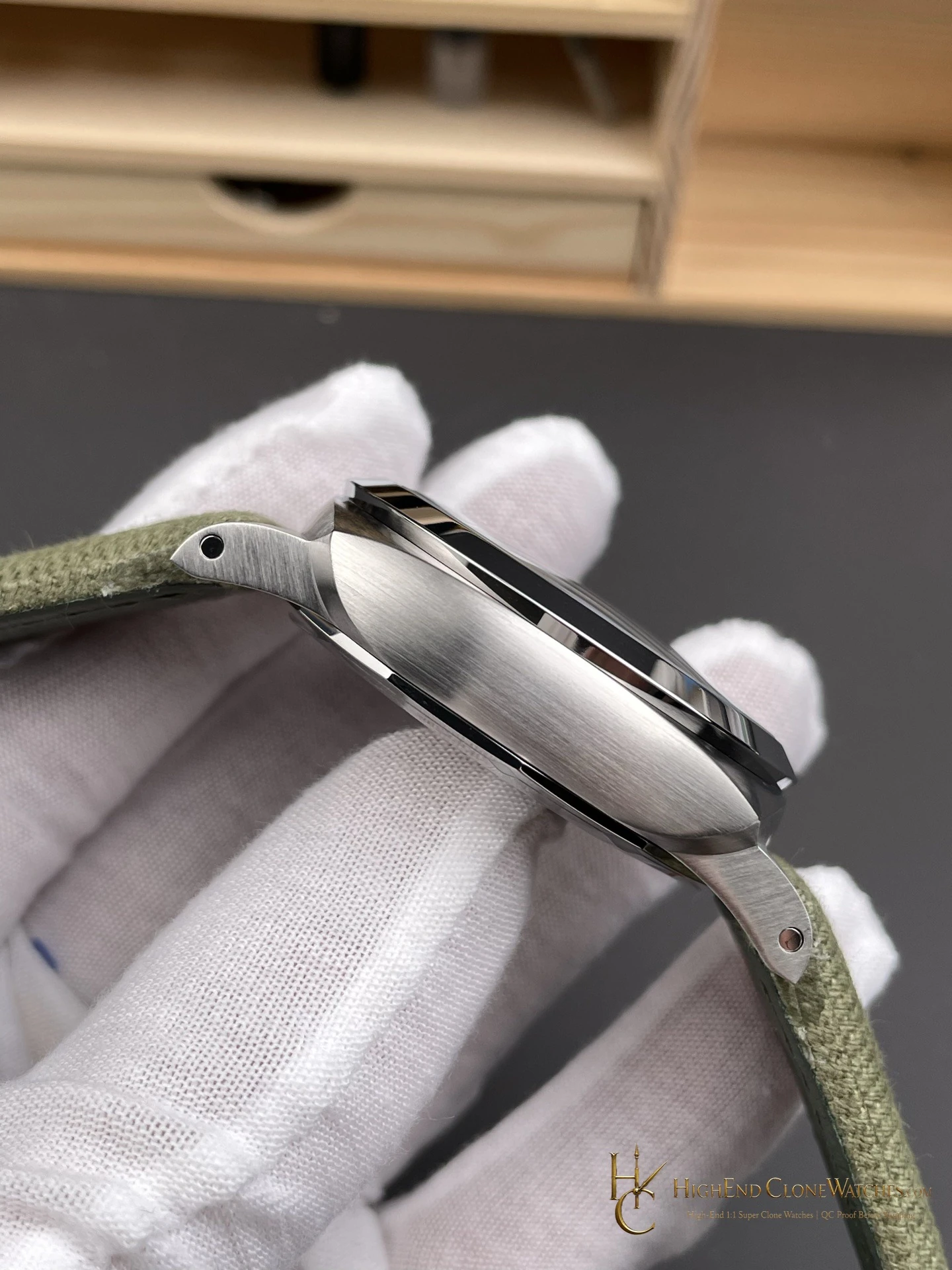
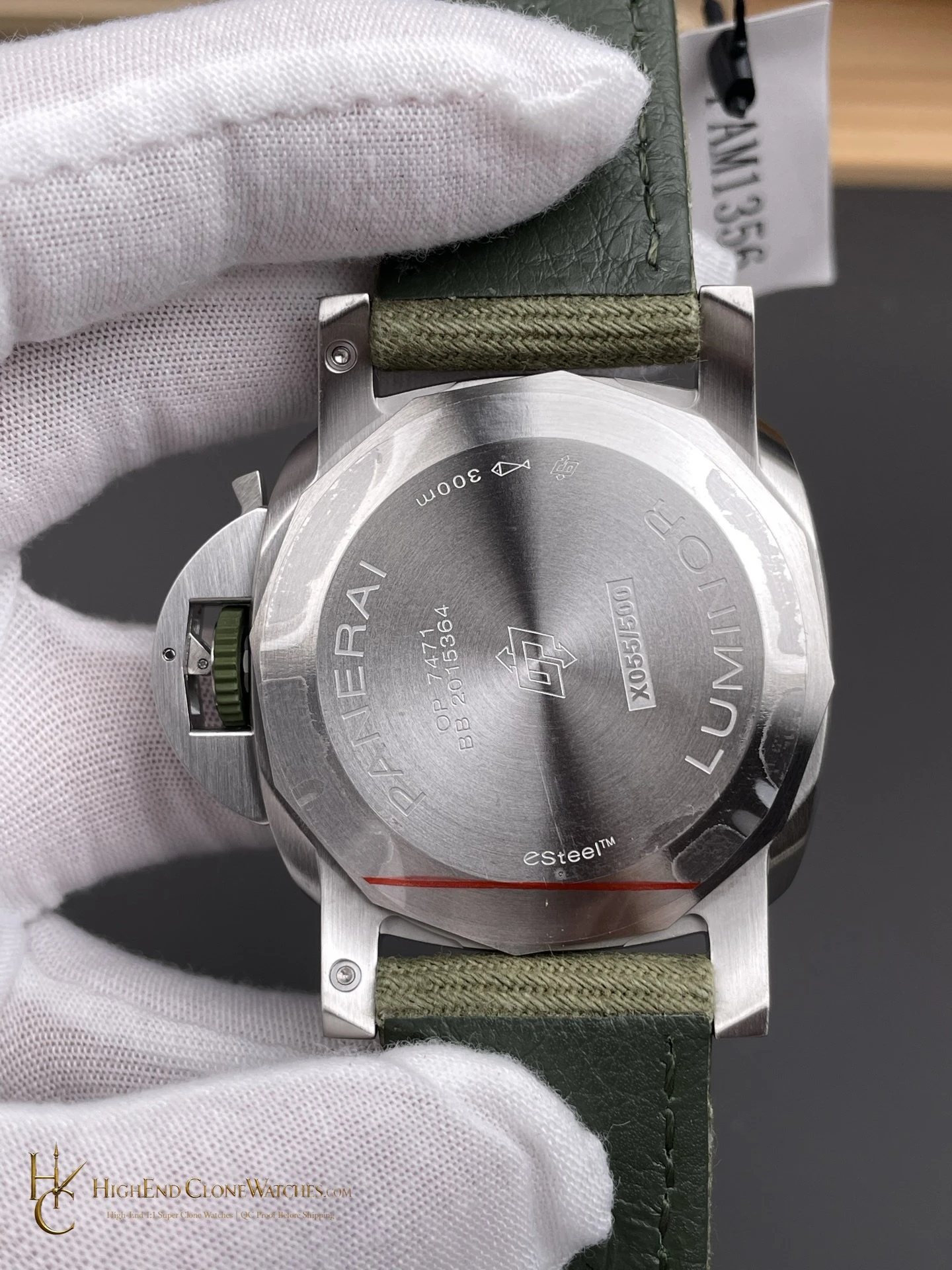
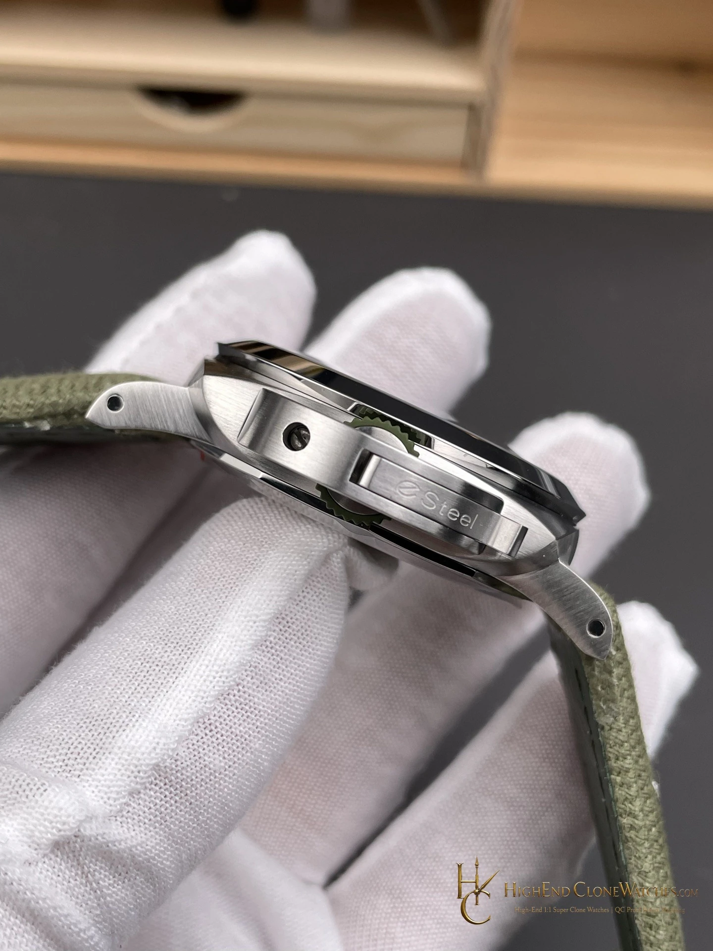
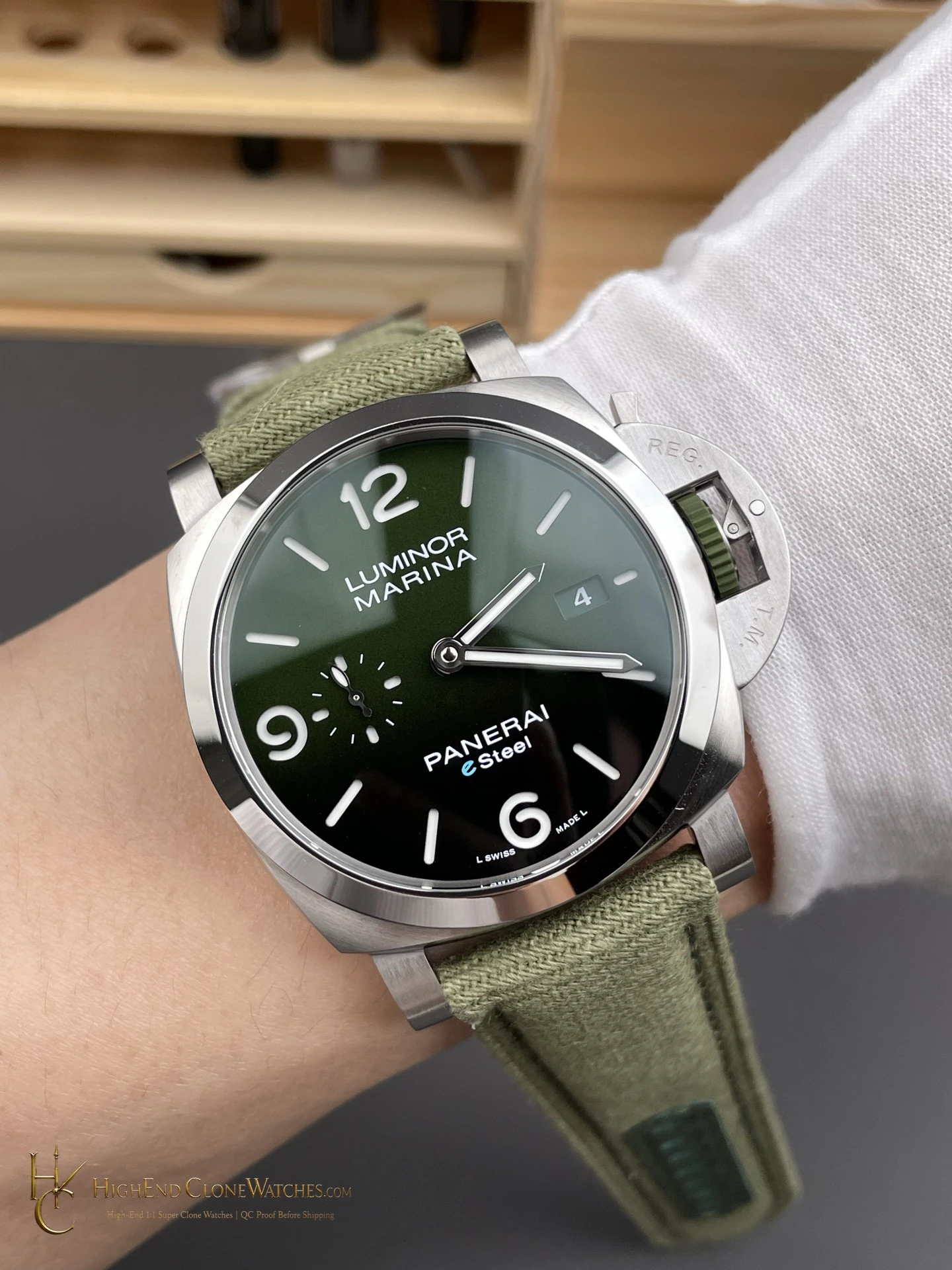
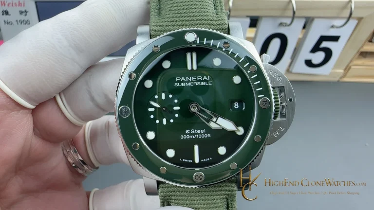
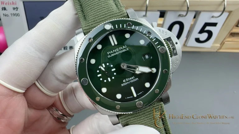
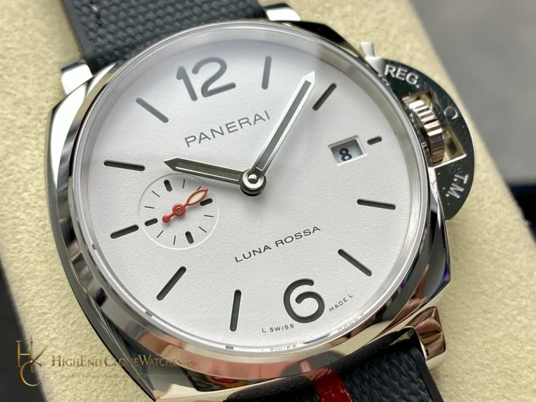
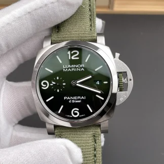
The polished bezel should form a clean boundary around the dial rather than pulling attention away from the gradient. A side photograph is useful for confirming the finish change between bezel and case, as well as the way the leather strap starts at the lugs. This reference works when those elements frame the dial quietly and let the green remain the reason the buyer chose it.
The practical attraction is that the color remains concentrated in the dial while the steel case and leather strap keep the rest of the watch familiar. In QC, ask for one image in neutral light rather than relying only on a dramatic angle. It makes the gradient, printed details, and polished bezel easier to assess without visual distraction.
The dial should look gradual rather than abruptly divided from green to black. A close image of the bezel-to-case transition and a profile image of the strap at the lugs are equally useful, because this watch relies on the relationship between dial color, steel finish, and leather rather than one isolated feature.