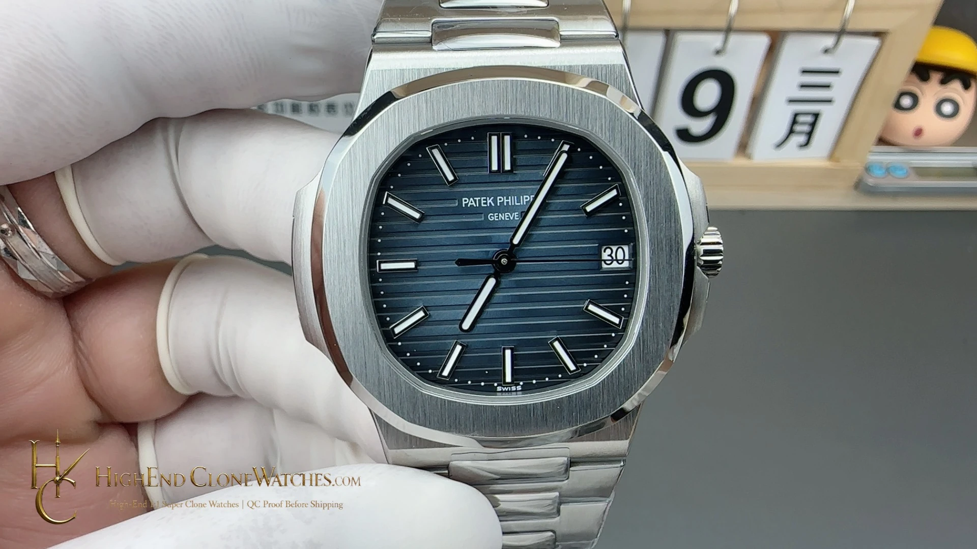
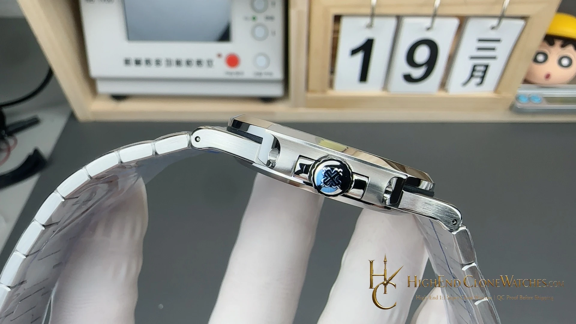
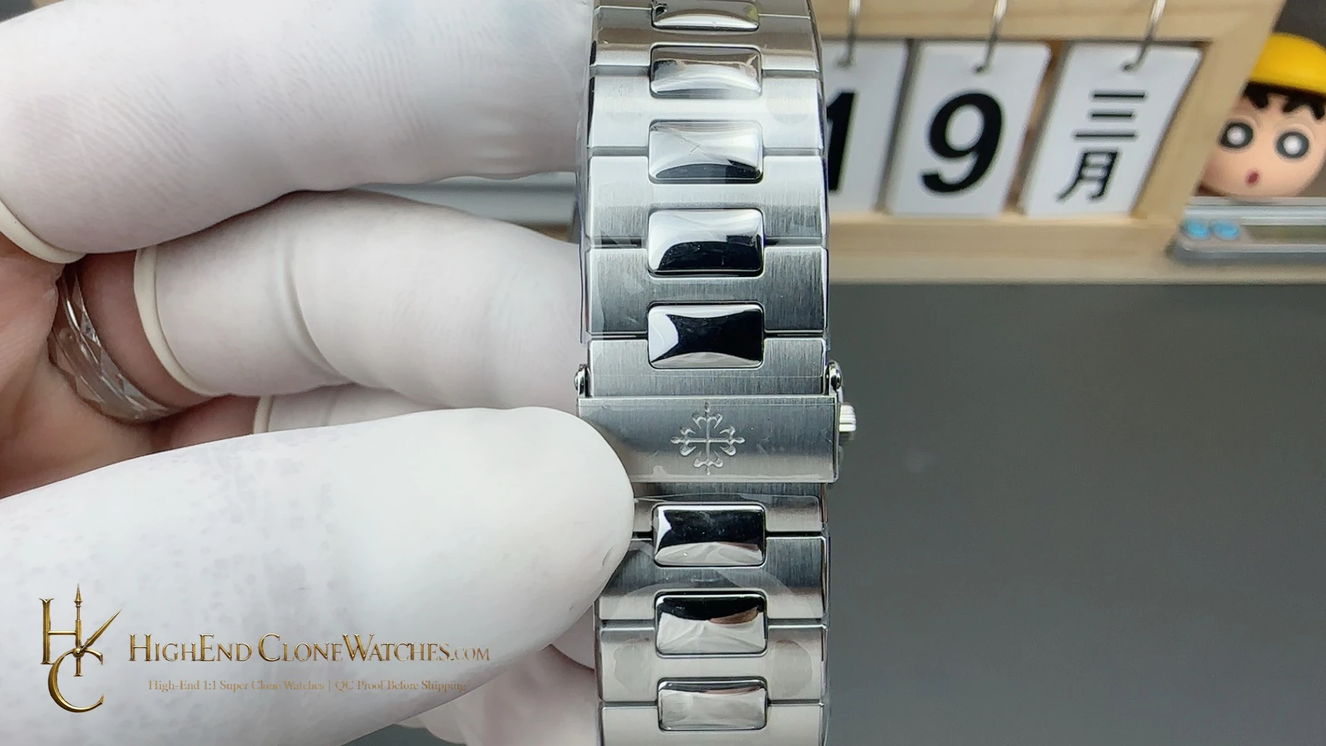
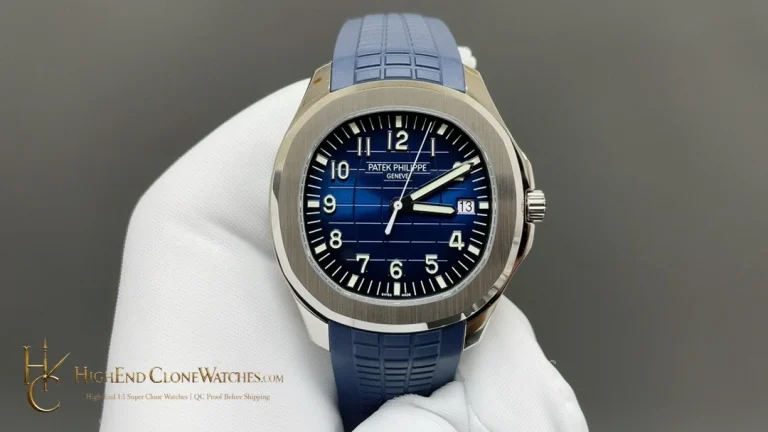
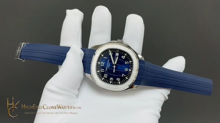
For this reference, QC should inspect the blue gradient and dial alignment first, then the bezel chamfers, bracelet surface transitions, attachment points, and fold-over clasp. A clean result keeps the dark-blue dial as the visual lead and confirms that the steel hardware supports the daily-wear role.
That makes the 5711/1A-010 a useful daily rotation decision: the dial has enough character to be identifiable, but the steel case and bracelet remain easy to place. Read the dial, bezel, and clasp views in sequence before ordering so the blue gradient, case proportion, and bracelet continuity are assessed together.
For a repeat-wear choice, the important sequence is dial first, then bracelet. The gradient dark blue should remain the visual anchor when the watch is viewed straight on, while the brushed links and polished center-link bevels should add definition without turning the piece into a different color story. That is where this reference separates from the 5711/1P: the 5711/1A-010 asks for confidence in a versatile blue dial, not a commemorative motif.