$1,699.00 Original price was: $1,699.00.$1,199.00Current price is: $1,199.00.
Buying notes for this configuration
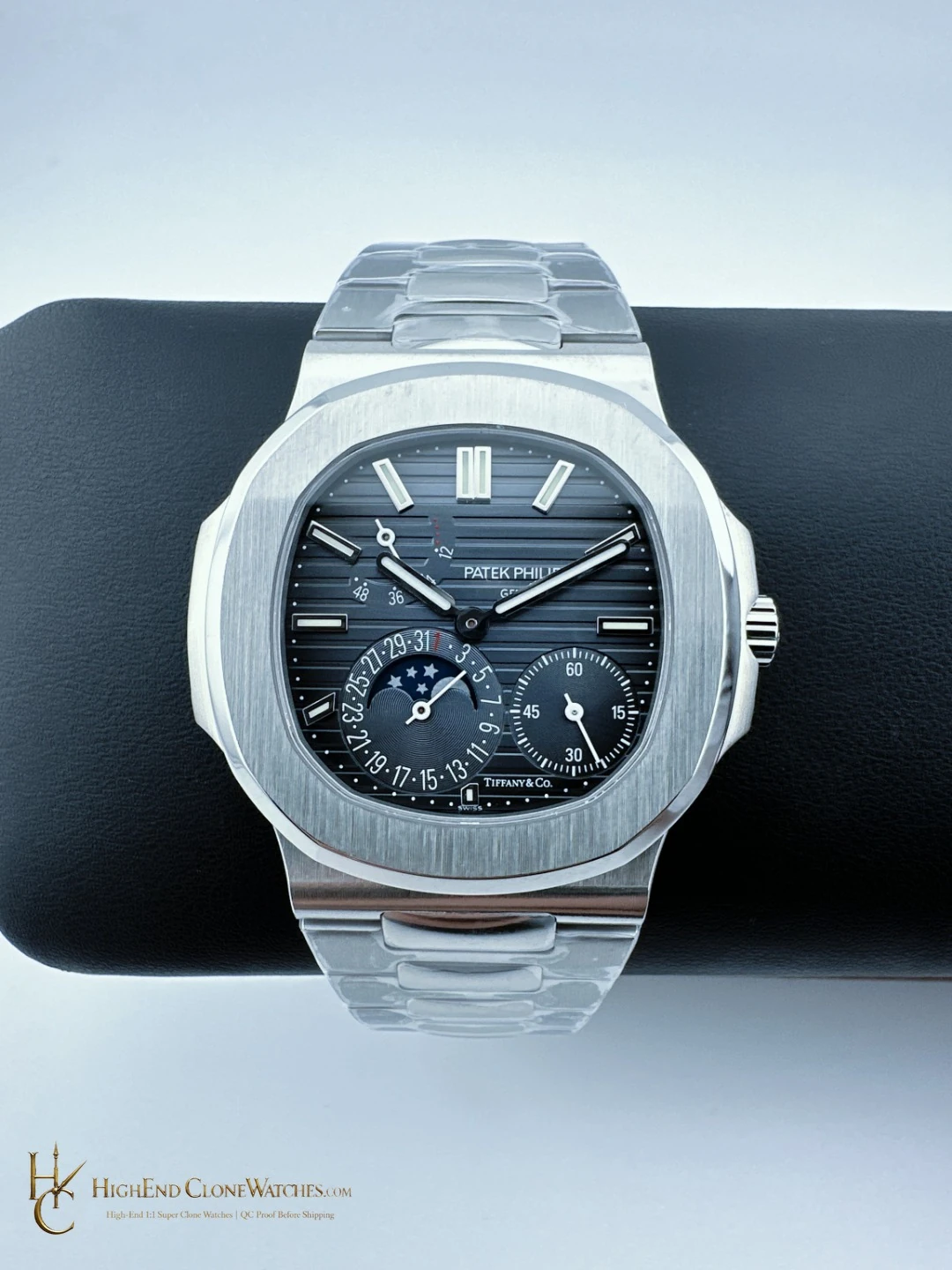
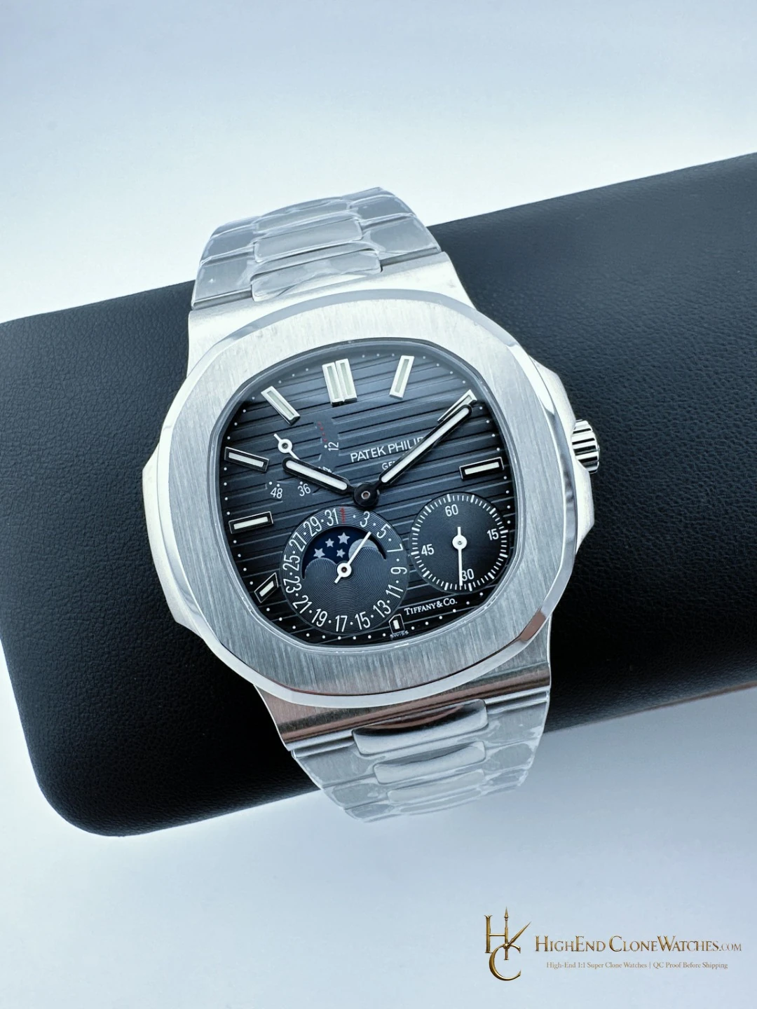
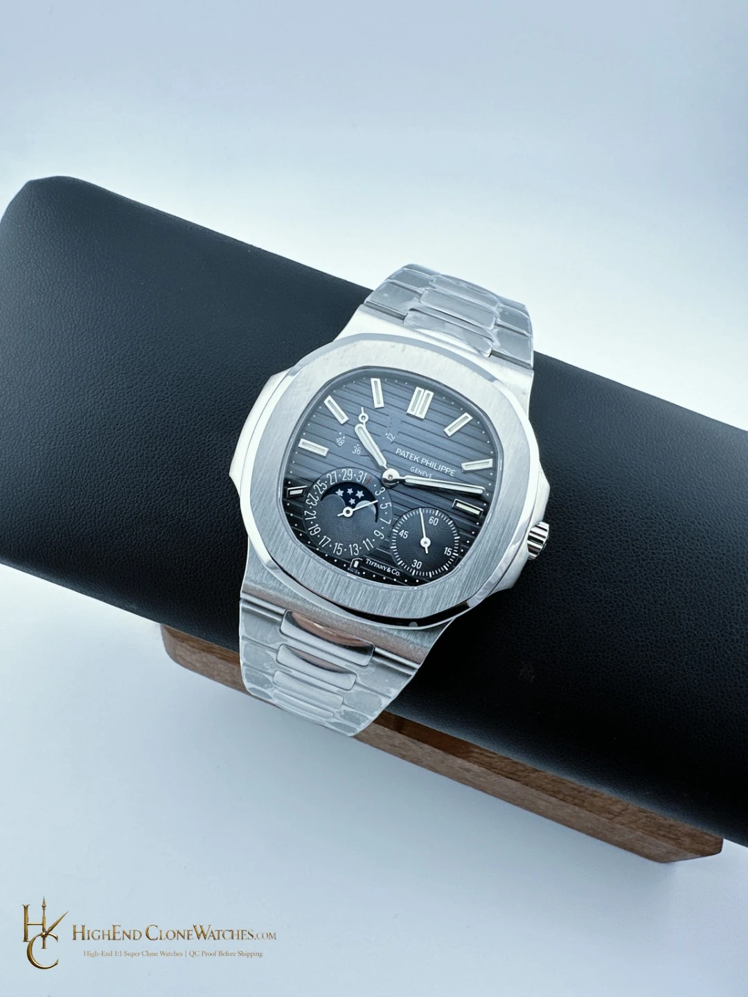
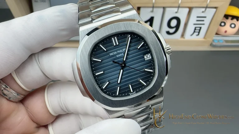
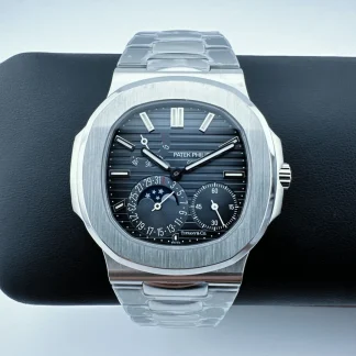
The dark blue-black 5712/1A-001 is the sharper of the two stainless-steel moon-phase choices. Its gradient dial creates a stronger field behind the asymmetrical display, and the V4 double-safety push-button folding clasp gives the bracelet a more substantial hardware presence. The exact alternative is the Morandi blue-grey 5712/1A-001 with 2022-plus push-button extension clasp. That version is calmer and easier to blend into a low-contrast steel rotation. Choose this dark dial when the moon-phase display should be noticed at a glance; choose Morandi blue-grey when restraint and a softer palette matter more. Inspect the dial transition and closure symmetry before deciding.
Select the dark blue-black version when the moon-phase dial should create the strongest contrast against steel and the folding clasp should feel substantial; choose Morandi blue-grey when a softer, more adaptable palette is preferred.
Patek Philippe Nautilus 5712/1A-001 brings a dark blue-black gradient dial to a 40.0mm stainless-steel moon-phase profile, with a V4 double-safety push-button folding clasp completing the bracelet. The deeper dial contrast makes the asymmetric display more immediate than the Morandi blue-grey version. Compare it with the same-reference 5712/1A-001 using a Morandi blue-grey dial and 2022-plus push-button extension clasp: that option is softer and more understated. This configuration fits a buyer who wants the moon-phase layout to stand out while the steel case stays clean. Review the gradient, case chamfers and clasp together.
Confirmed configuration
- Movement
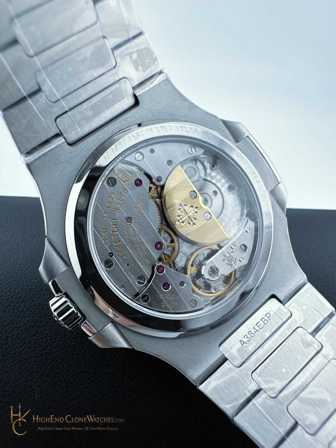
- Custom Caliber 240 PS IRM C LU Clone
- Bezel
- 316L Stainless Steel, satin-brushed face with polished chamfers
- Crystal
- Sapphire Crystal
- Bracelet
- 316L Stainless Steel with V4 double safety push-button folding clasp
Dark blue-black makes the moon-phase display decisive
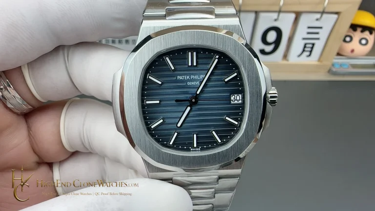
The dark blue-black gradient dial is the defining choice on this 5712/1A-001. Its deeper field gives the asymmetric moon-phase layout a stronger point of contrast, so the display reads immediately from across the wrist. The gradient keeps the surface from feeling flat while preserving the steel case as a clean frame.
Folding clasp adds a hardware decision
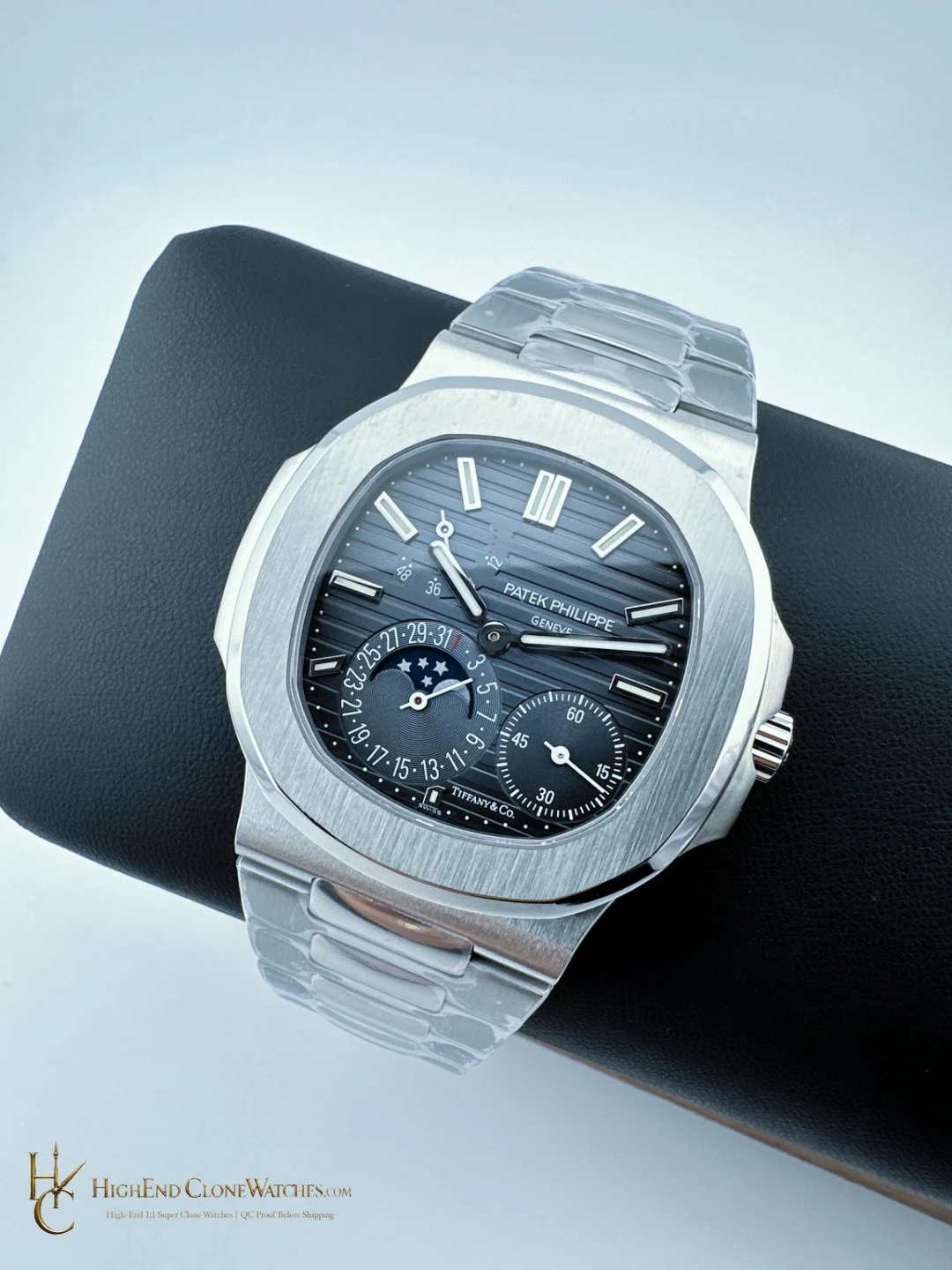
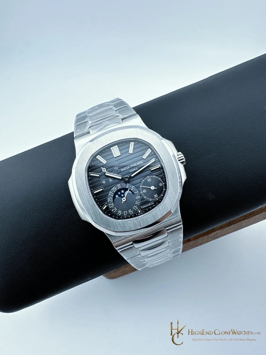
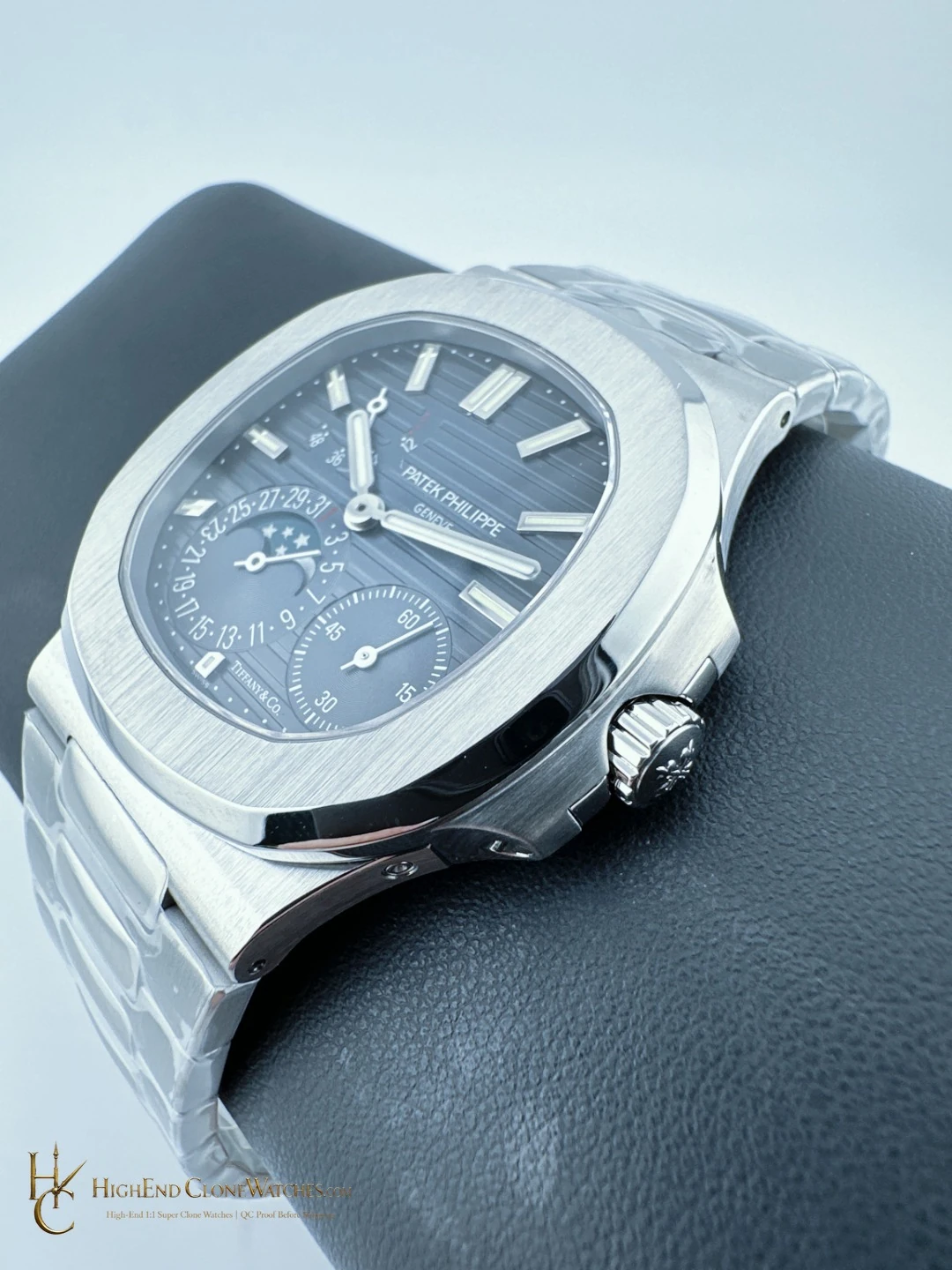
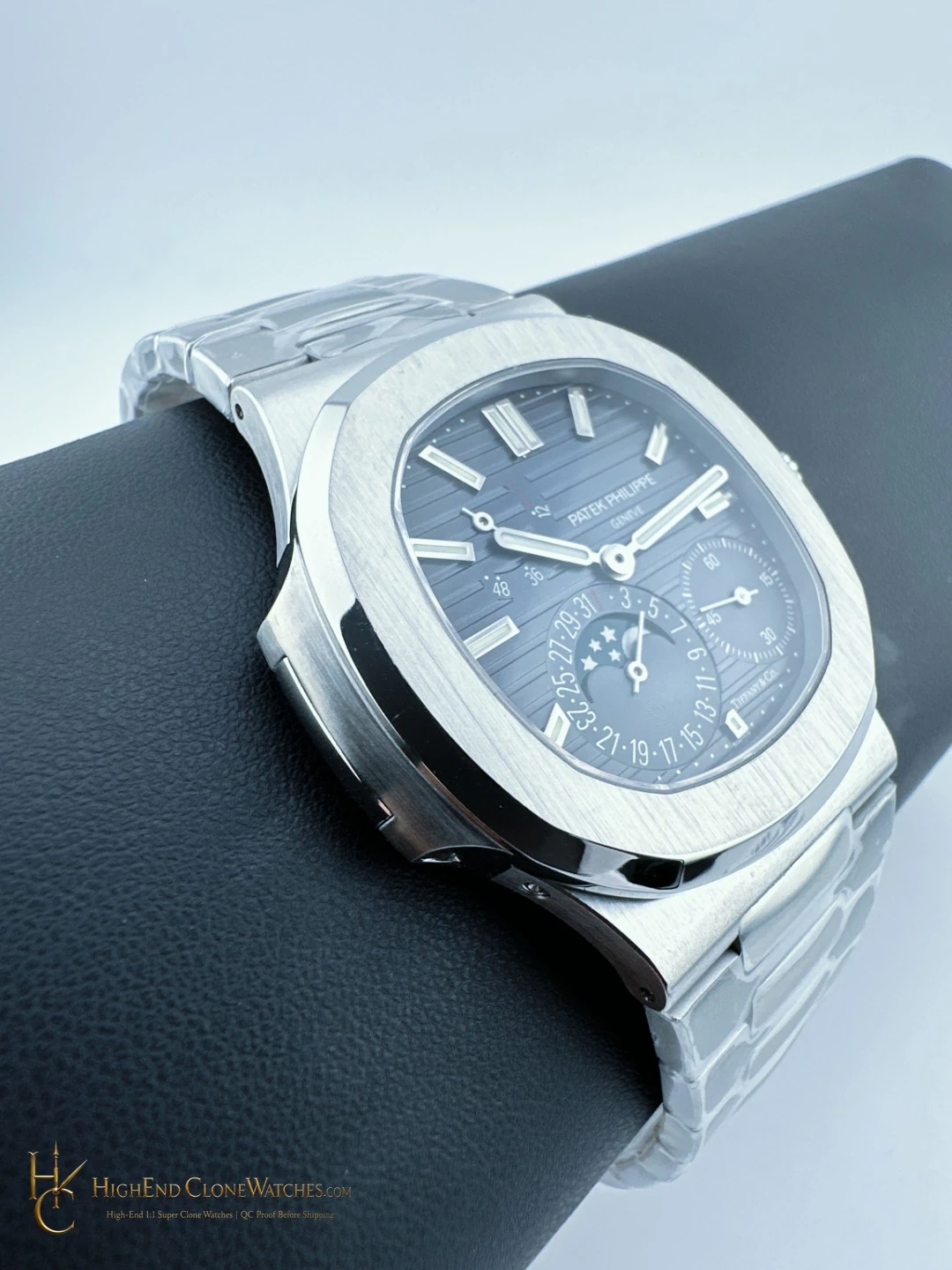
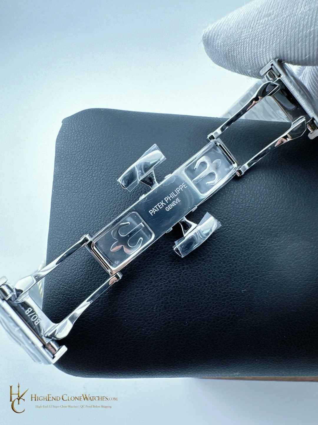
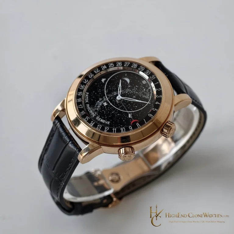
The 40.0mm stainless-steel case uses brushed surfaces with polished chamfers, and the integrated bracelet continues that geometry. Here the V4 double-safety push-button folding clasp is part of the appeal: it gives the closure a more deliberate presence than the extension clasp on the Morandi sibling. The front and underside views should be considered together.
Compare the Morandi blue-grey variant
The Patek Philippe Nautilus 5712/1A-001 40mm with Morandi blue-grey dial and 2022-plus push-button extension clasp is the direct alternative. It softens the color contrast and makes the bracelet hardware less assertive. Choose the dark blue-black version when the dial needs to lead and the closure should feel substantial; choose Morandi blue-grey when a quieter steel presentation is the better fit.
Gradient and clasp QC
QC should begin with the dial: the dark blue-black gradient should transition evenly around the moon-phase layout, with no distracting break in the visual field. Angled images should show the brushed case and polished chamfers meeting cleanly. Finally, check that the integrated bracelet is centered and that the V4 double-safety push-button folding clasp closes symmetrically, with both safety actions seated properly.
That sequence keeps the watch distinct from the Morandi version. Contrast establishes the identity; clasp symmetry confirms that the selected hardware matches the intended configuration.
Contrast is the point of the dark dial
The dark blue-black gradient gives this 5712/1A-001 a decisive front view. It sets a deep field behind the asymmetric moon-phase layout, so the display remains visible as a coherent design rather than blending into the case. The 40.0mm format keeps the outline controlled, while the brushed stainless-steel surfaces and polished chamfers provide the edge contrast that stops the dial from making the watch feel flat.
The V4 double-safety push-button folding clasp adds another reason to inspect the underside. The bracelet should approach the clasp without a sideways pull, both safety actions should seat evenly, and the closure should remain centered when the wrist is flexed. In this configuration the clasp is not a minor hardware note: it is part of the more substantial, higher-contrast choice that separates the watch from the Morandi blue-grey alternative.
When deeper contrast serves the collection
Choose the dark blue-black version when the moon-phase layout should be noticed immediately and the steel watch needs a stronger evening presence. The Morandi blue-grey 5712/1A-001 is the useful alternative for a softer palette and a 2022-plus push-button extension clasp. It will blend more easily into a low-contrast steel rotation; this version creates a clearer focal point. Review the gradient transition, case chamfers and closure symmetry in that order so the final choice reflects the exact configuration rather than the shared reference alone.
Questions to settle before ordering
Why choose the dark blue-black 5712/1A-001?
The deeper gradient creates stronger contrast around the asymmetric moon-phase layout while the V4 double-safety folding clasp adds a firmer hardware presence.
Which same-reference version is worth comparing?
The Morandi blue-grey 5712/1A-001 uses a 2022-plus push-button extension clasp and gives a softer, lower-contrast steel presentation.
What should QC focus on?
Check the gradient transition, moon-phase alignment, case chamfers, bracelet centering and double-safety clasp closure.
Review the exact configuration before it leaves.
Use model-specific QC proof to confirm the visible details and stated functions that informed your choice.
QC proof before dispatch