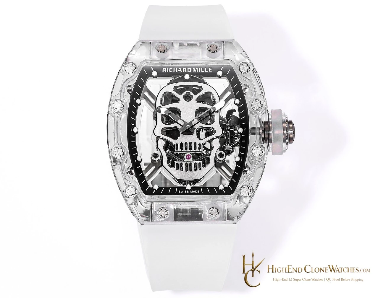
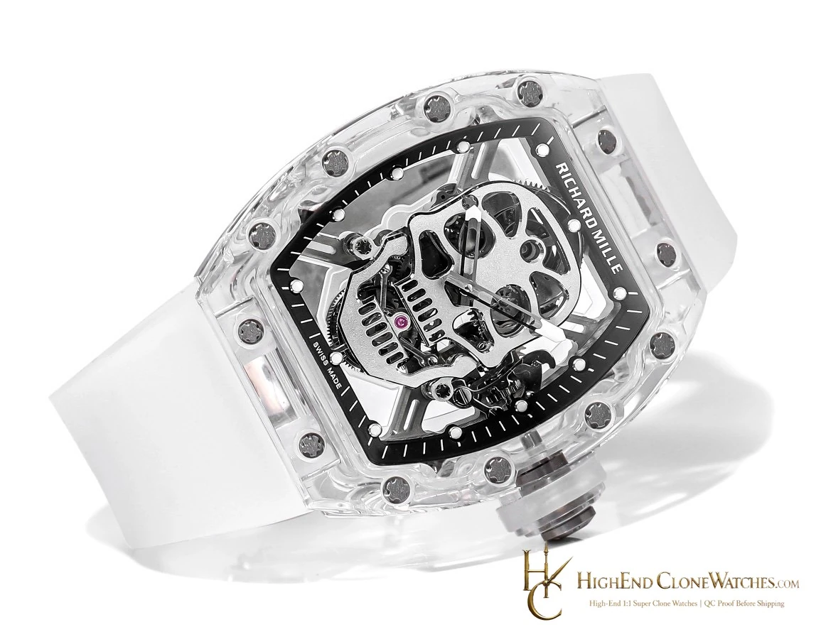
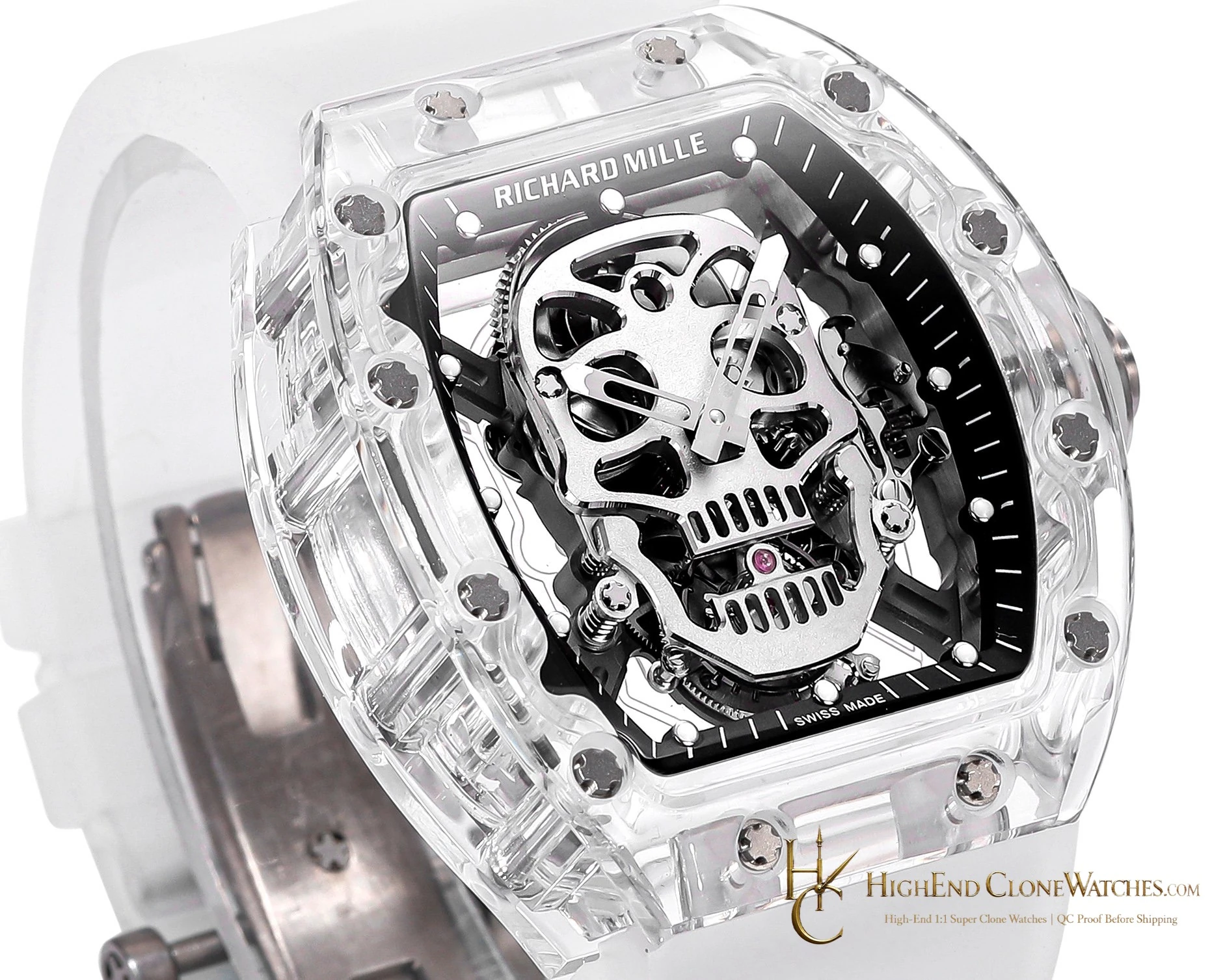
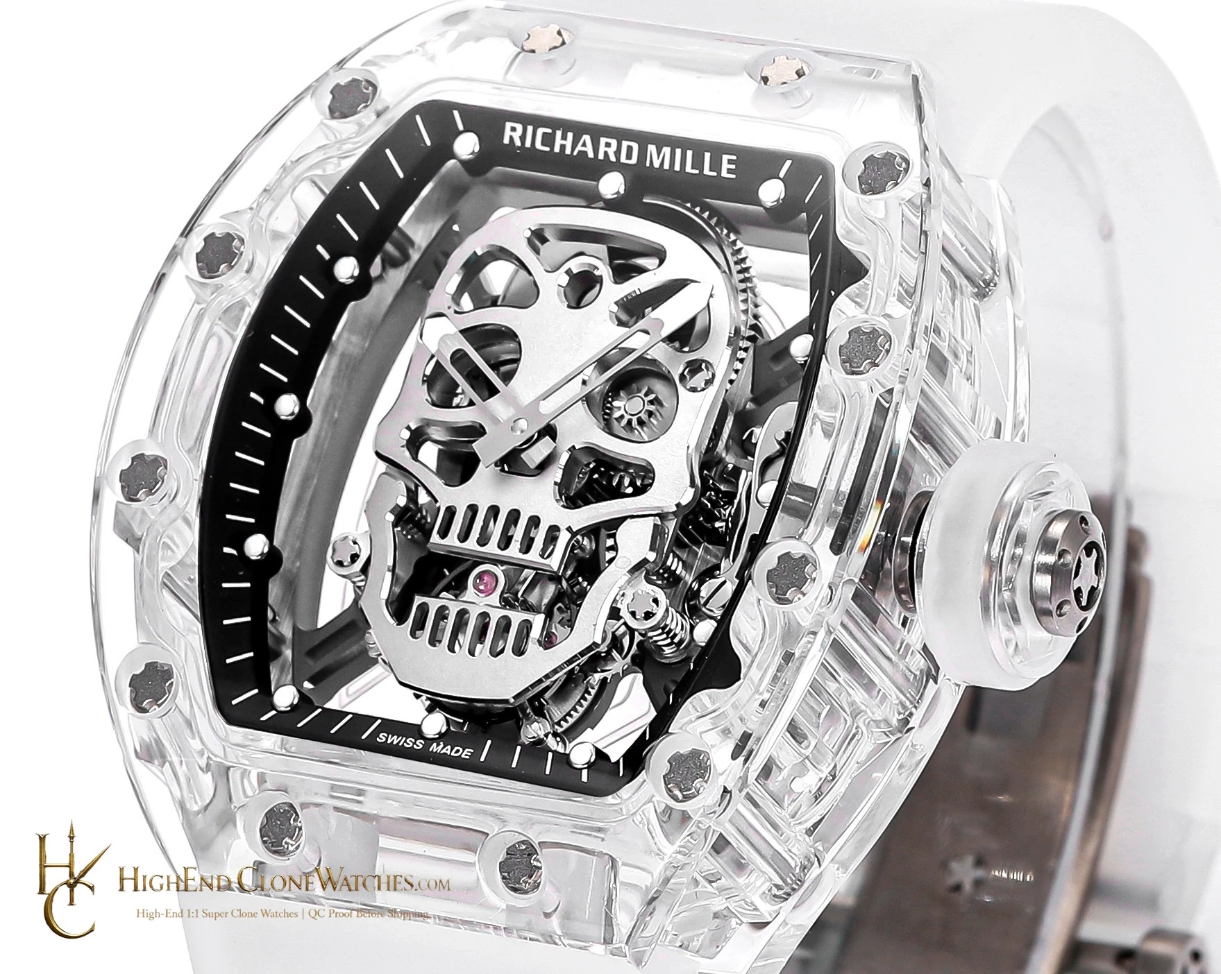
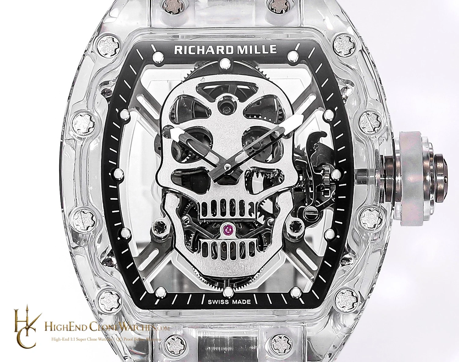
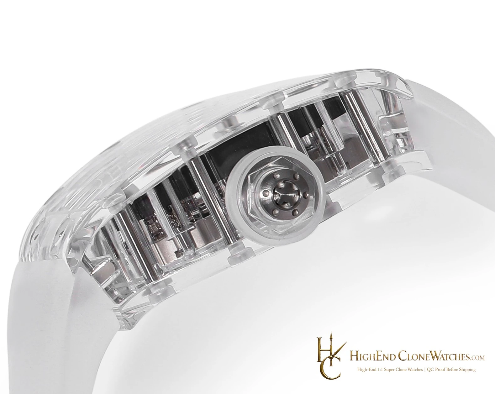
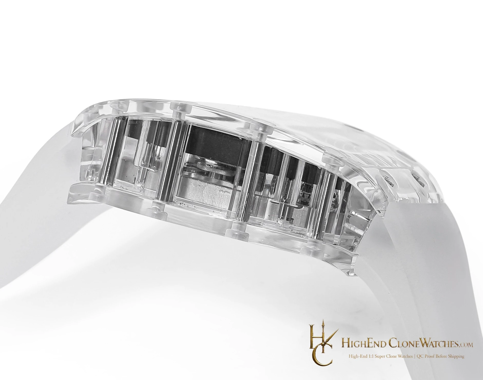
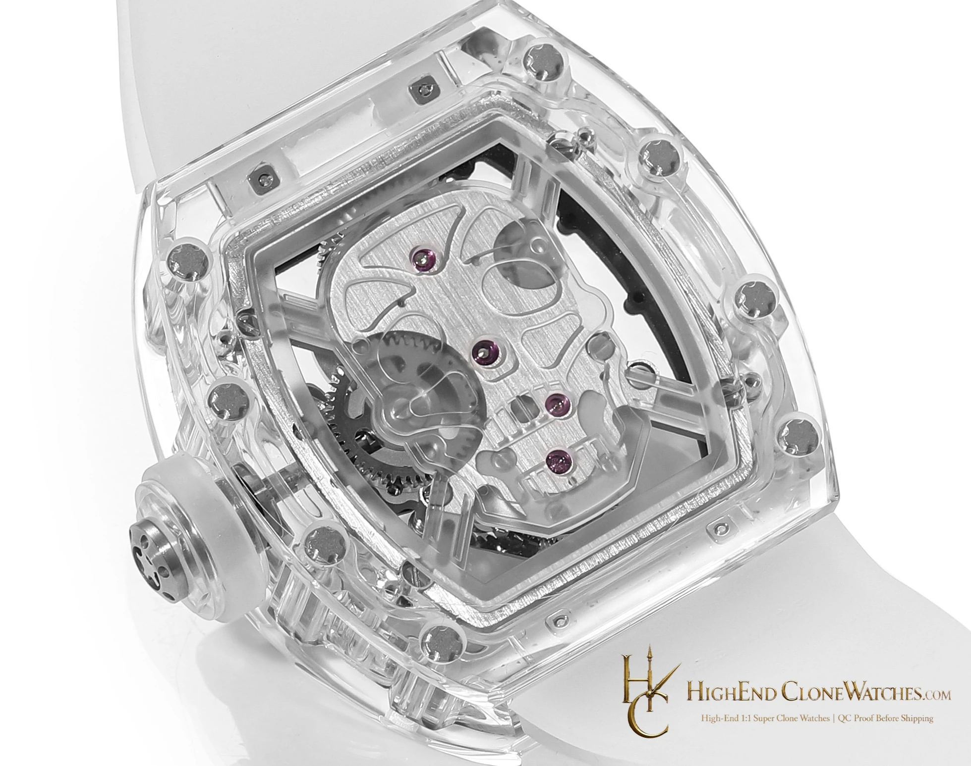
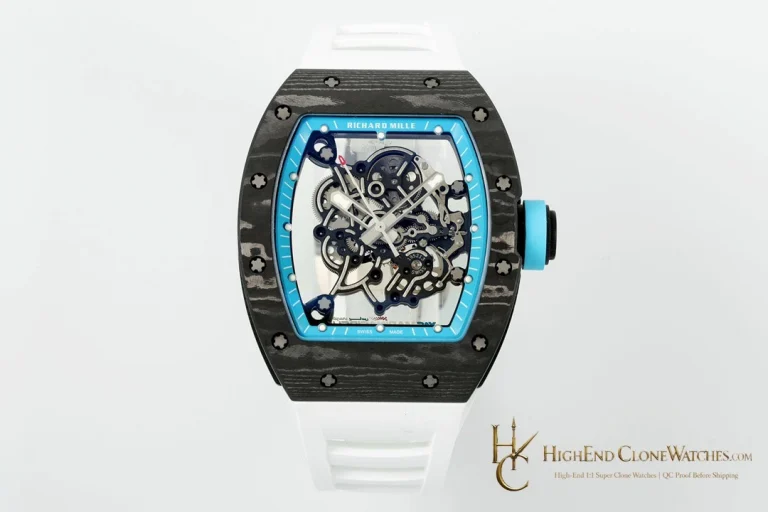
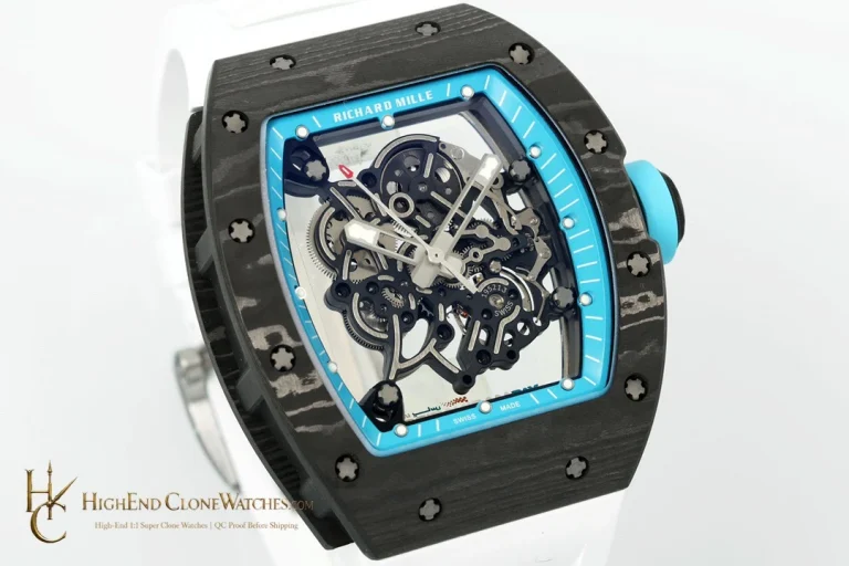
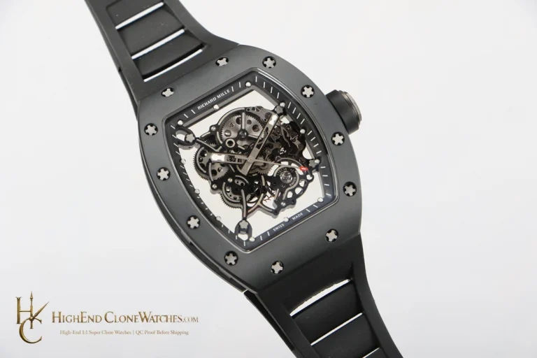
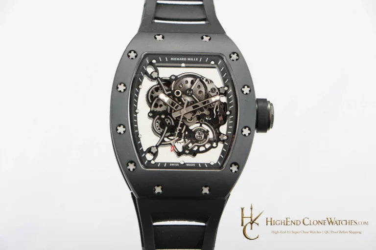
This version keeps the skull design visually direct and transparent. The blue configuration makes color part of the identity instead. In both cases, the quality of the decision depends on close views of the openworked front and the strap integration.
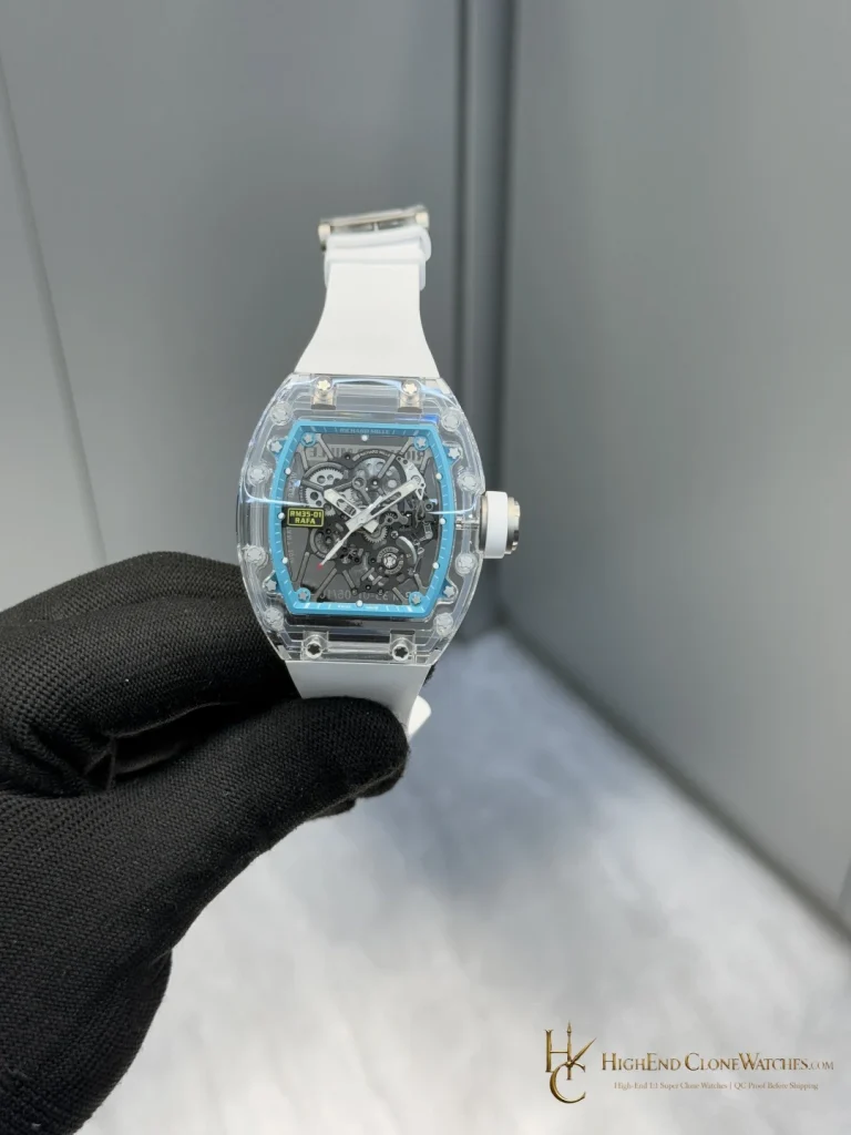
The clear-transparent presentation leaves the skull geometry visually direct. In the gallery, there is no blue layer competing with the openworked dial, so the eye moves from the skull to the layered display and then out to the white strap. The result is more neutral than the blue RM 52 while remaining unmistakably graphic.
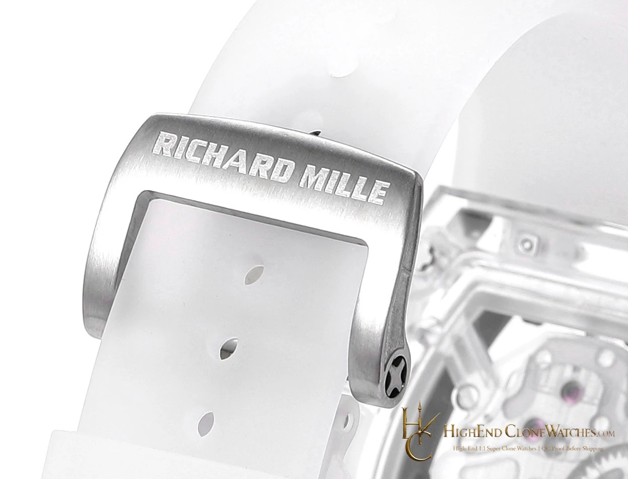
Request a centered front photograph for skull placement and hand alignment, an angled view that keeps the clear transparent surfaces readable, and close images of both white-strap attachments. The openworked dial should remain visually ordered behind the skull. Show the manual tourbillon presentation as it appears in this configuration, keeping the review tied to what the buyer can inspect.
The blue RM 52 is the nearby alternative when the skull presentation should carry a cooler color identity. This clear version lets the transparent treatment lead while the white strap provides the visible contrast at the wrist.