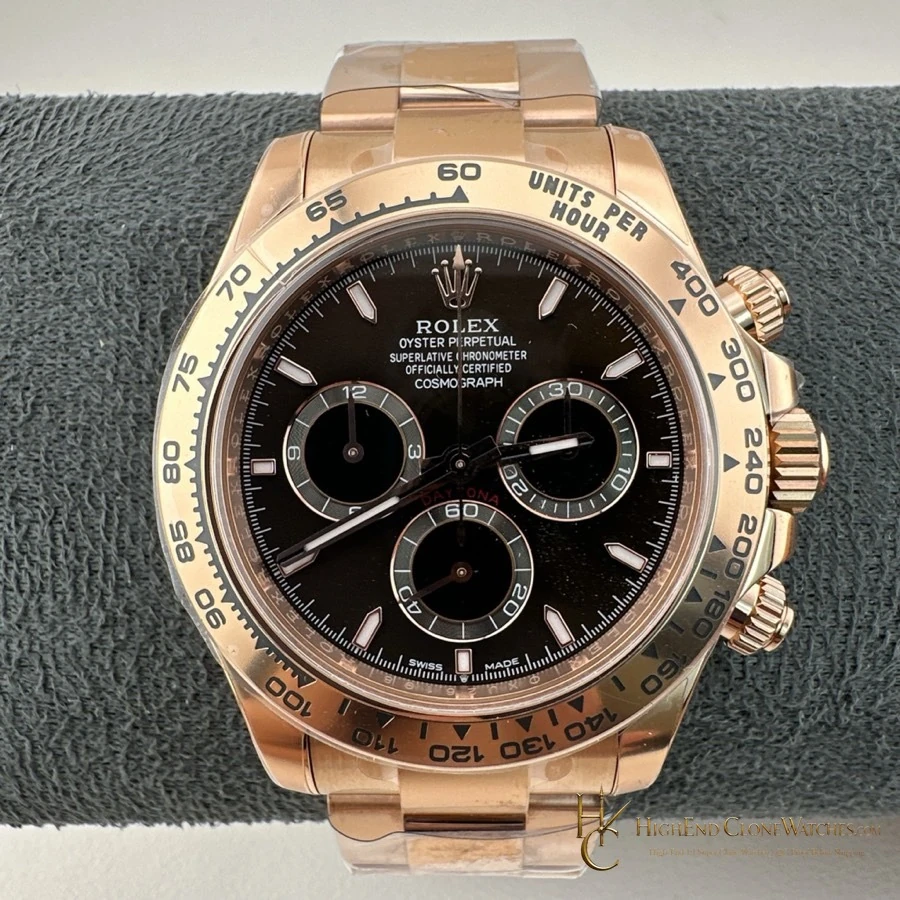
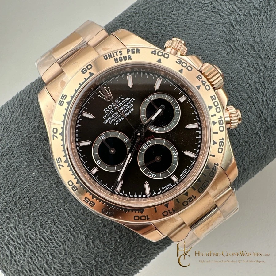
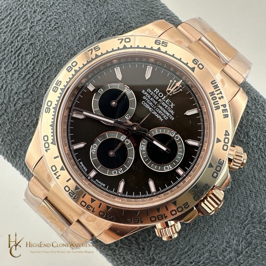
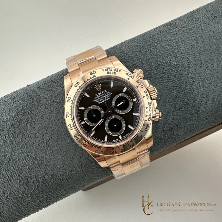
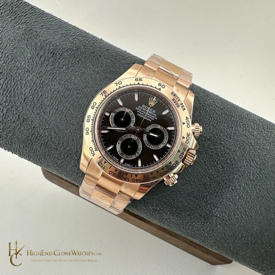
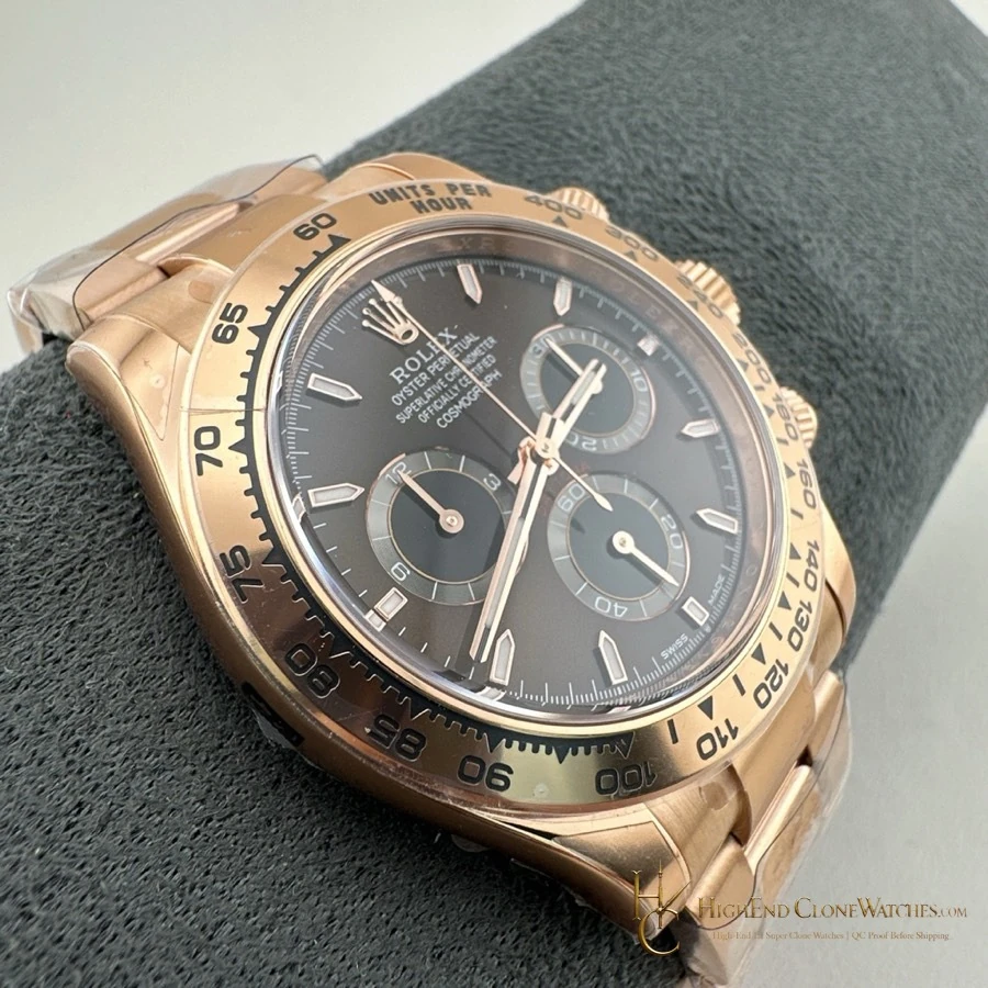
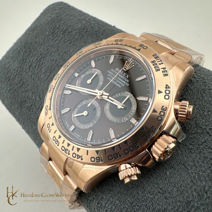
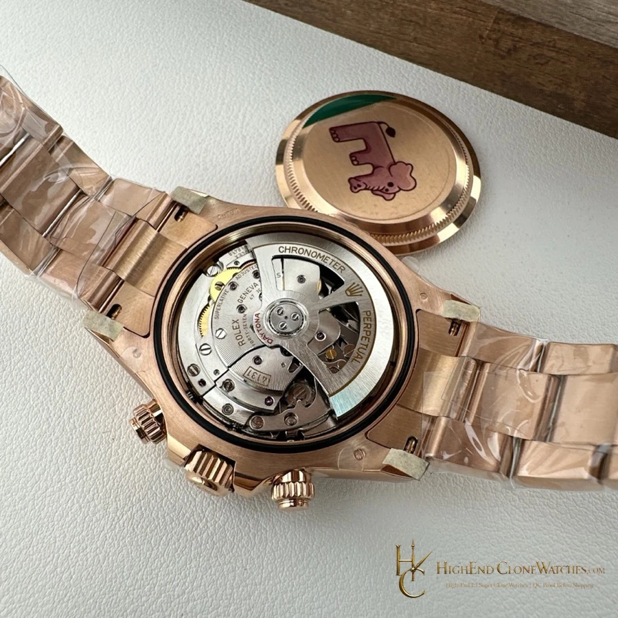
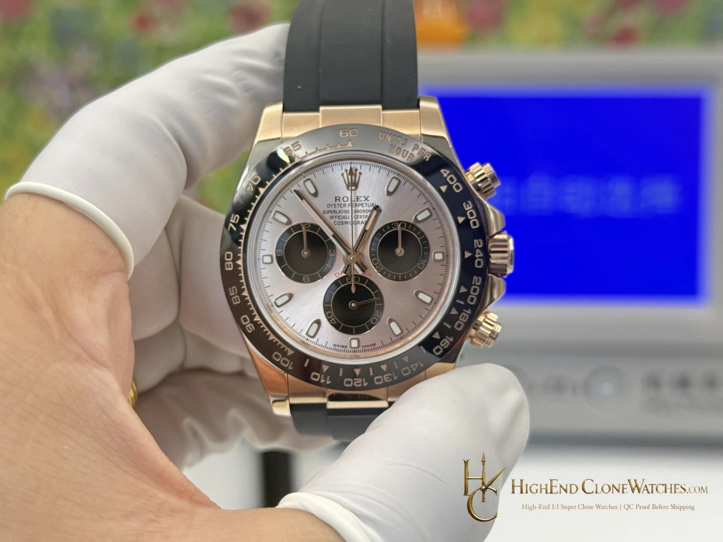
For a direct comparison, see the older M116505-0013 chocolate-dial configuration. Its 4130-era architecture and slightly thicker profile create a more traditional wearing impression; the M126505-0005 is the cleaner choice when the newer 4131 layout and contemporary bracelet feel are the priority.
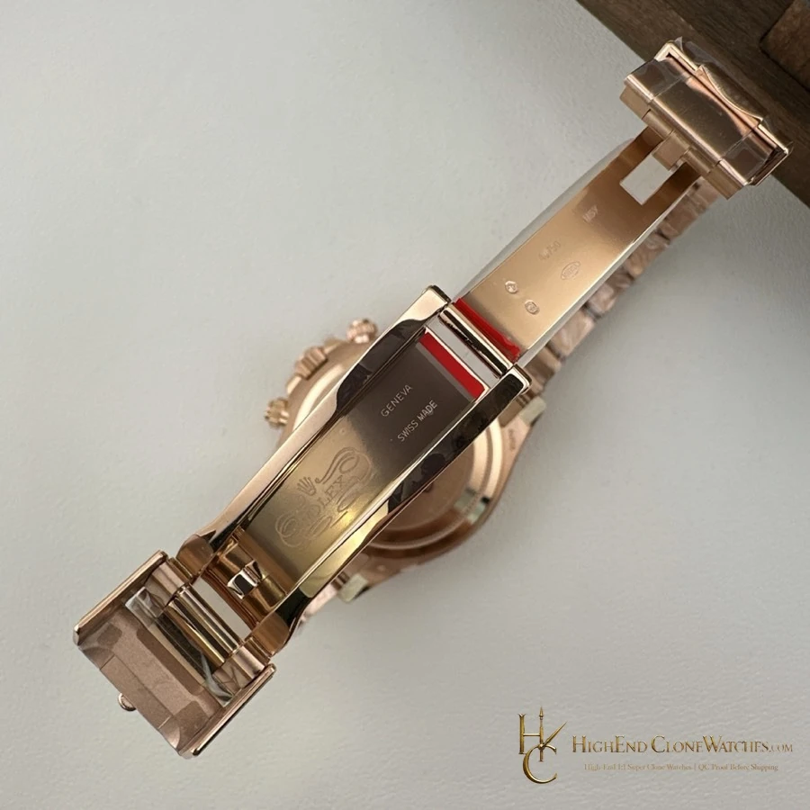
The difference is useful beyond the specification sheet: this version carries its warmth in a tighter, more current outline, which makes it easy to wear with business clothing as well as a relaxed wardrobe. The bracelet retains a strong visual role, so it is not the right reference for a buyer who prefers the reduced profile of Oysterflex.
The chocolate surface is at its best in natural daylight, where the brown moves gently instead of reading as a flat dark disc. Rose-gold accents pick up that warmth around the bezel and bracelet, but the black registers keep the chronograph practical. The Easylink bracelet makes the watch easier to live with across changing temperatures, and the full Oyster construction gives the case a stable, deliberate stance that a softer strap would not provide.