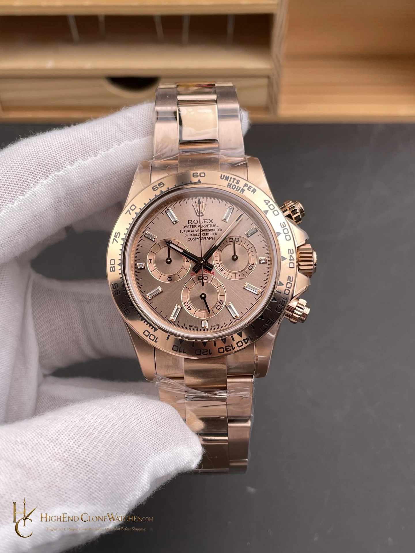
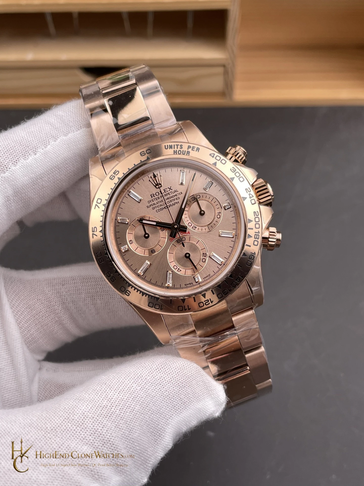
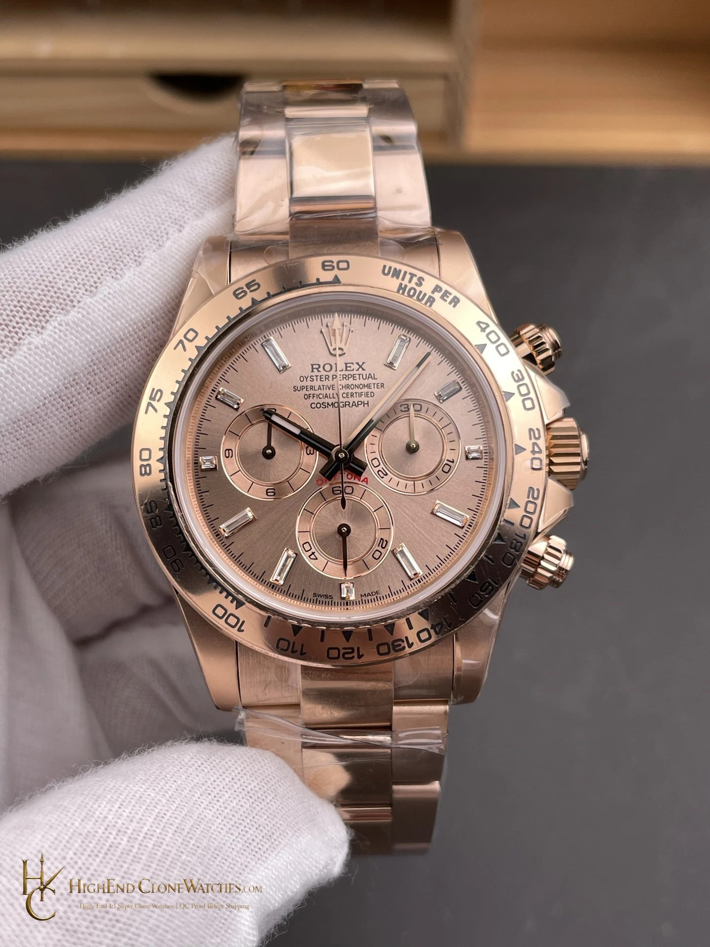
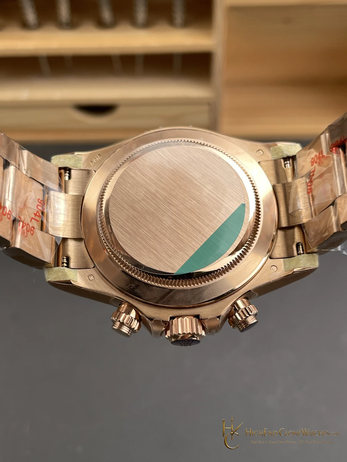
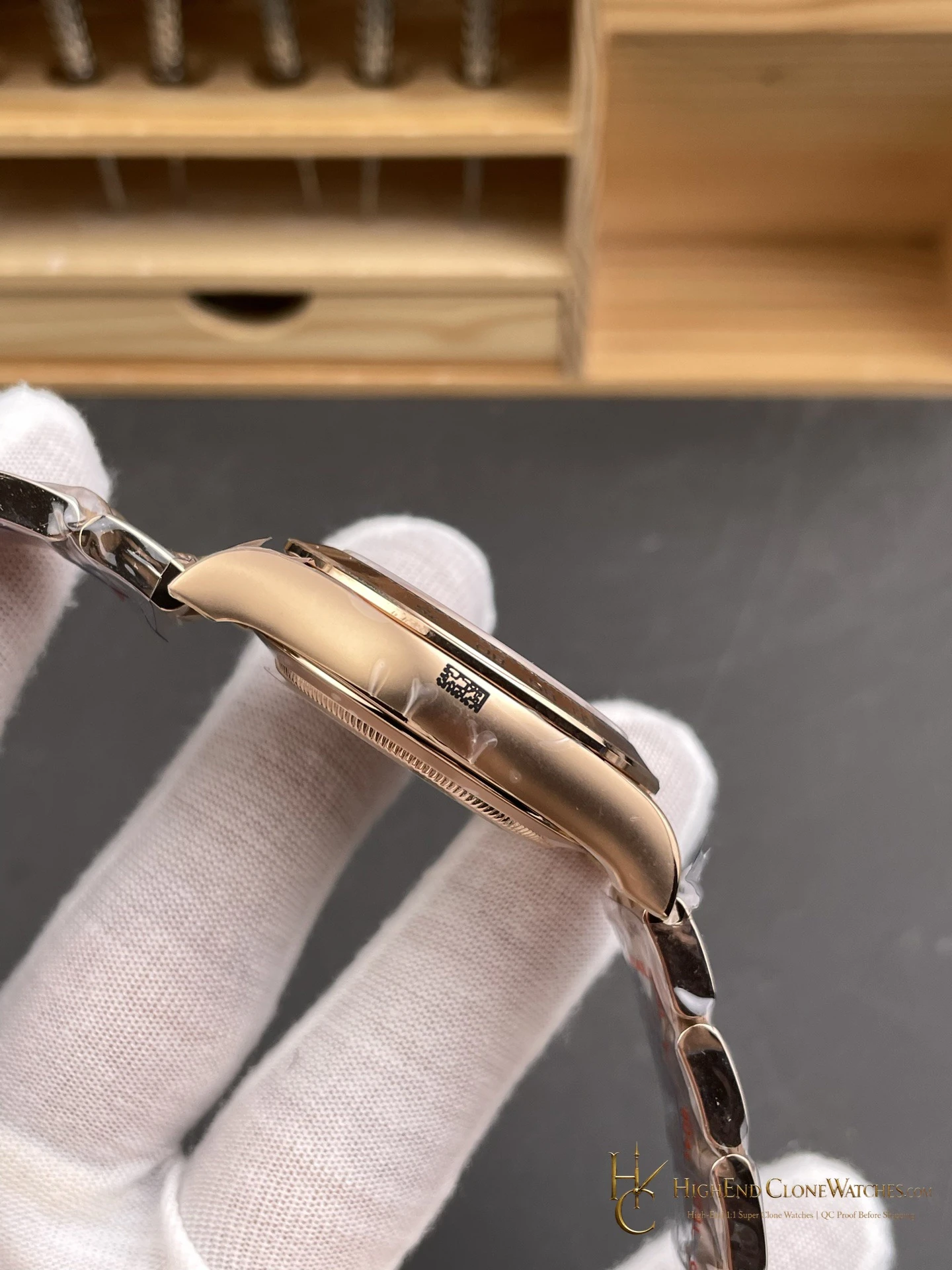
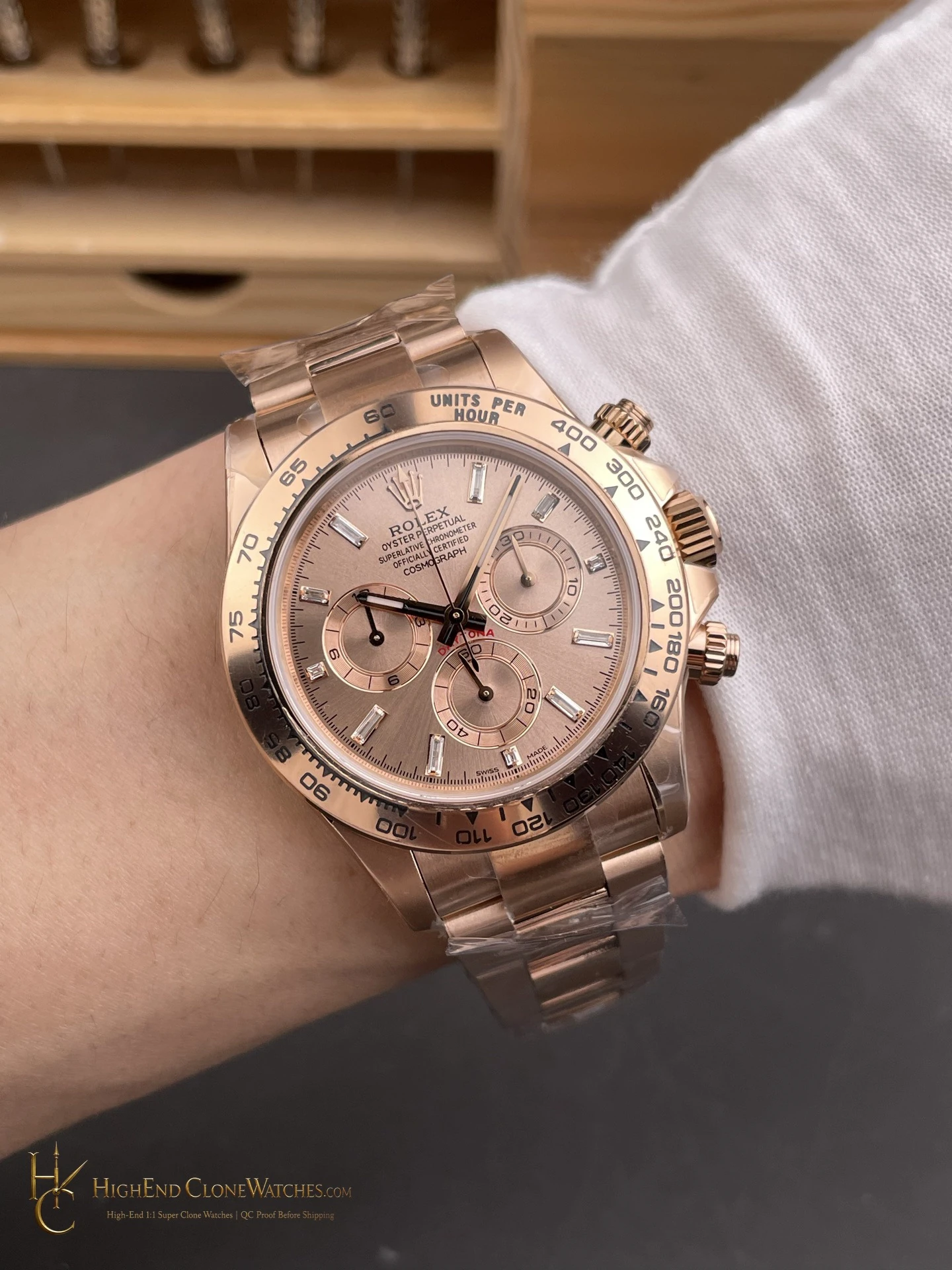
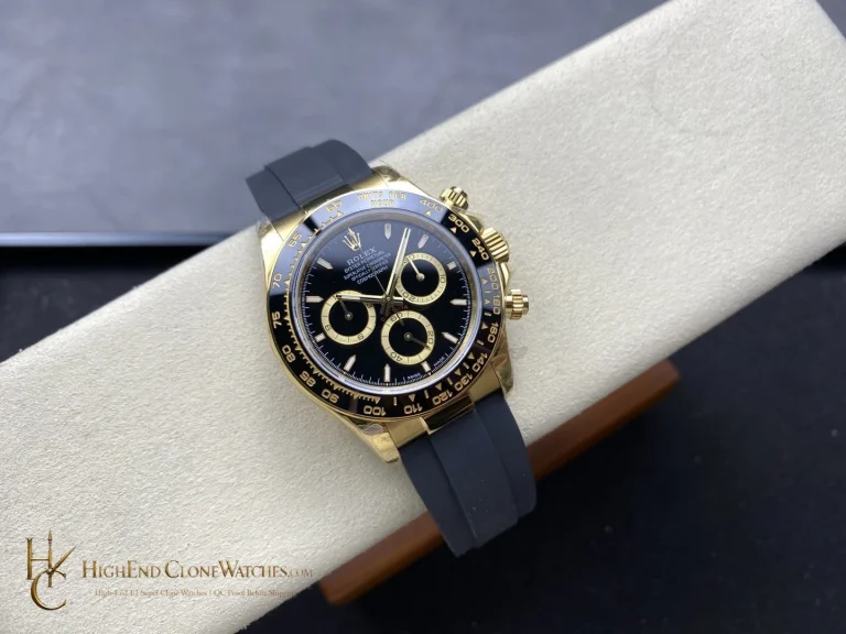
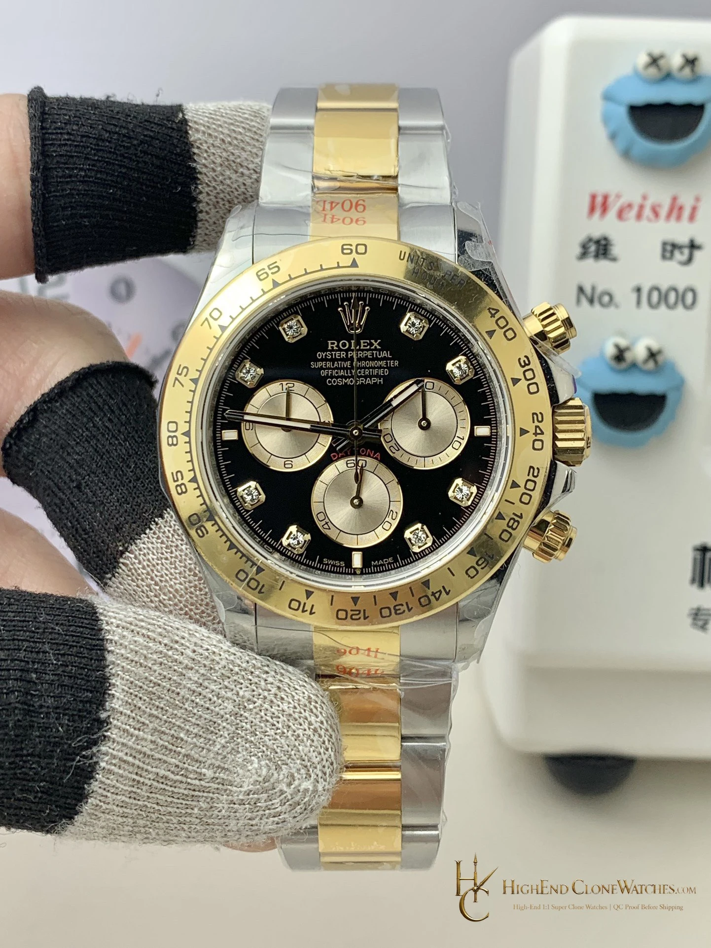
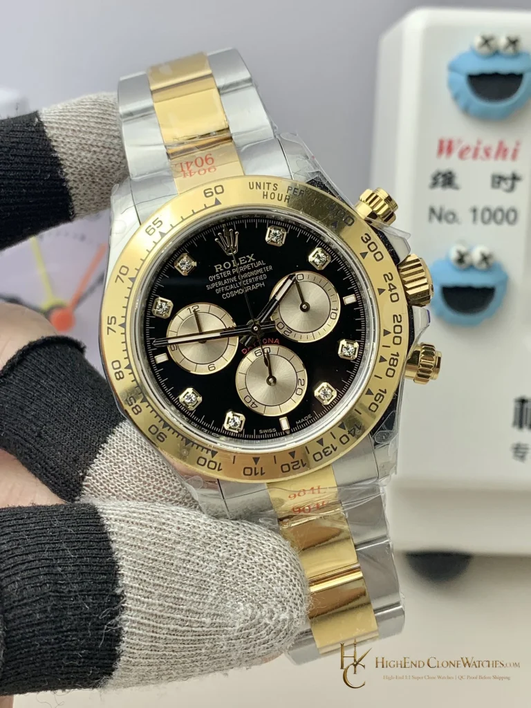
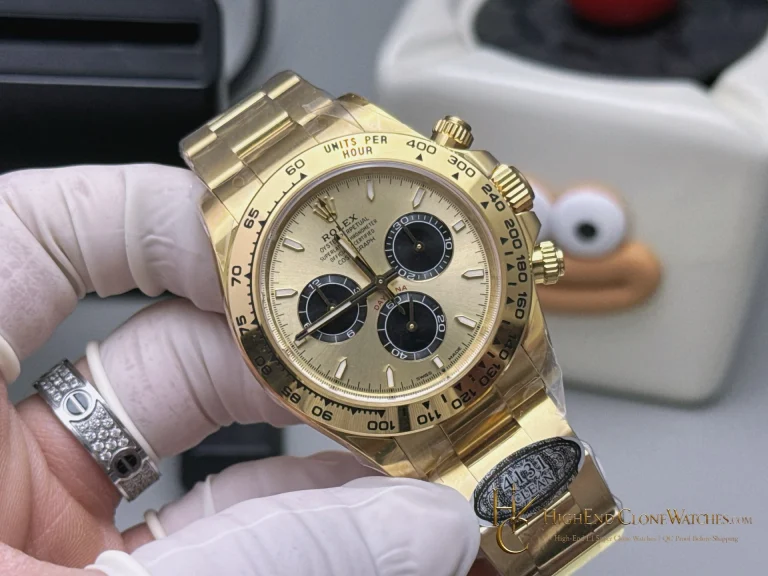
For a quieter rose-gold choice, compare the darker M116505-0013 chocolate-dial Daytona. Its dial lowers the contrast and lets the case finish lead; the M116505-0017 suits a collector who wants the dial itself to be the statement.
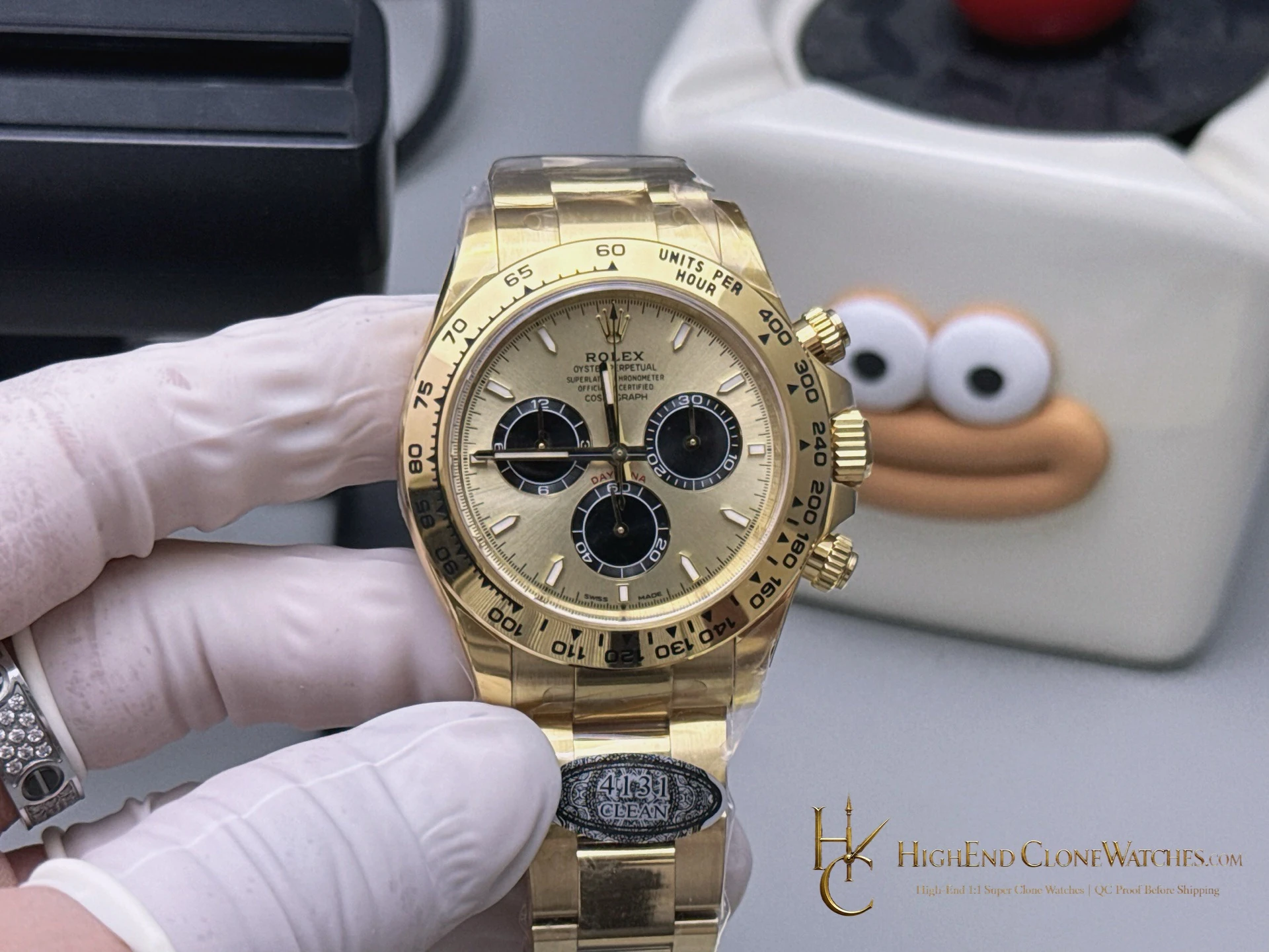
This brighter version has more presence in a room and works naturally with black, navy or grey clothing, where the rose-gold case and gold face carry the outfit without another colored accessory. The tradeoff is direct: it is less discreet, but much more immediate.
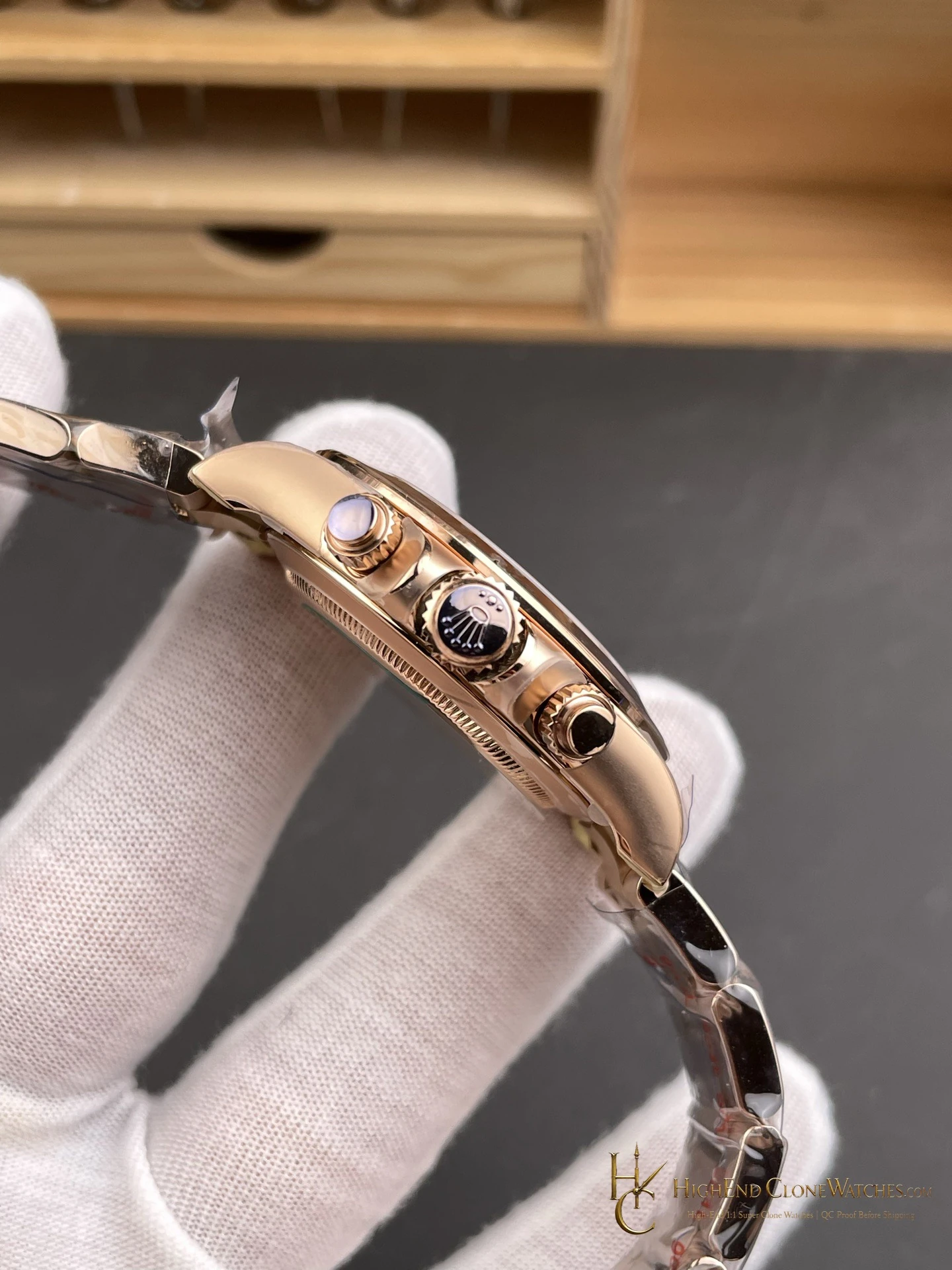
The gold face changes the balance of the watch before the case is even noticed. Black registers prevent the warm field from becoming difficult to read, while the rose-gold bracelet repeats the dial tone and keeps the configuration coherent. The 12.2mm case has more wrist presence than the newer thin-profile references, which is part of the appeal for a collector who likes a substantial chronograph and does not need the most discreet option.
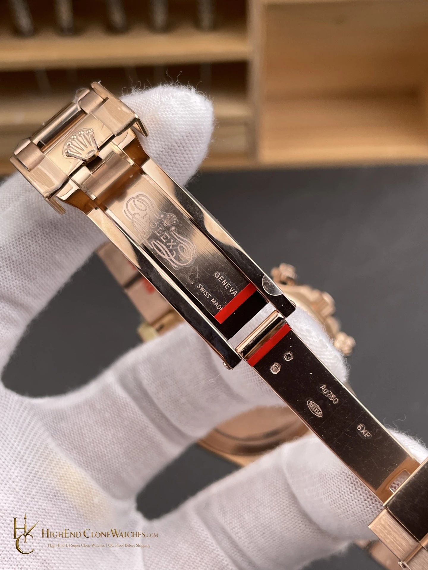
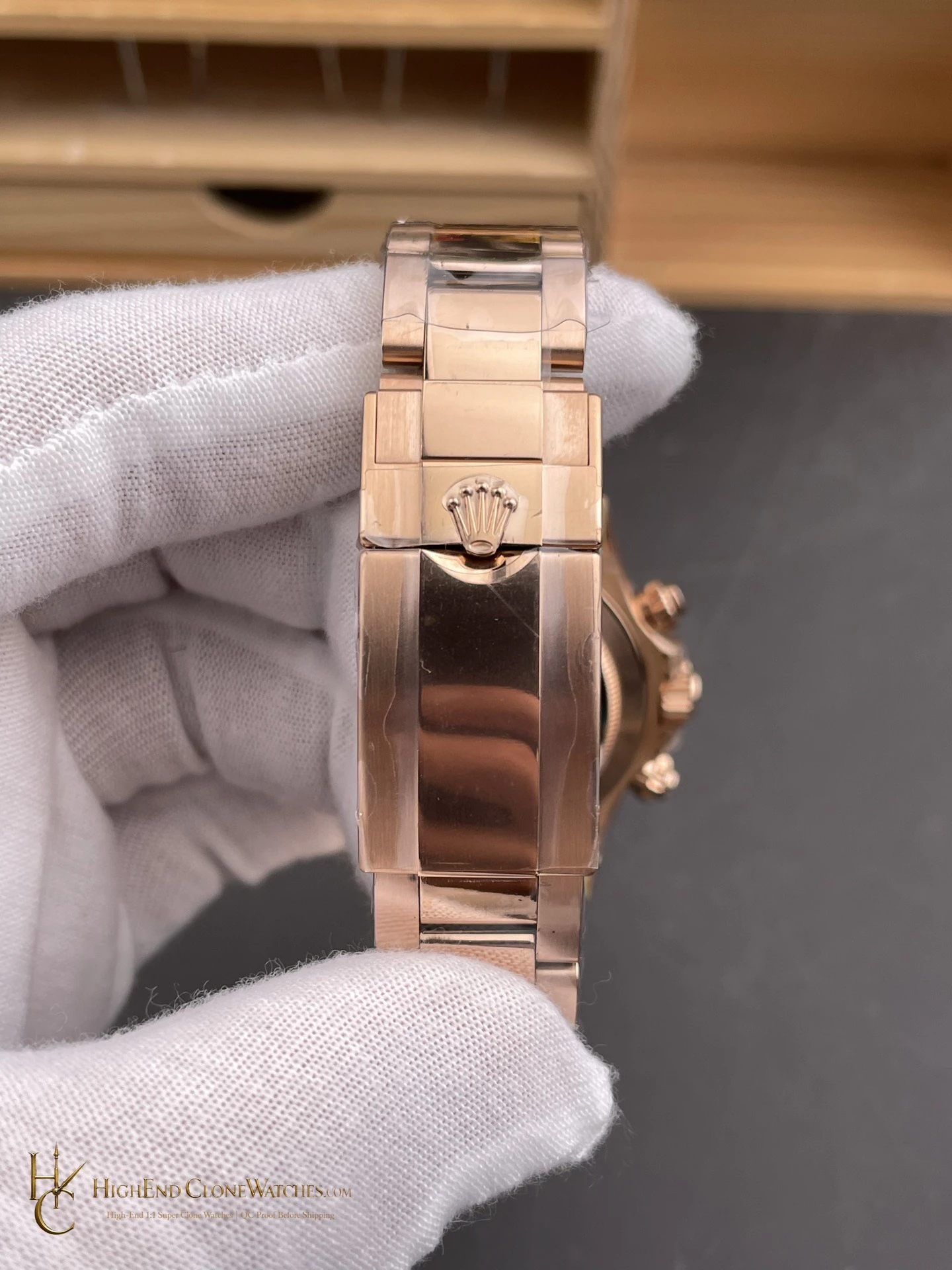
The full Oyster bracelet is important here because it carries the rose-gold tone through the whole watch. A strap version would make the dial feel more isolated; the bracelet makes the M116505-0017 read as a complete precious-metal Daytona. That is the core buying reason for this configuration.