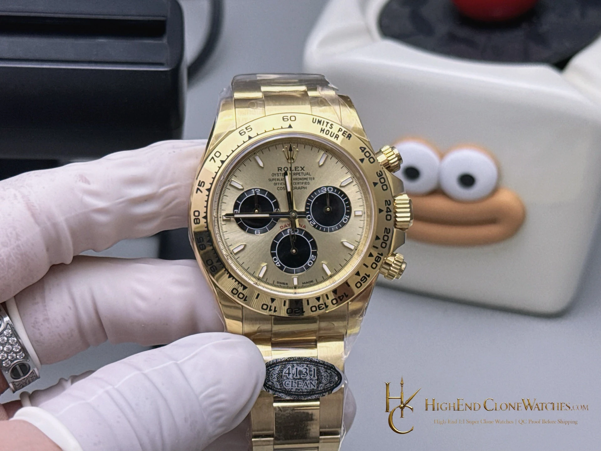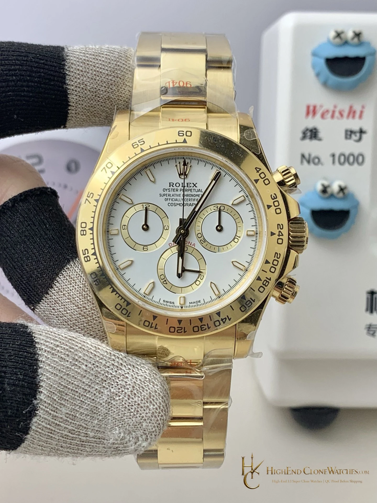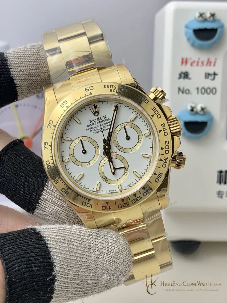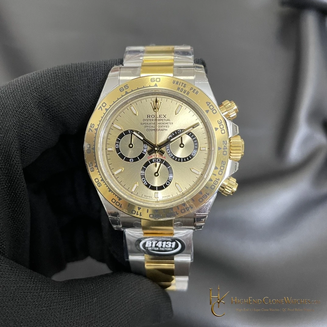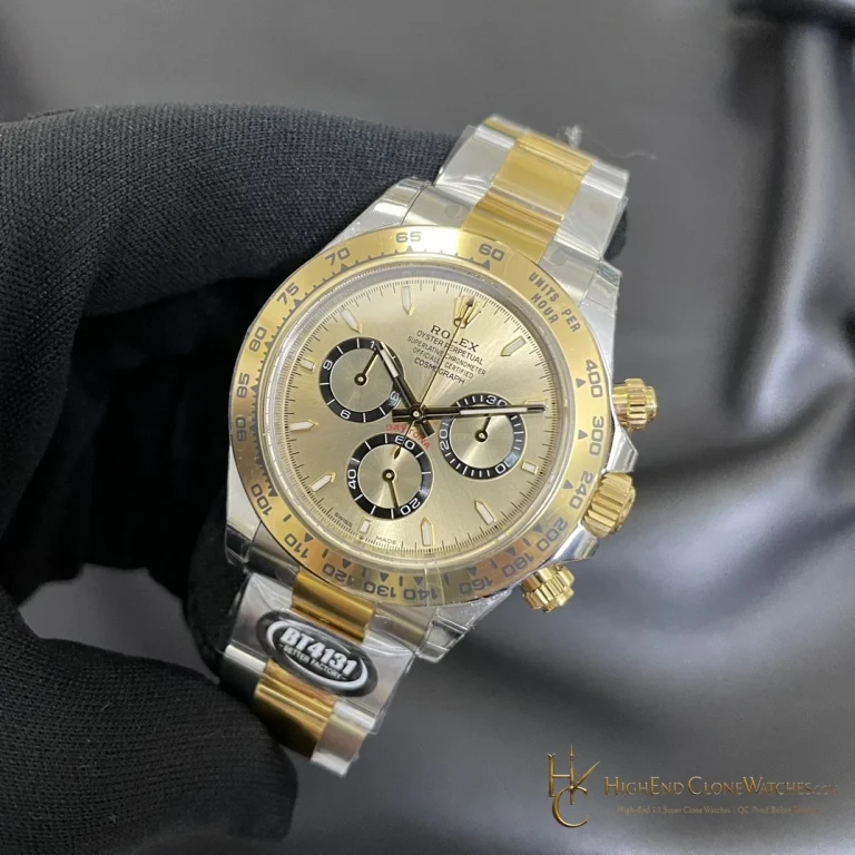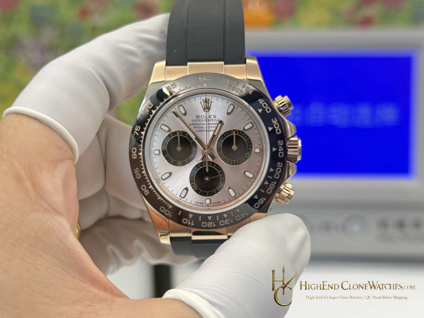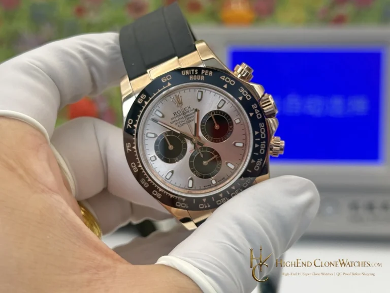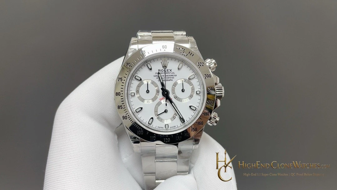
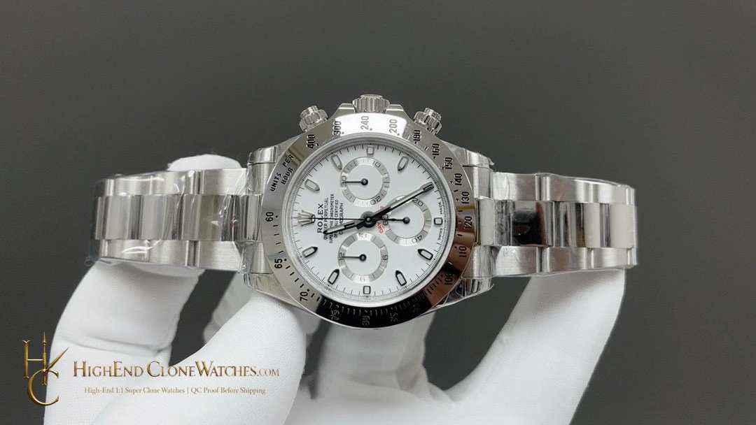
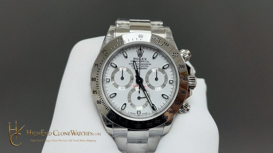
This version is for buyers who want the Daytona layout to do the talking. The white dial and black registers are recognizable without being loud, and the steel-tone Oyster bracelet keeps the watch adaptable. It is the sensible pick when one Daytona must cover the widest range of clothing and settings.
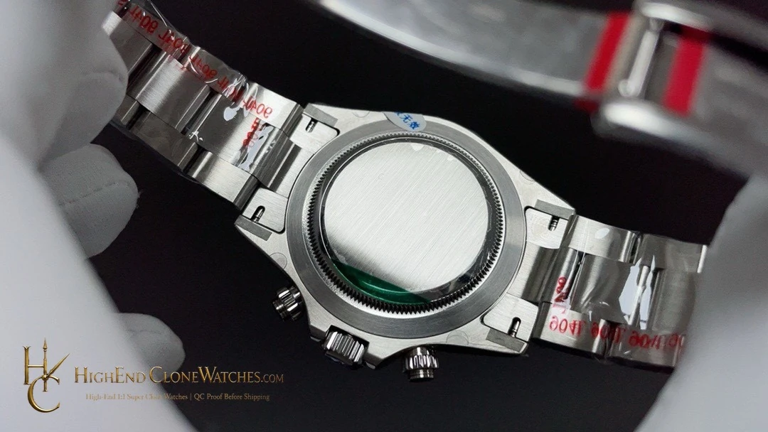
Its value is the separation between dial contrast and exterior tone: the white-and-black face remains visually direct, while the steel tachymeter and bracelet do not compete for attention. Buyers deciding between this reference and the yellow-gold-tone alternative should start with that tradeoff, then use the gallery to judge which wrist presence they prefer. For QC, include a direct dial shot, a bezel close-up, a case-to-first-link angle, and a clasp image so the clean, cooler presentation can be checked as a whole.
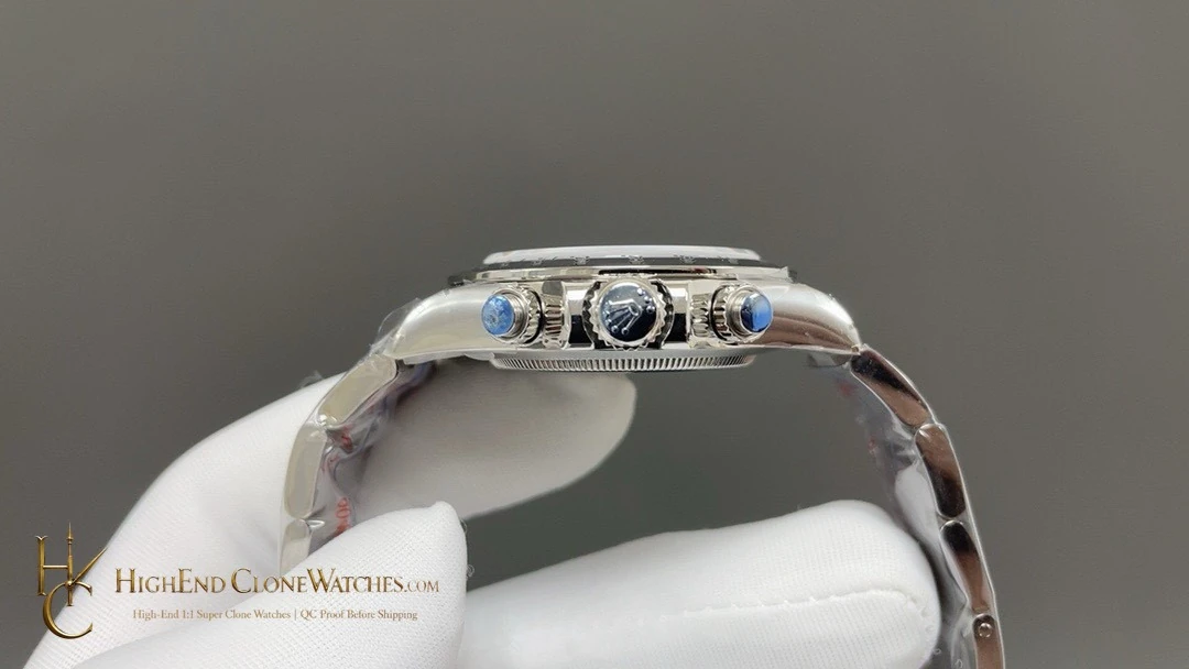
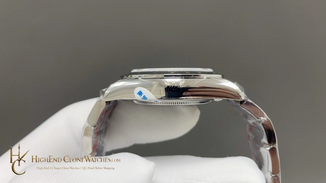
For a buyer building one versatile chronograph option, the steel-tone exterior is the important practical distinction. It lets the white dial and black sub-dials remain the center of attention instead of asking the bracelet to make the visual statement. Compare the front image with a side and clasp view before ordering: those views make it easier to assess bezel engraving, the transition into the first Oyster links, and whether the cleaner exterior gives the exact level of restraint you want.
That restraint does not mean the watch lacks definition. The white field, black registers, and engraved scale provide the visual structure, while the bracelet simply keeps the overall profile balanced.
The result is a readable chronograph with a measured, uncomplicated exterior.