

Contrast turned inward
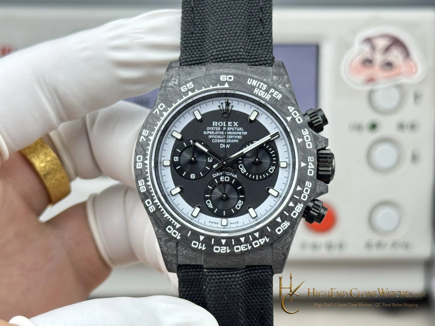
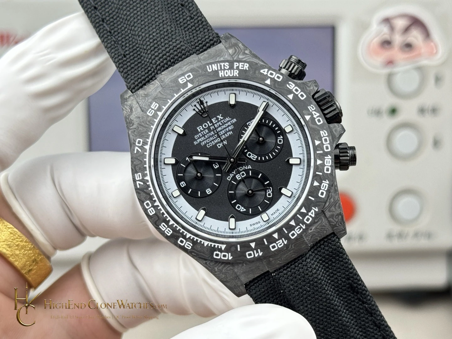
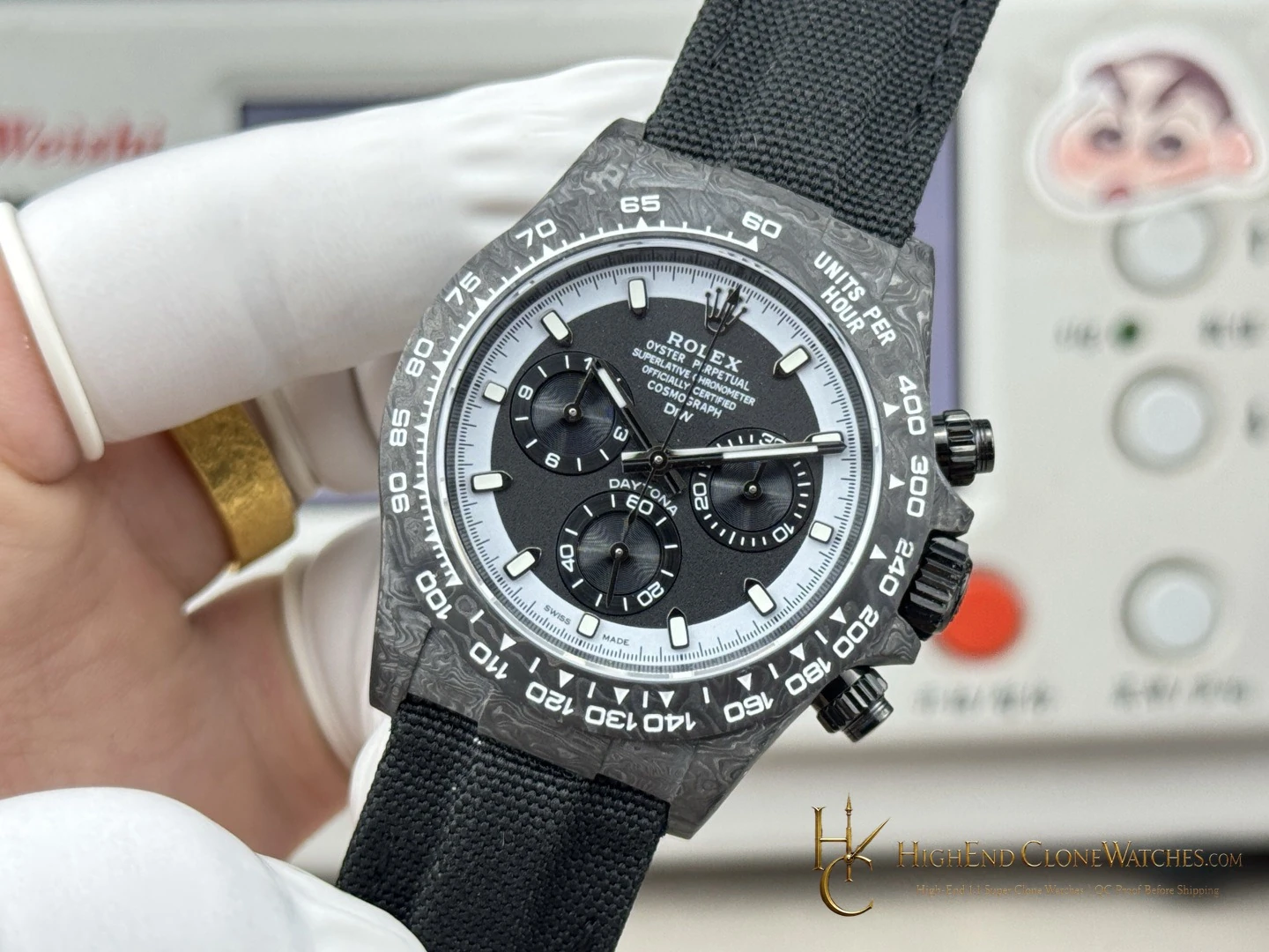
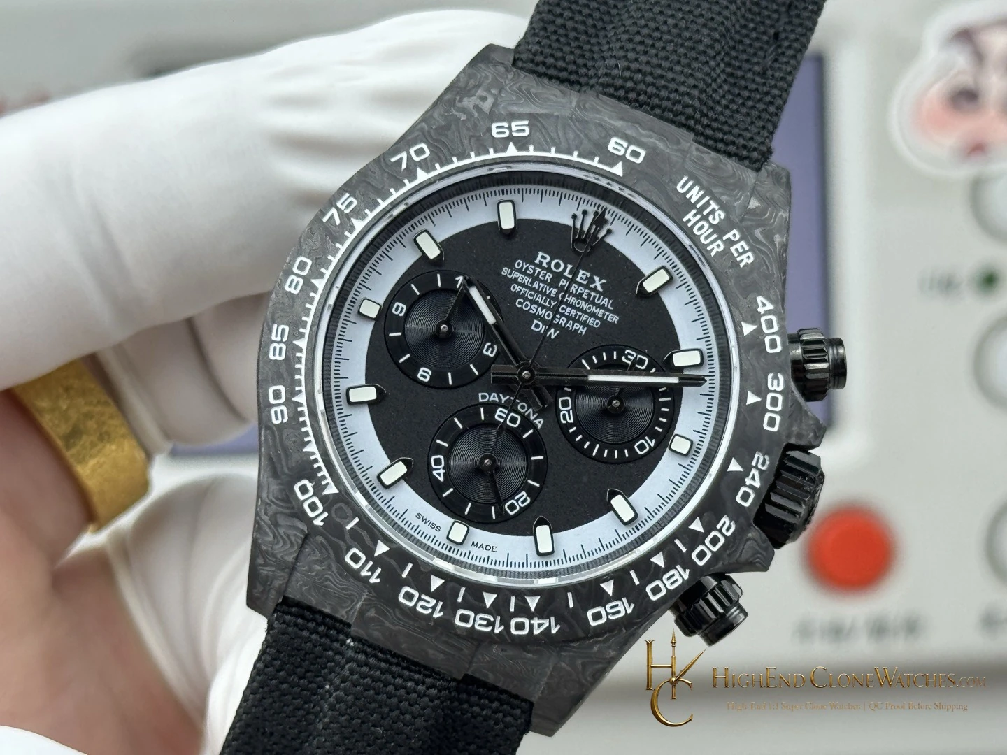
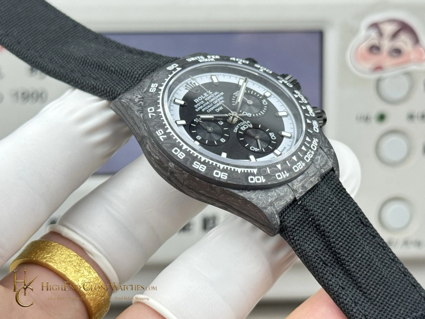
The defining choice is the reversed color placement. A dark center holds three dark registers as separate circular forms, while the pale dial ring keeps the outer minute track open and easy to follow. The result is more graphic than a light dial with dark sub-dials; it has a stronger edge and a quieter center when viewed from across a room.
The 40mm case gives that contrast a compact frame. It works well under a shirt cuff or with a tailored jacket because the dial remains legible without taking over the wrist. The visible chronograph layout stays familiar, yet the CREAM INVERT treatment gives it a different visual cadence from standard steel or cream-faced versions. The dial reversal and smaller proportion drive the decision; the 4130 movement sits beneath that visible layout.