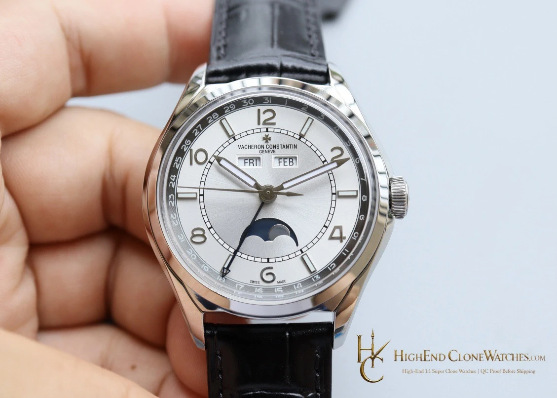
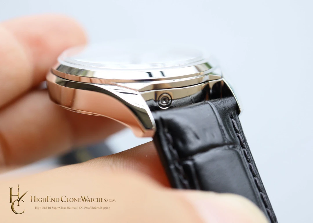
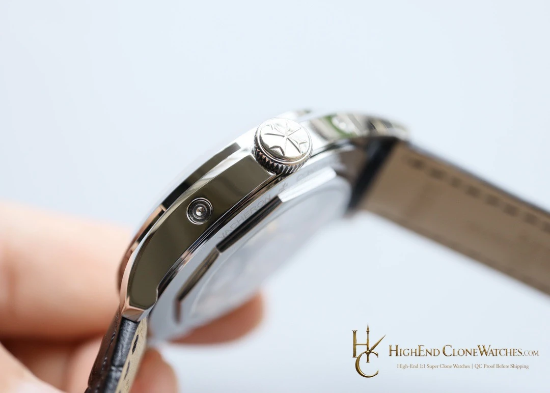
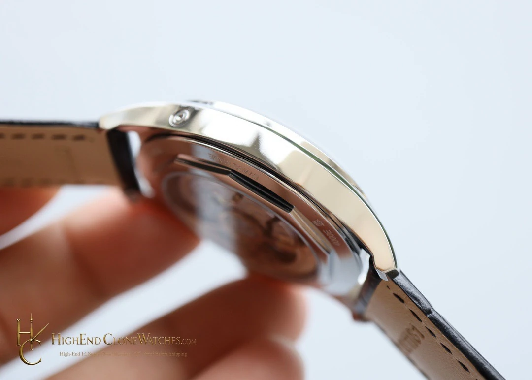
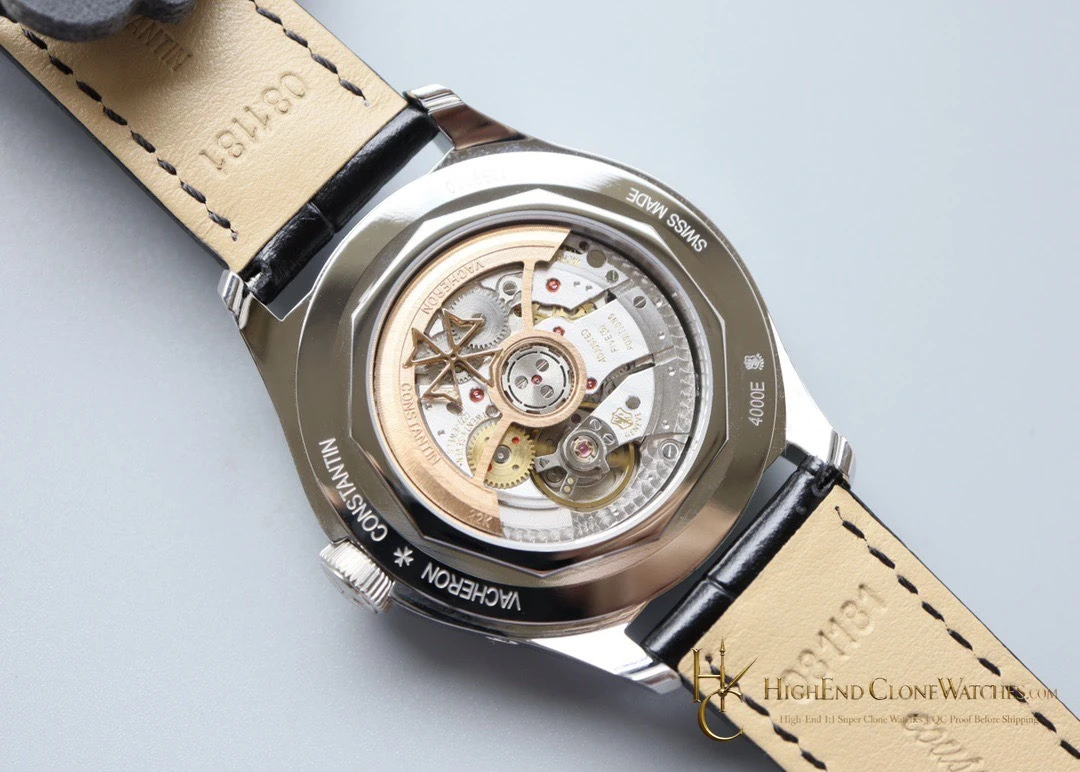
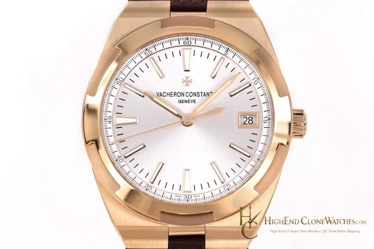
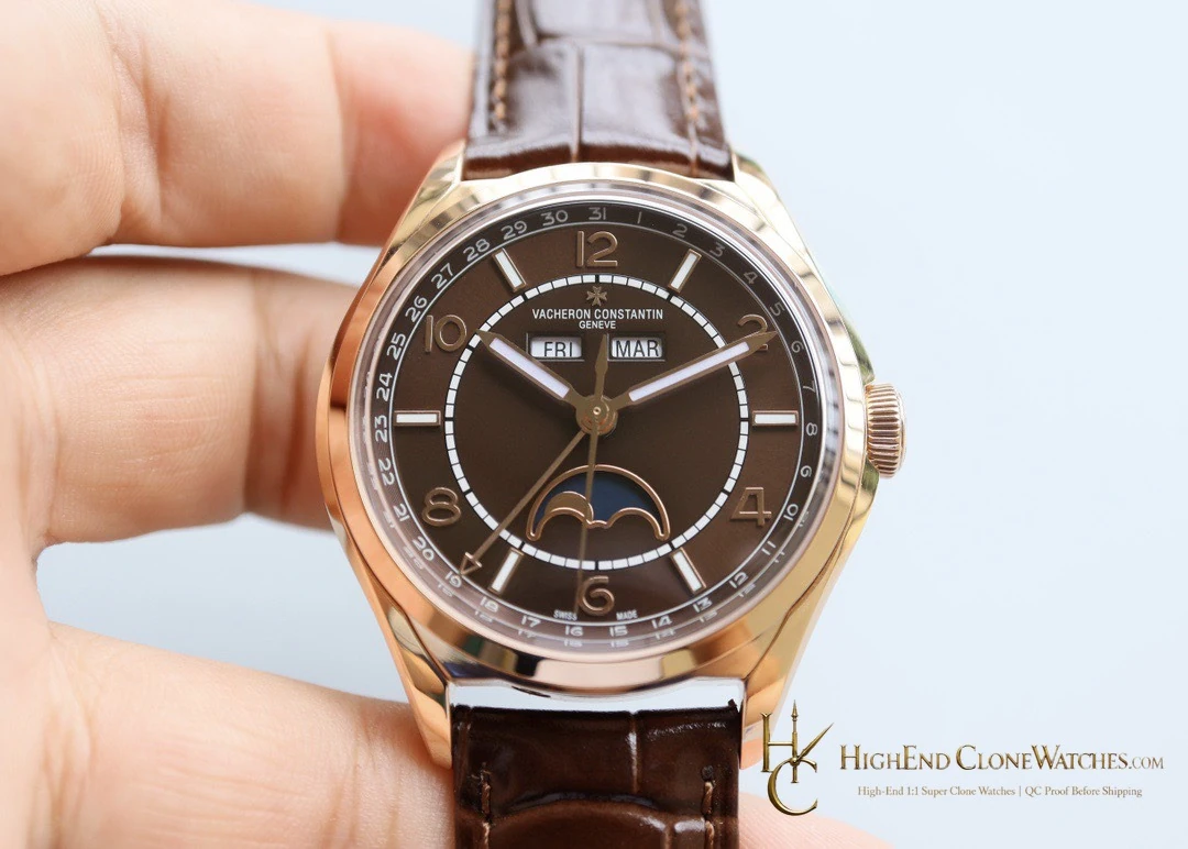
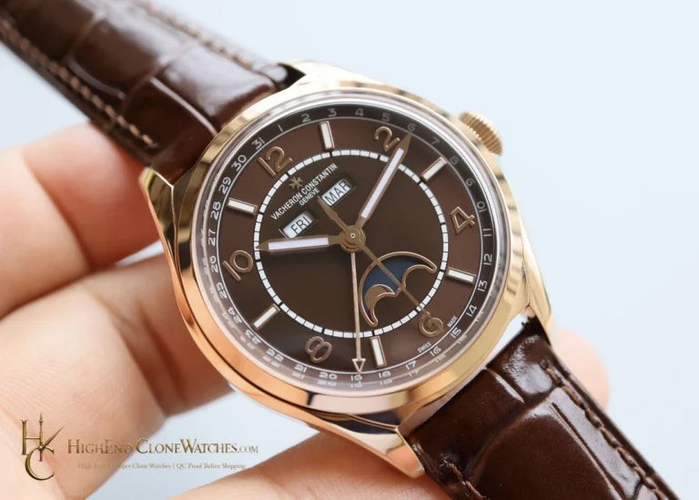
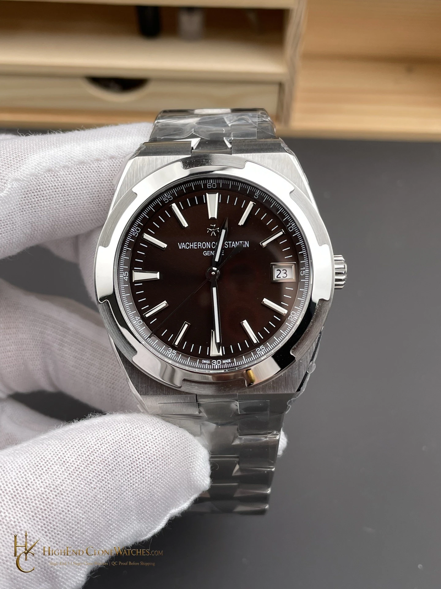
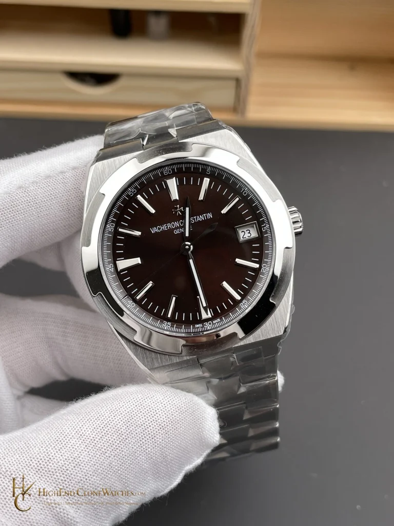
It makes sense for a collector who wants the calendar complication to remain the point of interest, especially with dark office clothing.
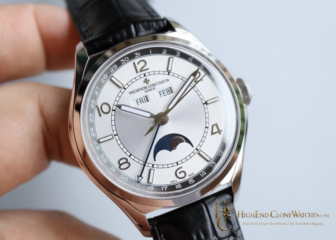
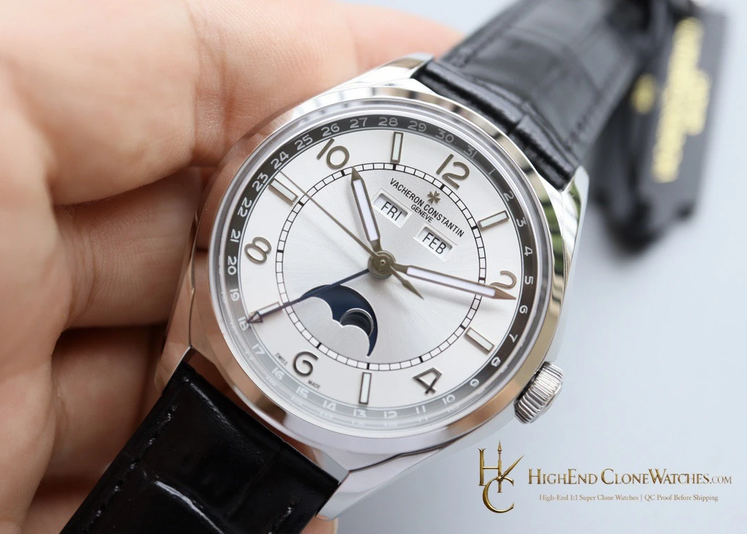
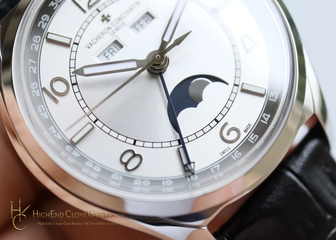
The silver-grey palette gives the calendar indications separation without making the dial clinical. It works particularly well for a buyer who values the visual rhythm of day, month, date, and moon phase, but still wants the watch to look composed when the functions are not being read.
The sector layout also gives the eye a natural route through the functions, which makes this version feel deliberate rather than overfilled.
The calendar is best understood as a balanced face rather than a list of functions, which is what lets the Fiftysix remain convincing with a cuff and plain tailoring.
Before dispatch, our QC team reviews the sector divisions, calendar apertures, pointer-date track, moon-phase display, and caseback alignment.