$1,659.00 Original price was: $1,659.00.$1,199.00Current price is: $1,199.00.
Buying notes for this configuration
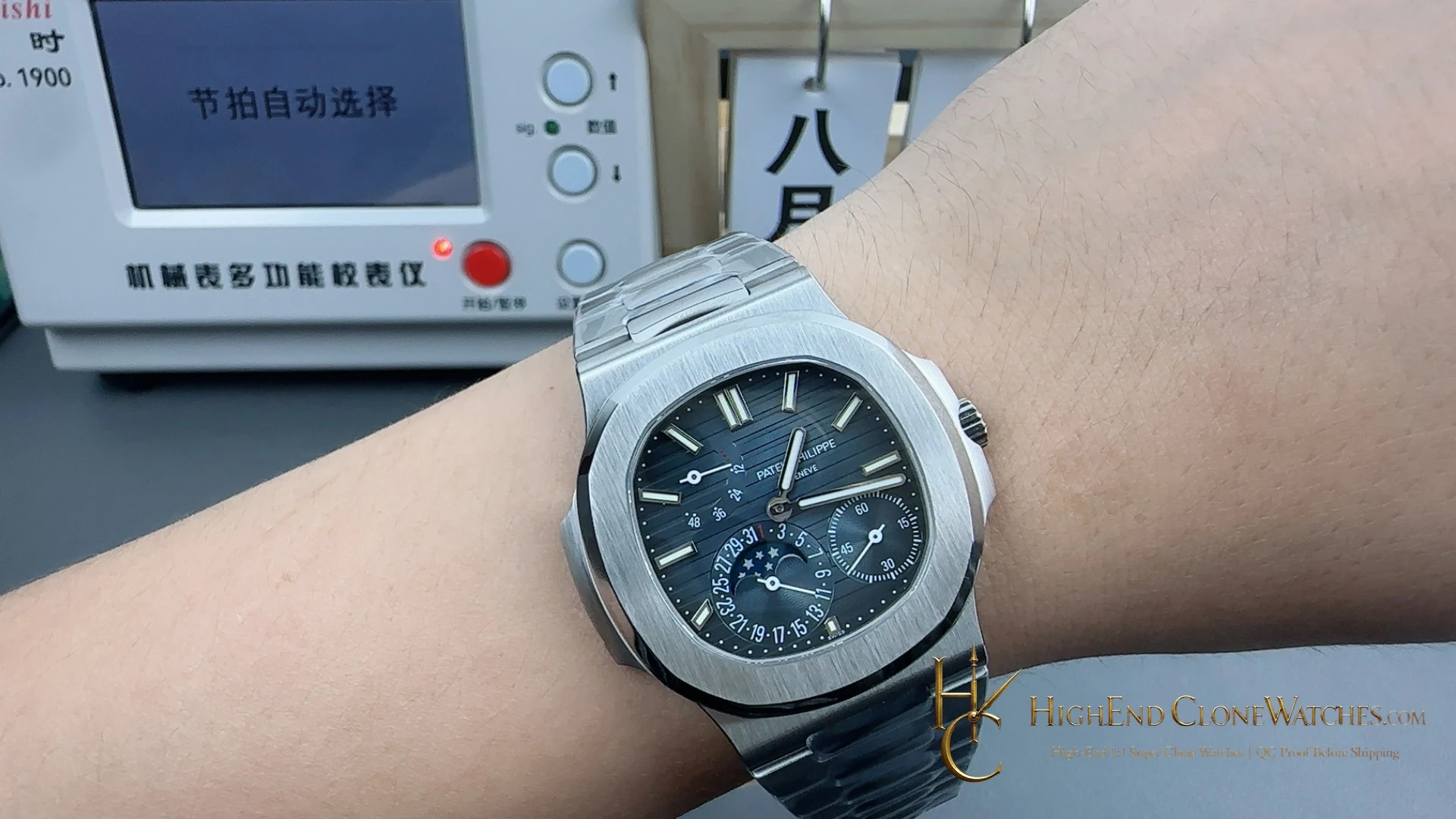
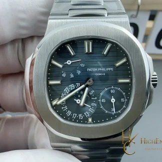
The Morandi blue-grey 5712/1A-001 is a cool, softened take on the stainless-steel moon-phase configuration. Its dial color gives the asymmetric display room to breathe, while the brushed case and polished chamfers keep the watch from becoming muted. The exact nearby alternative is the 5712/1A-001 with dark blue-black gradient dial and V4 double-safety folding clasp. That version creates stronger contrast and puts more emphasis on the closure hardware. Select Morandi blue-grey for a versatile, quieter steel rotation; select dark blue-black when the dial should make a sharper statement. The push-button extension clasp is worth checking from the underside because it changes the practical wearing experience.
Choose the Morandi blue-grey version when a softened steel palette should carry the moon-phase layout; choose the dark blue-black version when deeper contrast and a more security-focused folding clasp are wanted.
Patek Philippe Nautilus 5712/1A-001 uses a Morandi blue-grey dial to soften the stainless-steel moon-phase profile. The 40mm case, brushed surfaces and polished chamfers keep the silhouette crisp, while the integrated steel bracelet and 2022-plus push-button extension clasp make the wearing hardware part of the choice. Compare it with the 5712/1A-001 dark blue-black gradient variant, which brings deeper contrast and a V4 double-safety folding clasp. This Morandi version suits a buyer who wants the complication to feel calm and adaptable rather than dramatic. Inspect the dial and clasp views together.
Confirmed configuration
- Movement
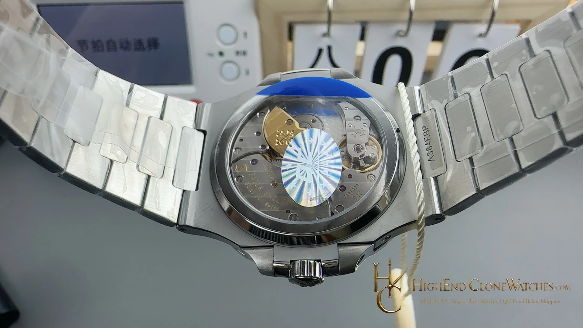
- Super Clone Caliber 240
- Bezel
- Stainless steel, brushed with polished chamfers
- Crystal
- Sapphire with AR
- Bracelet
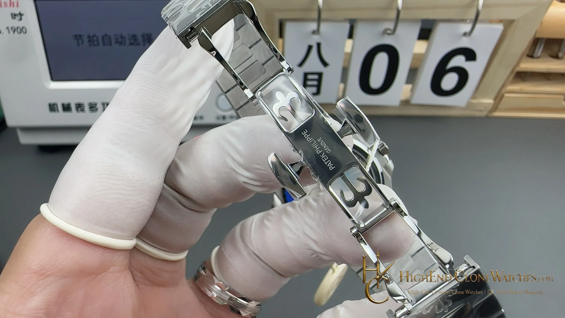
- Integrated stainless steel with 2022+ push-button extension clasp
- Water Resistance
- 30m
Morandi blue-grey softens the 5712 profile
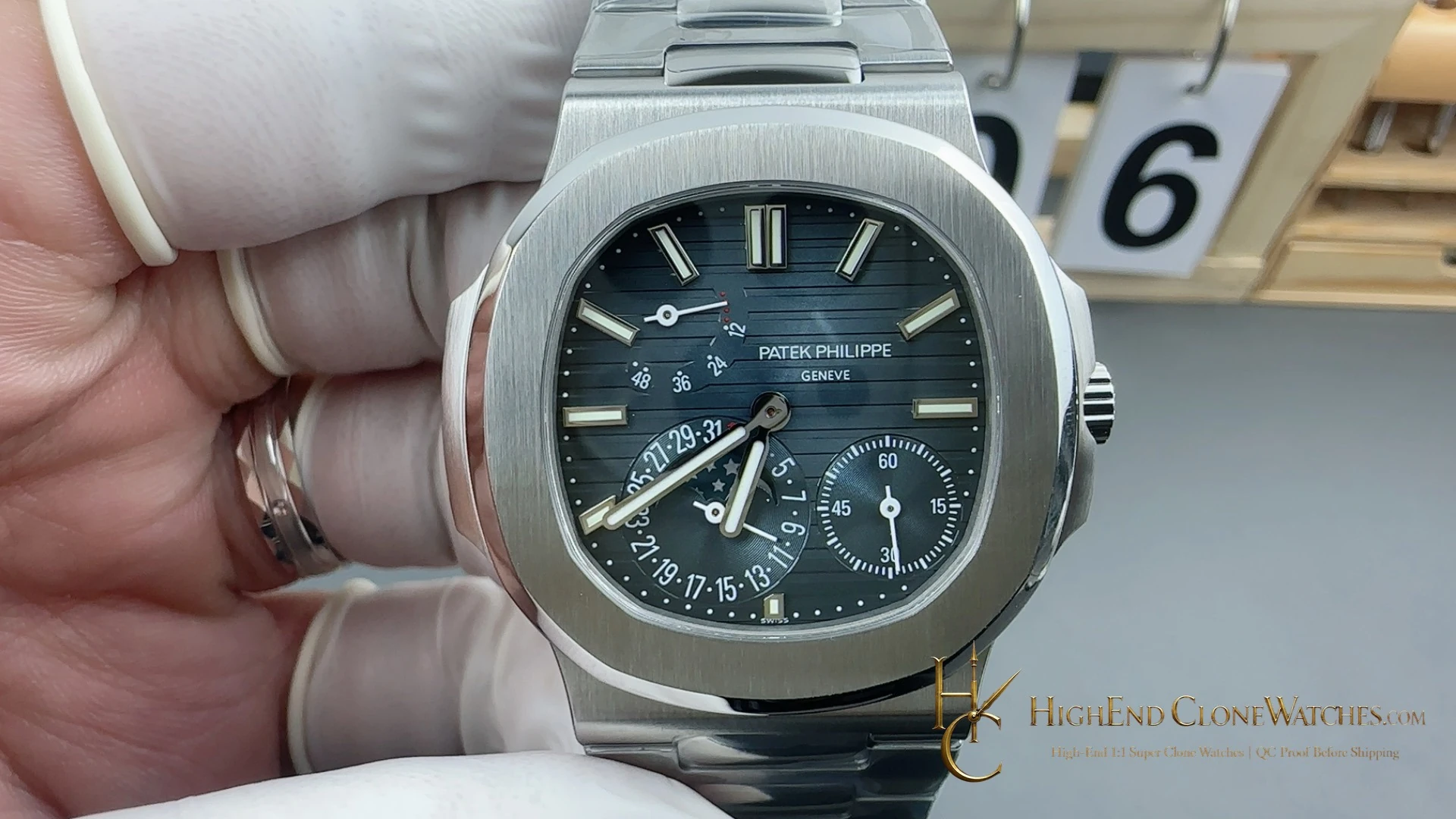
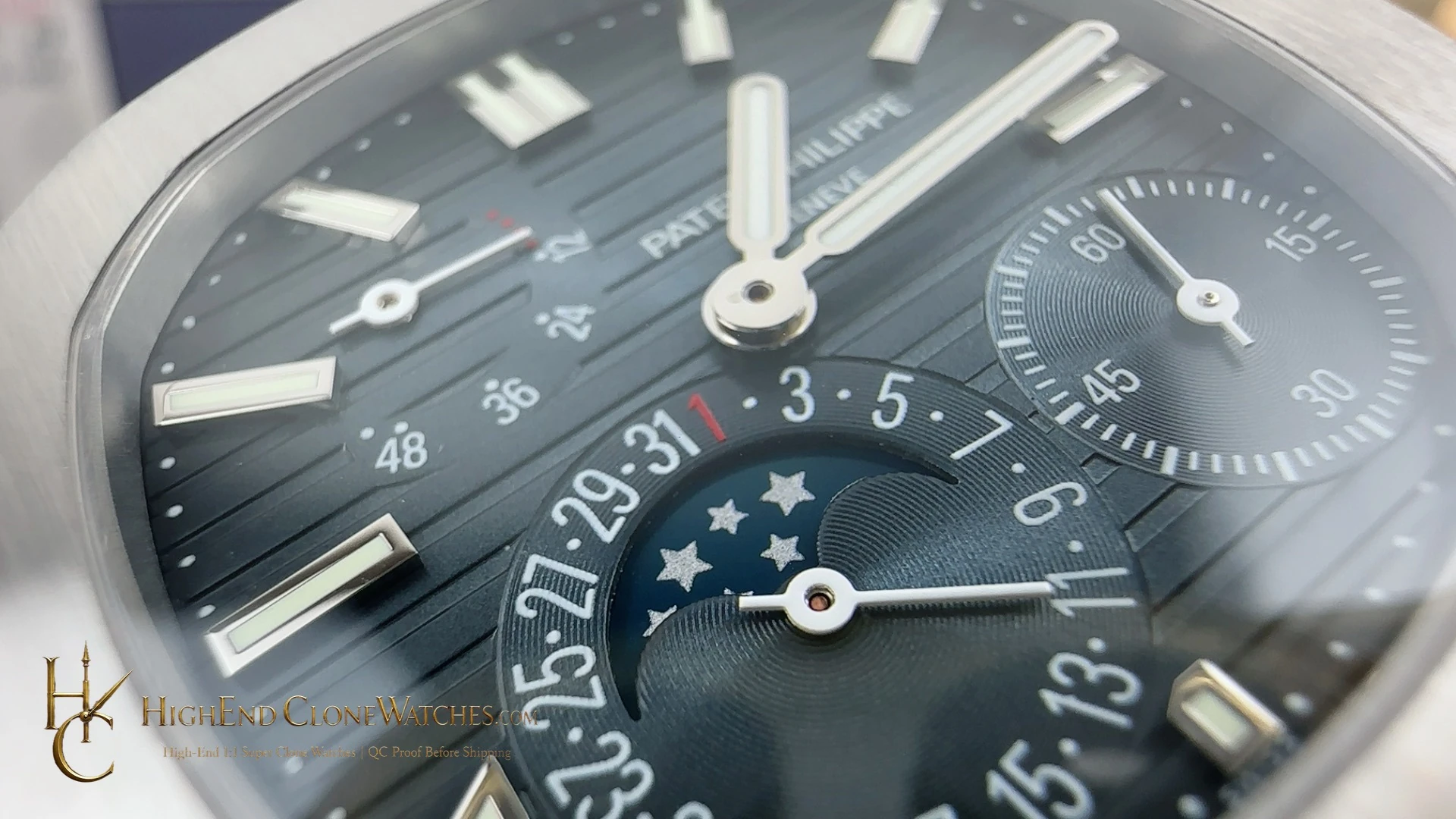
The Morandi blue-grey dial is the leading reason to choose this 5712/1A-001. It gives the moon-phase layout a subdued color field that works with the stainless-steel case instead of competing with it. The asymmetrical arrangement remains the focal point, but the overall presentation stays calm and adaptable.
Steel surfaces keep the outline crisp
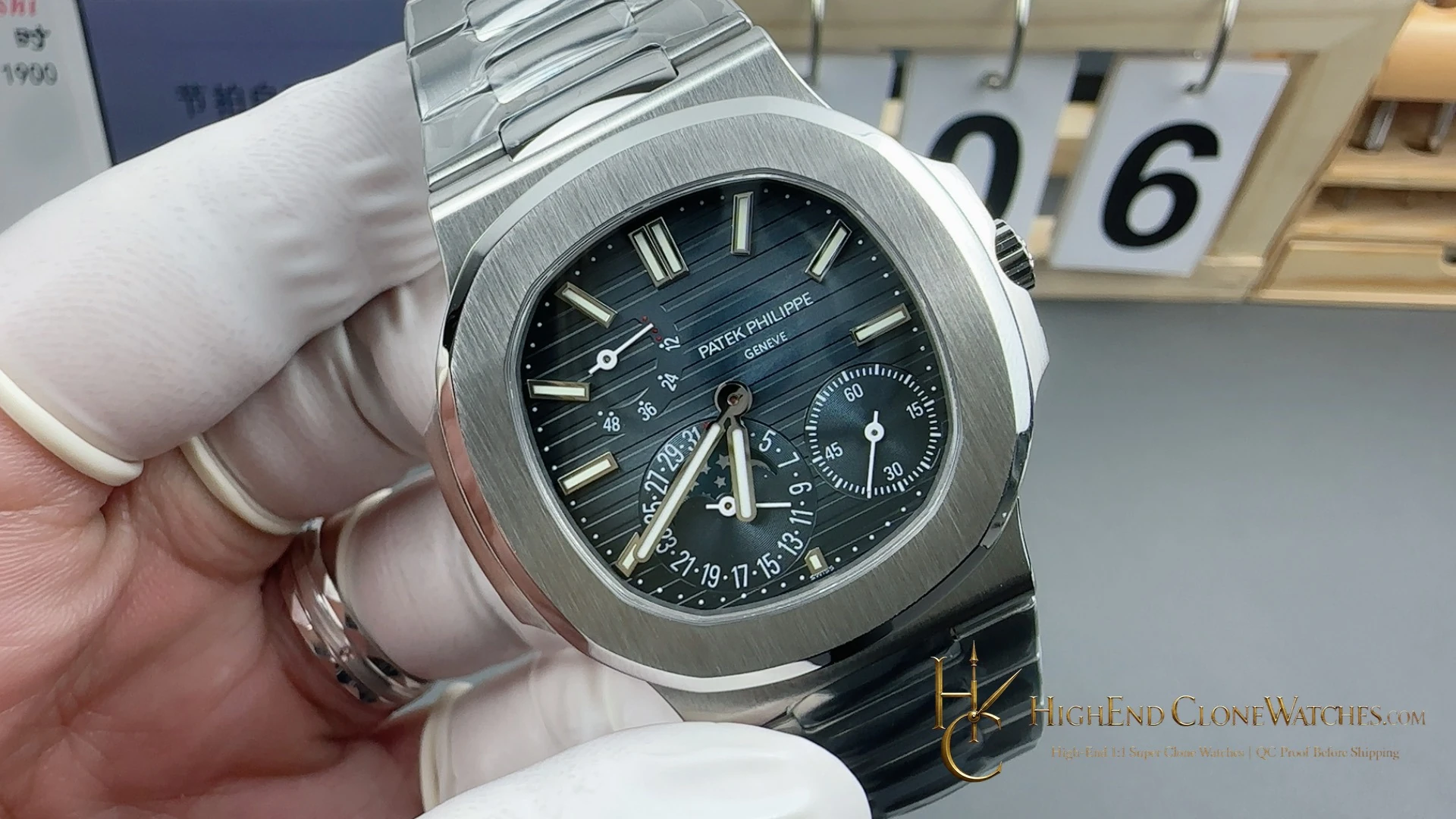
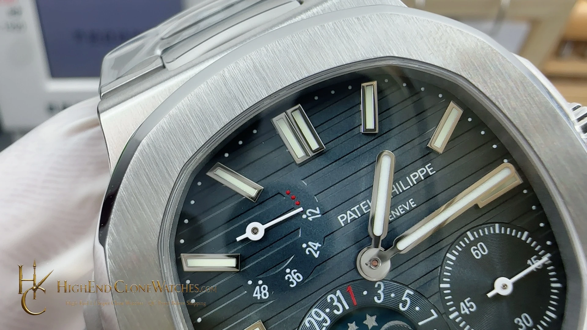
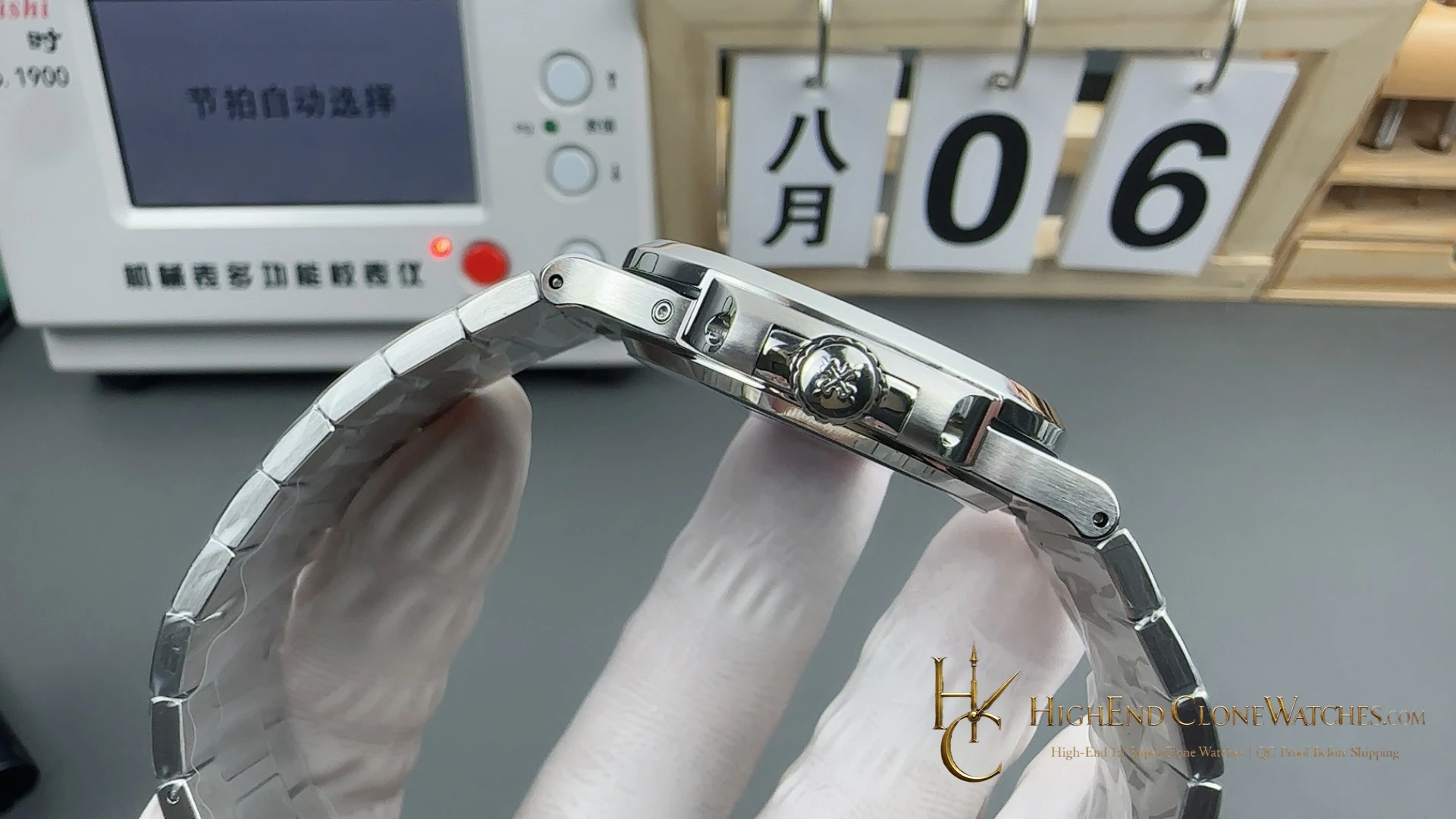
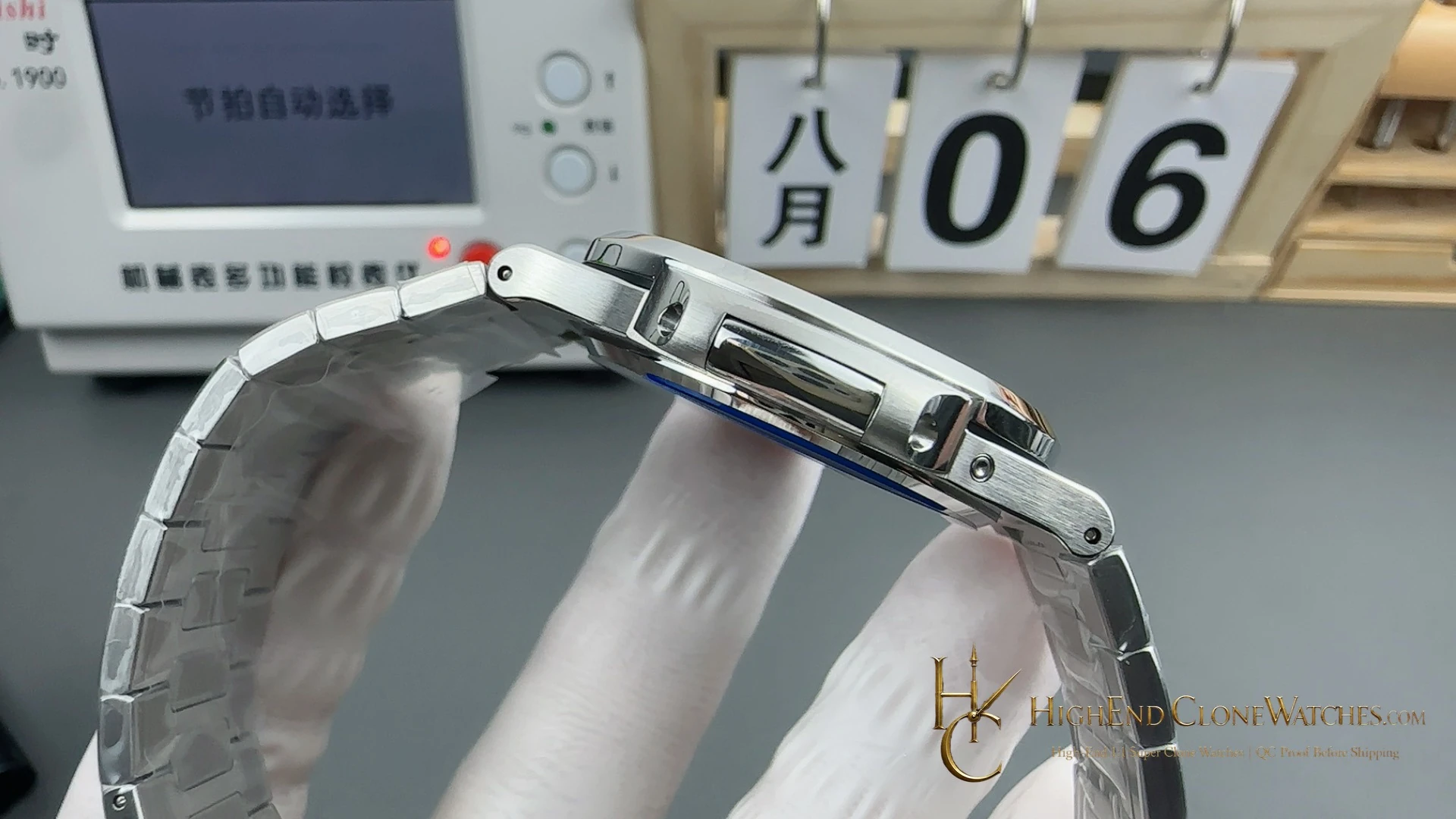
The 40mm stainless-steel case uses brushed surfaces with polished chamfers, creating a clear edge around the softer dial tone. The integrated steel bracelet continues that line into the wrist. The 2022-plus push-button extension clasp is part of the configuration, so the bracelet underside deserves the same attention as the front view.
Morandi blue-grey versus dark blue-black
The direct alternative is the Patek Philippe Nautilus 5712/1A-001 40.0mm with dark blue-black gradient dial and V4 double-safety folding clasp. It is the higher-contrast choice, with a closure that changes the hardware emphasis. Choose this Morandi version when the dial should blend into a steel rotation; choose dark blue-black when the moon-phase watch needs to stand farther apart.
Dial and clasp QC
Start with the front image to check the Morandi blue-grey tone and the alignment of the asymmetric moon-phase layout. Angled views should show an even relationship between brushed case faces and polished chamfers. The integrated bracelet should meet both case sides cleanly, and the 2022-plus push-button extension clasp should sit centered, close smoothly and remain aligned when extended.
The comparison becomes useful only after these details are settled. The dial sets the mood, while the clasp decides how the steel watch behaves on the wrist; both are specific to this configuration.
Soft color, structured case
The Morandi blue-grey dial is deliberately quieter than the dark blue-black sibling, but it is not visually empty. Its softened tone gives the asymmetric moon-phase layout room to remain the focal point, while the brushed case and polished chamfers provide the sharper edges. Review the front and angled images together: the first shows the blue-grey balance, and the second confirms that the case finishing keeps the profile defined rather than washed out.
The integrated stainless-steel bracelet continues that contrast from the case into the wrist. Its attachment should sit flush on both sides, with the bracelet remaining centered as it approaches the 2022-plus push-button extension clasp. The extension should open and close cleanly, and the push-button action should not leave the closure skewed. Those are the practical details that make this version different from a simple dial-color swap.
A quieter 5712 for a broader rotation
Select Morandi blue-grey when you want the moon-phase display to remain interesting without making the dial the loudest object in the outfit. The dark blue-black 5712/1A-001 is the alternative for stronger contrast and a V4 double-safety folding clasp with more pronounced hardware presence. This model is the more adaptable choice when steel, cool color and a lower-contrast closure need to work across several settings. Let the dial mood decide first, then use the clasp views to confirm the intended wearing behavior.
Questions to settle before ordering
What is the visual signature of this 5712/1A-001?
A Morandi blue-grey dial gives the stainless-steel moon-phase configuration a calm, softened color balance.
What is the closest alternative?
The dark blue-black 5712/1A-001 adds deeper contrast and a V4 double-safety folding clasp.
What should QC verify?
Check the blue-grey dial, moon-phase alignment, brushed and polished case surfaces, bracelet fit and push-button extension clasp.
Review the exact configuration before it leaves.
Use model-specific QC proof to confirm the visible details and stated functions that informed your choice.
QC proof before dispatch