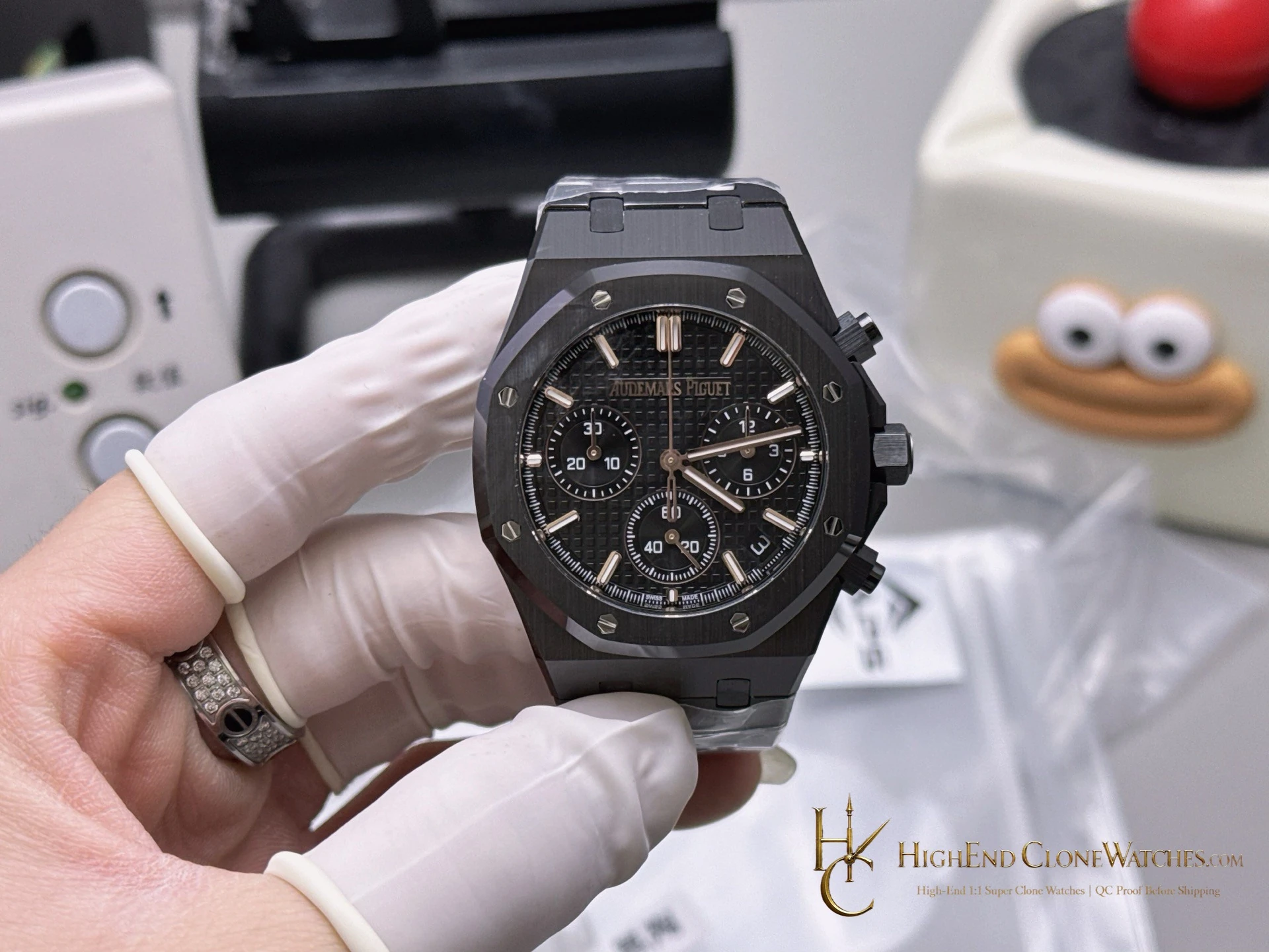
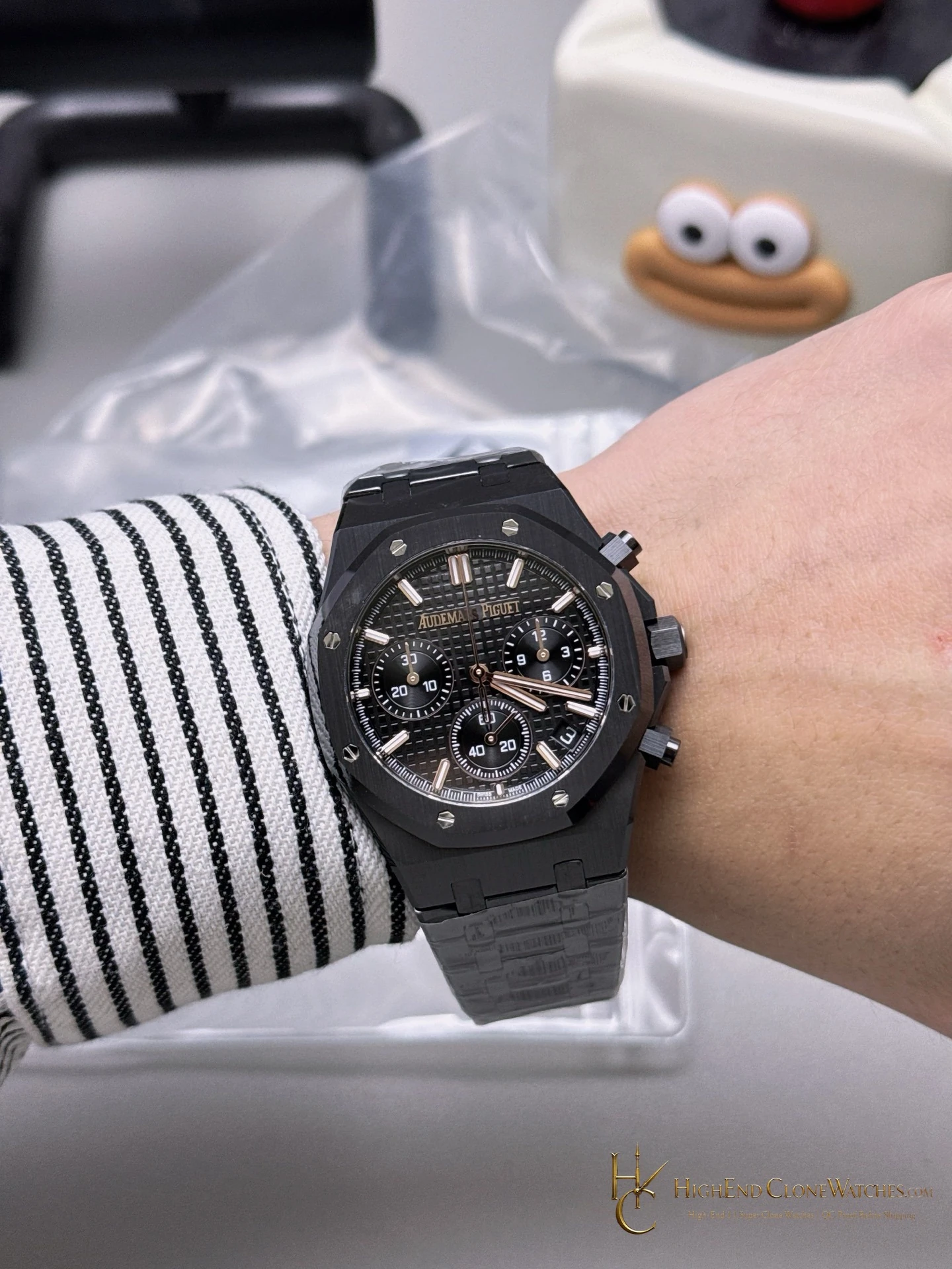
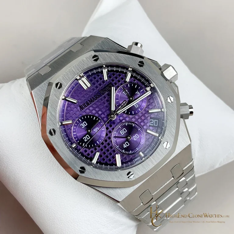
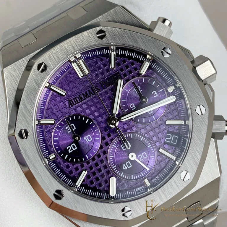
For a buyer, the practical distinction is the chronograph layout and the way it sits inside the black textured dial. This is the stronger choice when a quiet palette and technical dial are wanted together. The nearby 26240ST steel version is better for someone who wants the same family of sub-dials with visible metal contrast and a more traditional Royal Oak presence.
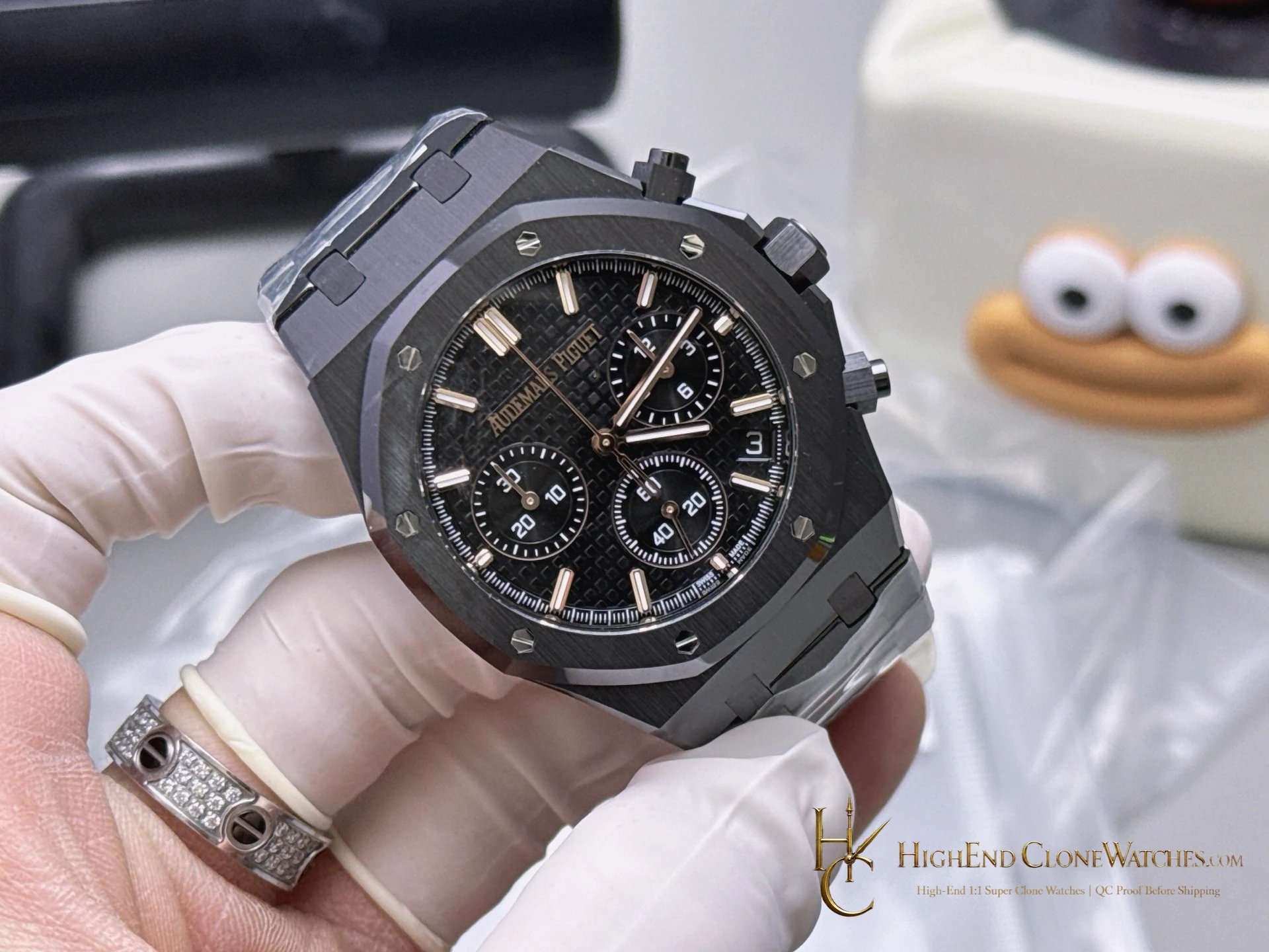
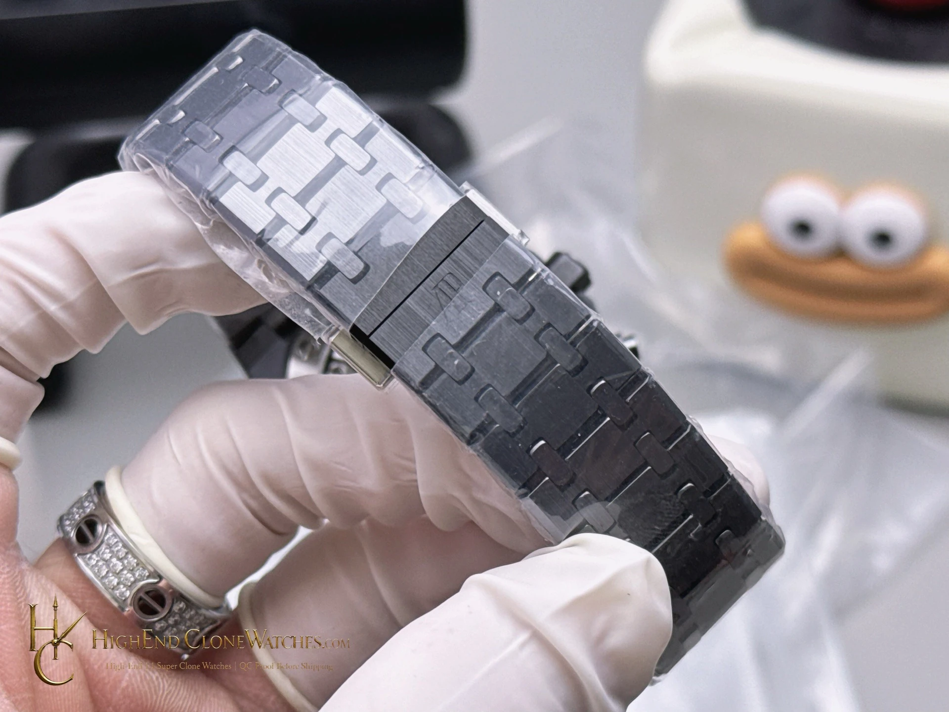
This configuration belongs in a contemporary wardrobe: black tailoring, technical outerwear, or an evening rotation where the watch should feel deliberate rather than decorative. It is less flexible than steel when the goal is to show finishing through bright reflections, but it is more coherent for a buyer who wants the bracelet, bezel, and case to read as one object. The angled gallery views are particularly useful because they show how the ceramic surfaces handle light without relying on a bright metal border.
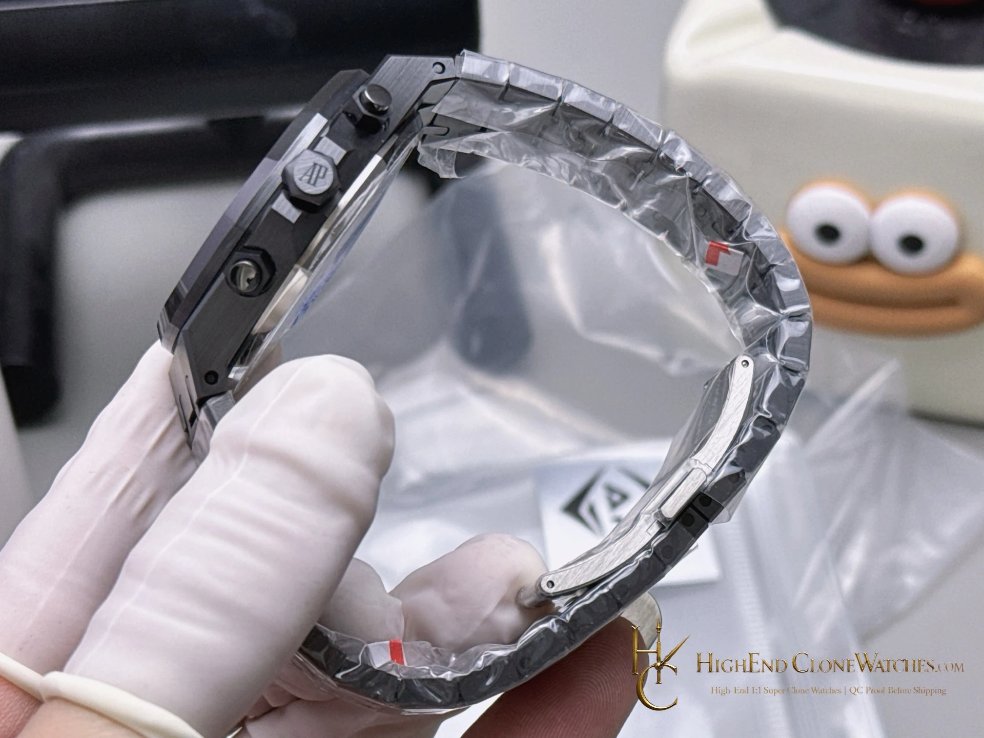
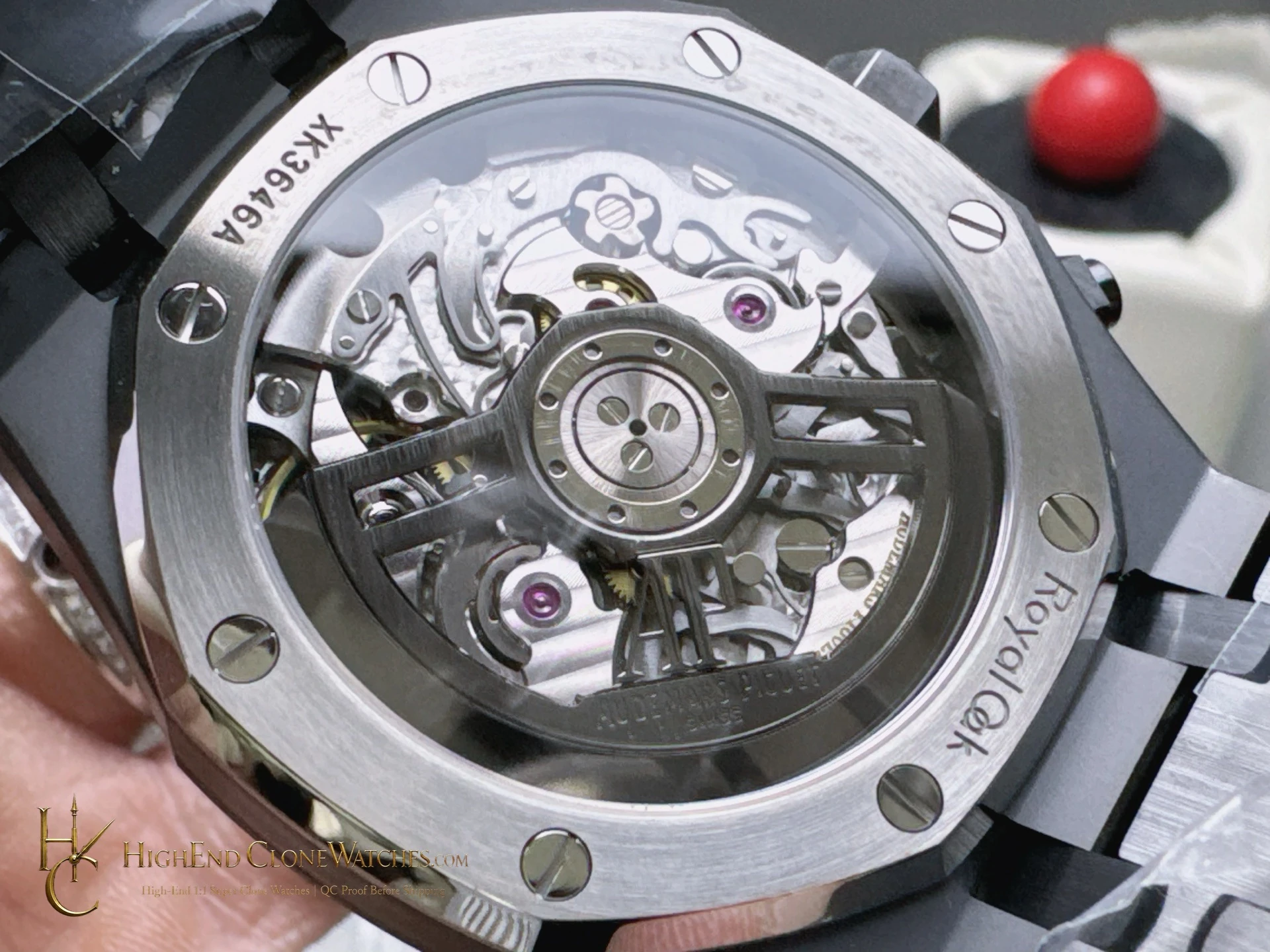
QC should review the sub-dial spacing and hand alignment first, then move outward to the bezel screws, octagonal edges, crown, and pushers. The ceramic bracelet needs close attention at the end links, link articulation, and clasp engagement. Inspectors should look for a continuous finish across case and bracelet, clean transitions around the bezel, and a dial texture that remains legible beneath the dark colour. Those checks preserve the point of this 26240CE: a fully coordinated black Royal Oak chronograph whose shape stays visible even when the colour nearly disappears.
The all-black treatment makes edge work unusually important. The dial registers, bezel screws, crown, and pushers should remain readable against the dark ceramic body, while the bracelet should continue the same visual line from the lugs. This is the configuration to choose when a monochrome silhouette matters more than reflective contrast.