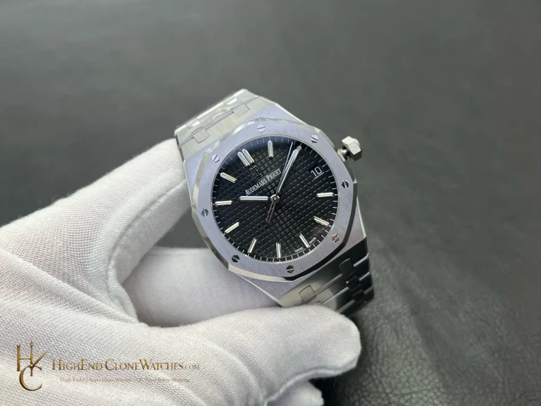
The closest alternative is the black-dial 26240ST: it offers a similar chronograph layout with cooler steel contrast and a less conspicuous colour story. This 26239OR is the better fit when the buyer wants warmth and presence, especially for evening clothing, while accepting that the plated finish deserves more deliberate handling than a plain steel surface.
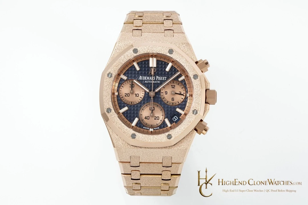
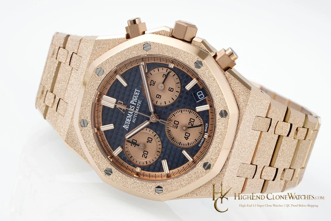
The blue dial keeps the chronograph readable without making the watch look overly busy. Sub-dials, applied markers, and the Grande Tapisserie pattern give the eye several layers to follow, while the rose-gold frame sets a clear boundary around them. It is a collection-forward configuration rather than the easiest single everyday watch, but that distinction is exactly what makes it useful beside black, blue-steel, or ceramic Royal Oaks.
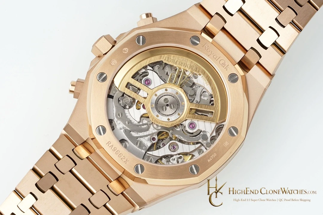
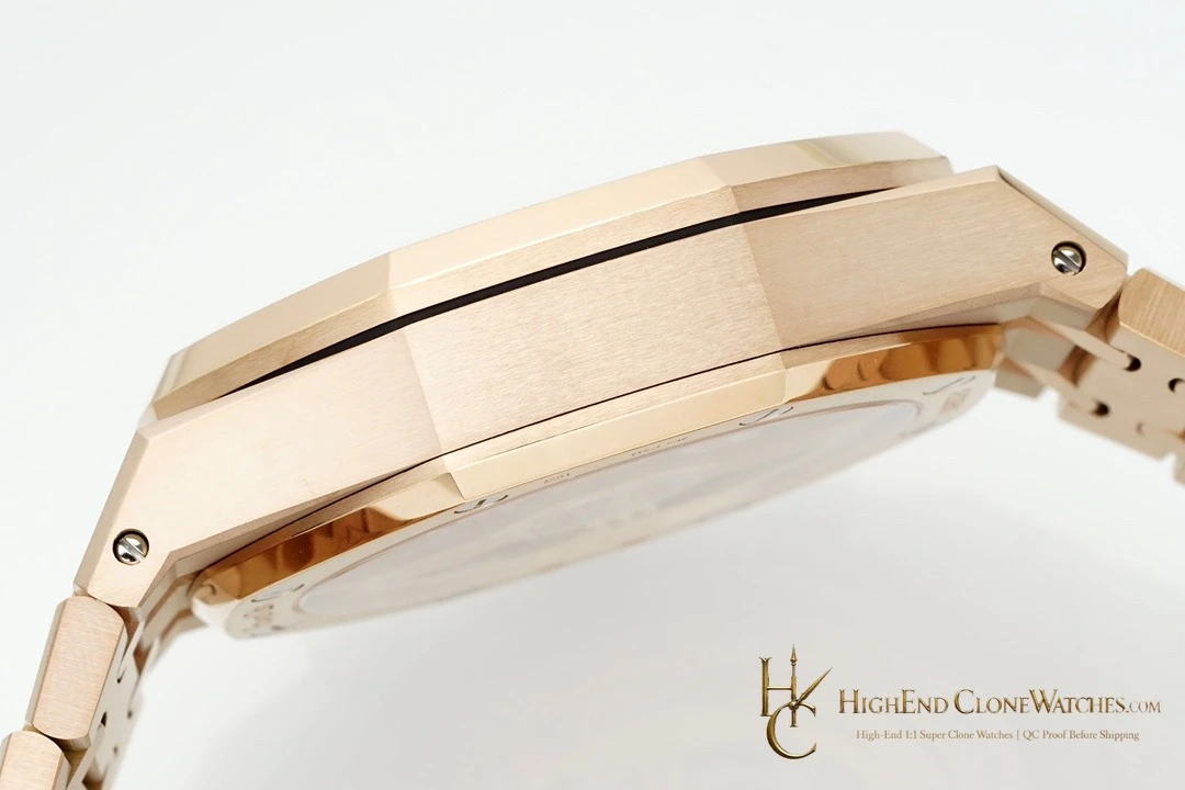
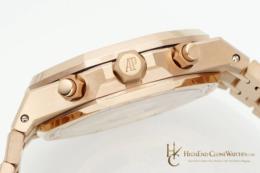
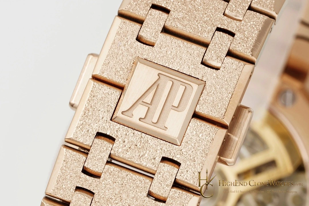
QC should check the dial pattern, sub-dial alignment, hand clearance, and pusher placement before reviewing the exterior. The rose-gold tone should remain coherent across case, bezel, bracelet, and clasp; brushing should run consistently on the flat surfaces and polished chamfers should be crisp. Inspectors should also review end-link fit, bracelet articulation, clasp engagement, and the seating of the eight bezel screws. Those details protect the specific appeal of this reference: a blue chronograph face carried by a warm, coordinated Royal Oak frame.
Here the blue dial is intentionally framed by a warmer exterior. Review the face first, then follow the tone through the bezel, case, bracelet, and clasp. That sequence shows why this 26239OR is a dressed chronograph choice rather than a cooler steel sibling with a similar complication layout.