Blue is the first decision
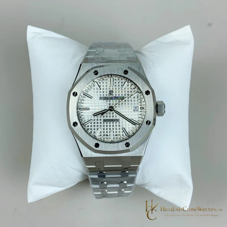
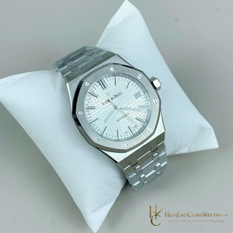
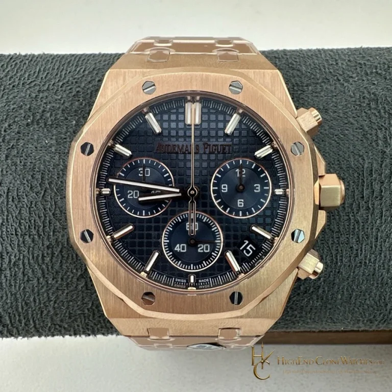
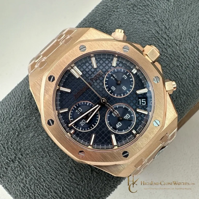
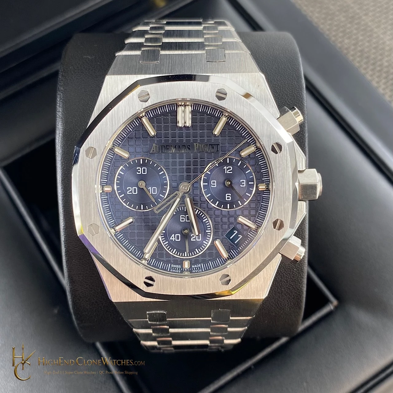
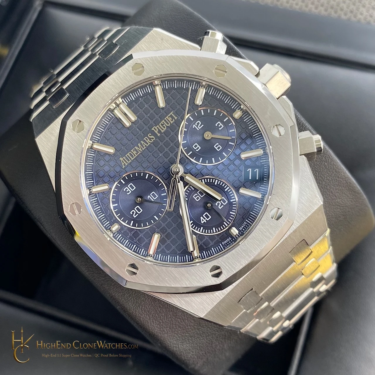
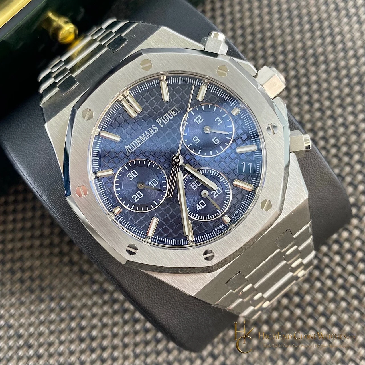
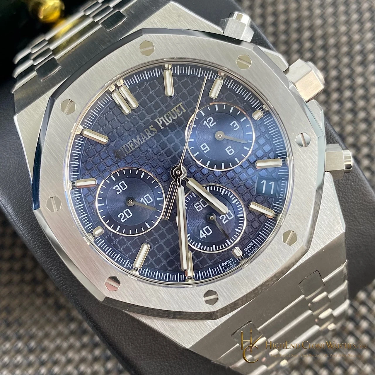
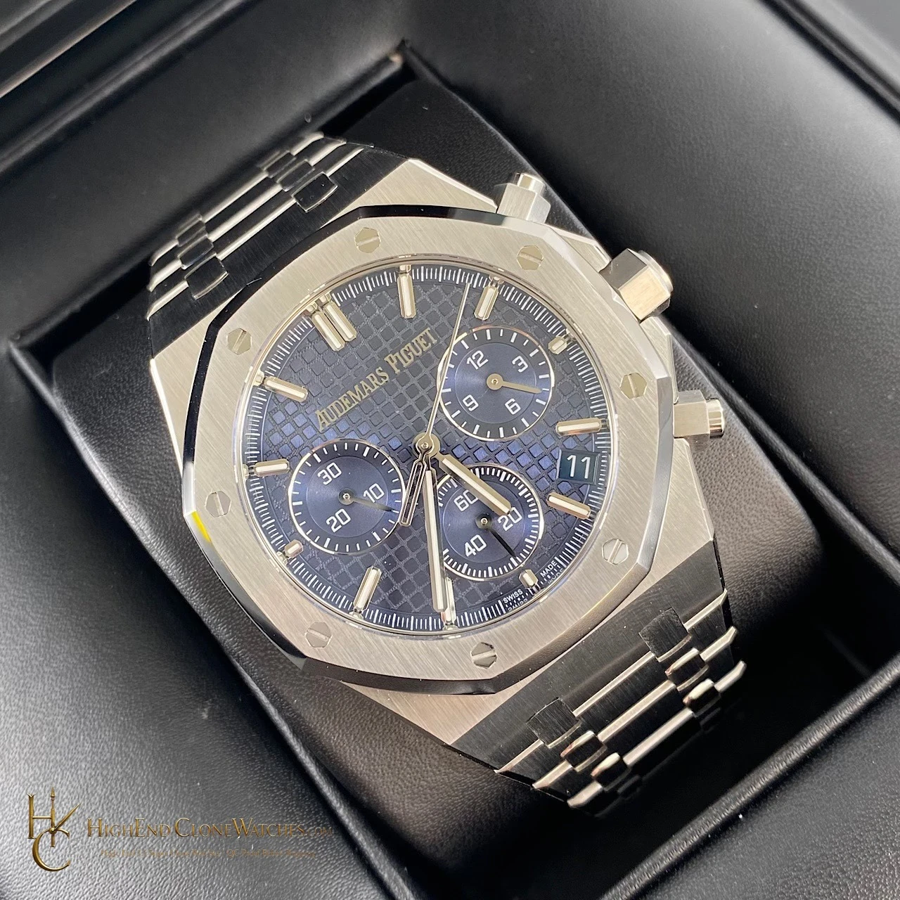
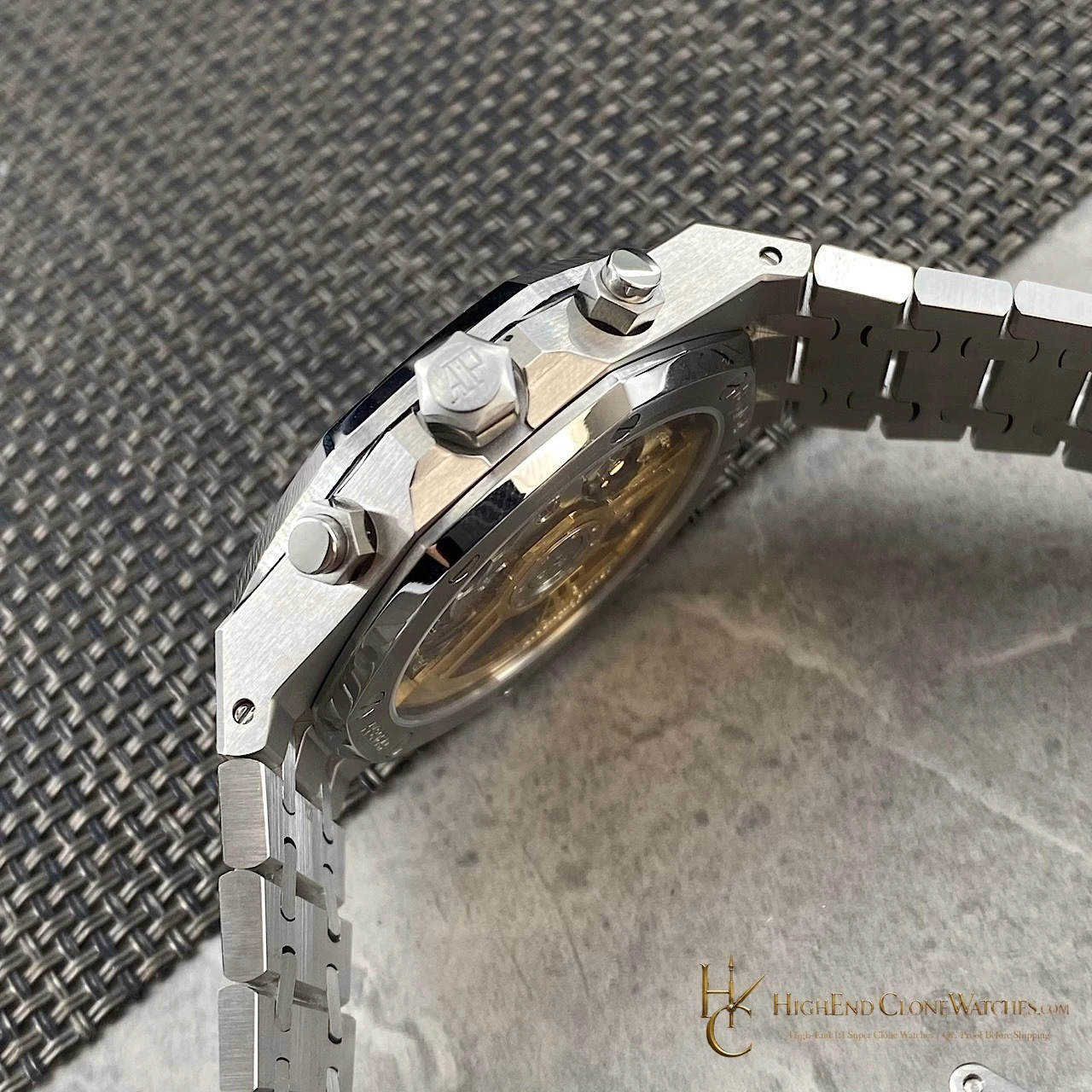
The dial carries the strongest visual argument. Its blue field gives the chronograph layout a cool center, while the square texture catches light differently across the front and angled views. The octagonal bezel and exposed screw geometry keep the composition architectural rather than soft. For a buyer comparing several Royal Oak chronographs, this is the version where dial color does the most work without changing the overall steel-toned character of the watch.