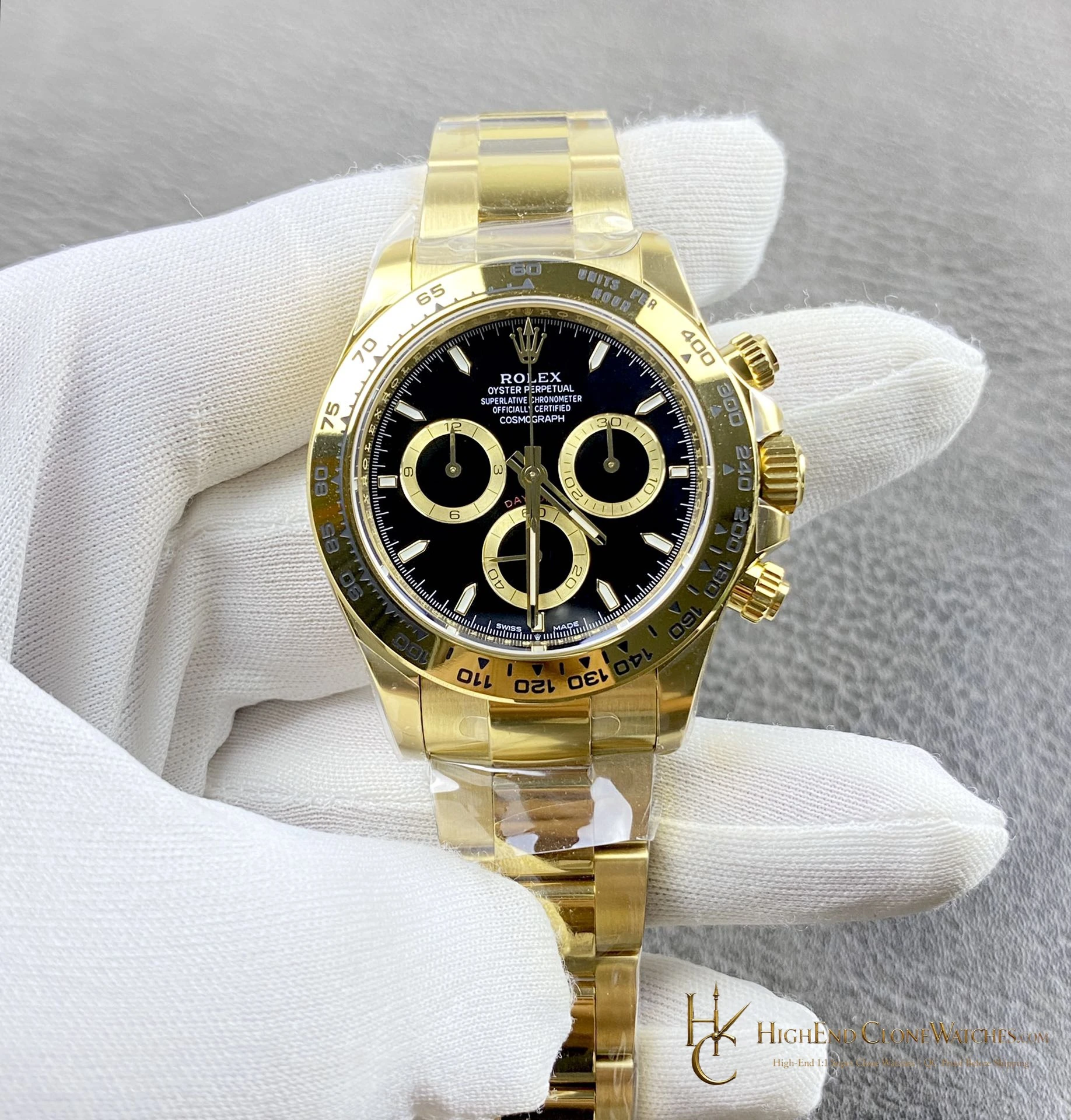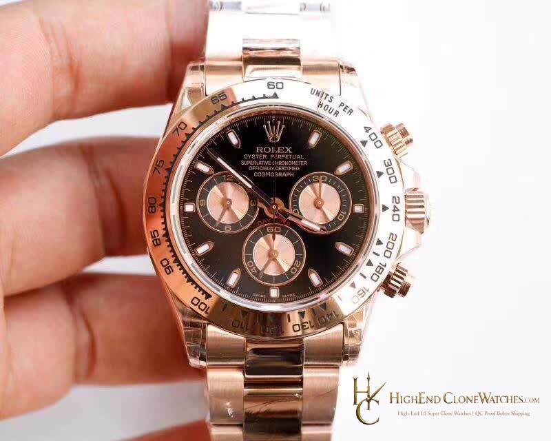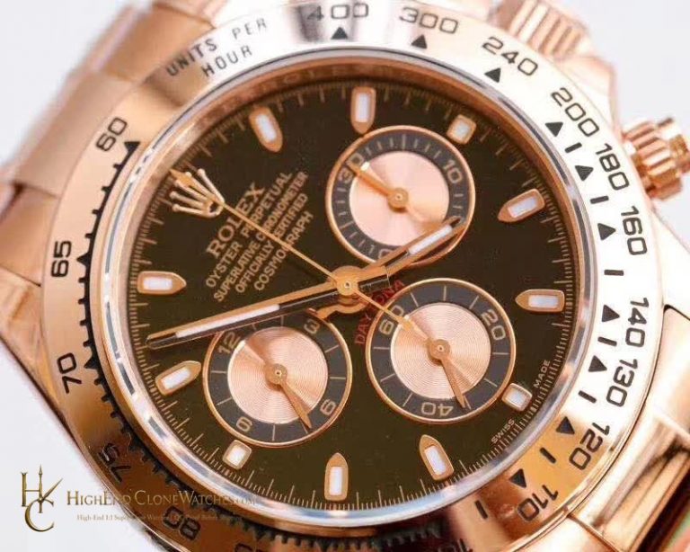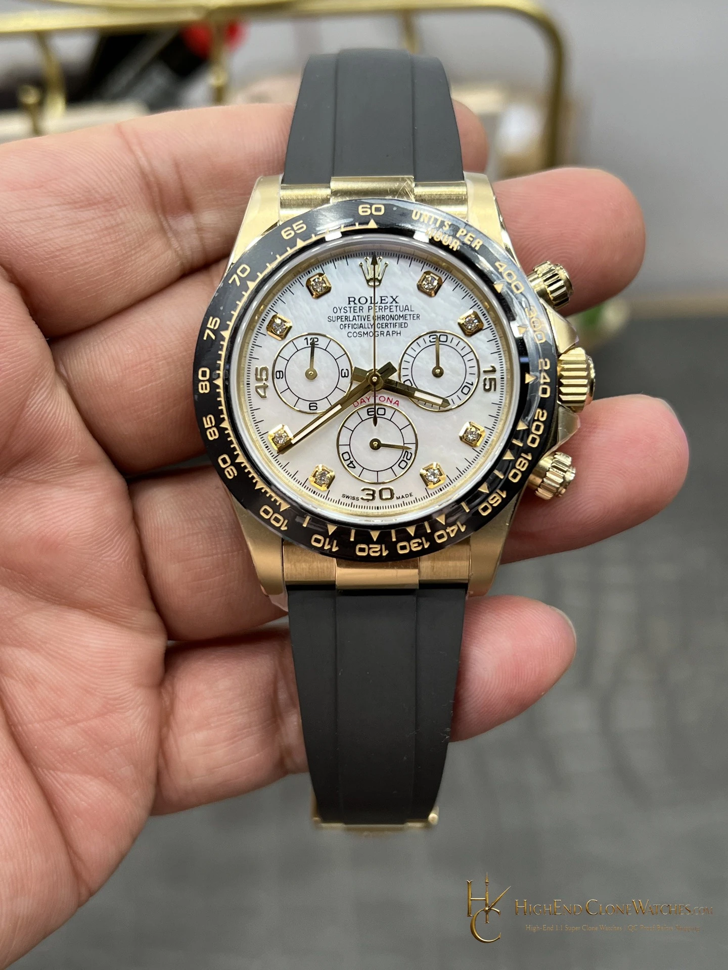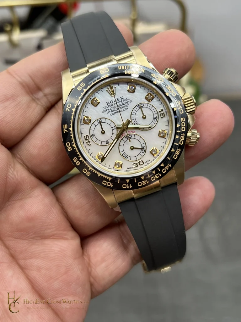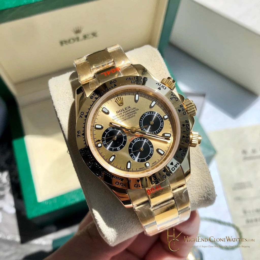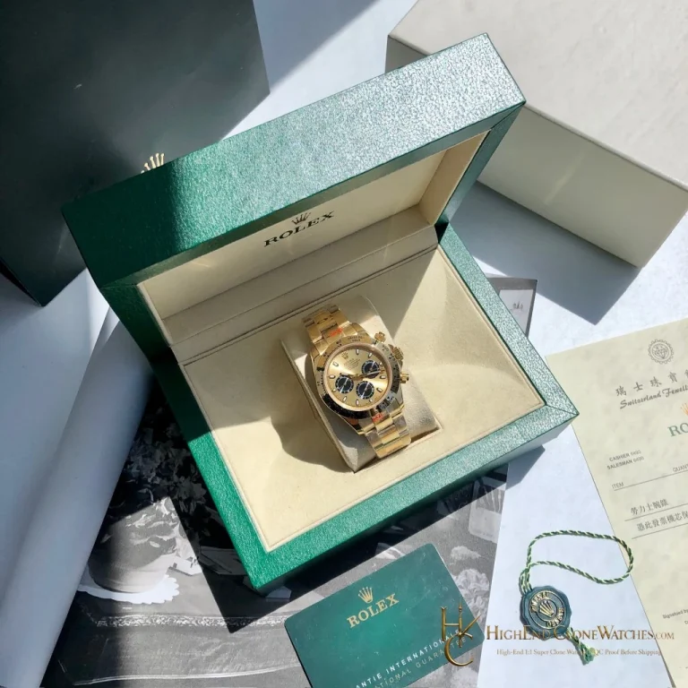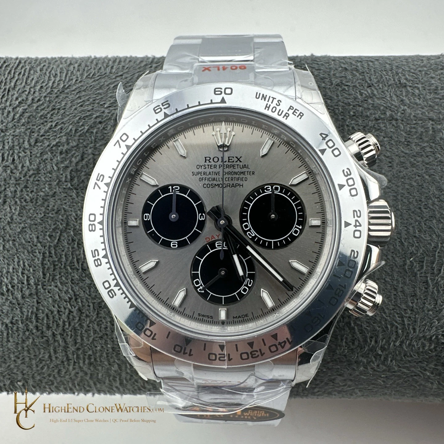
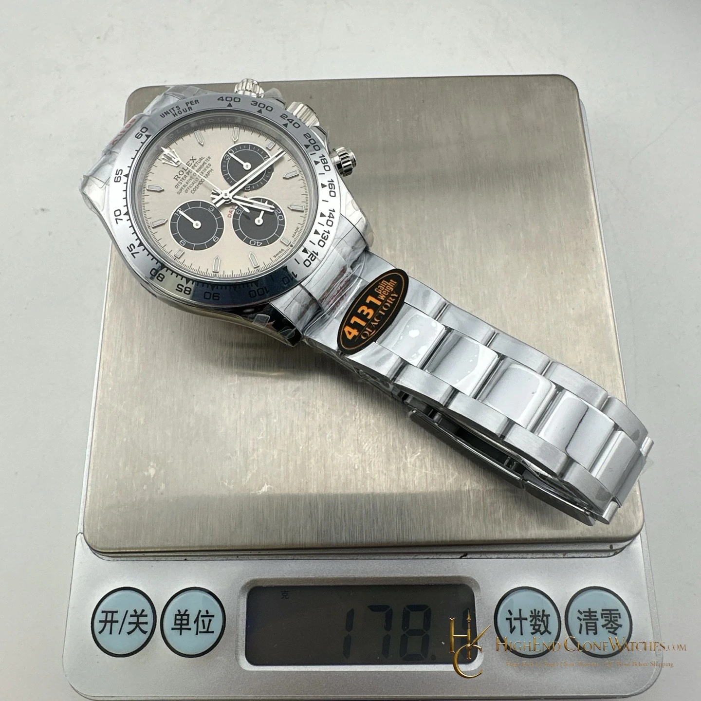
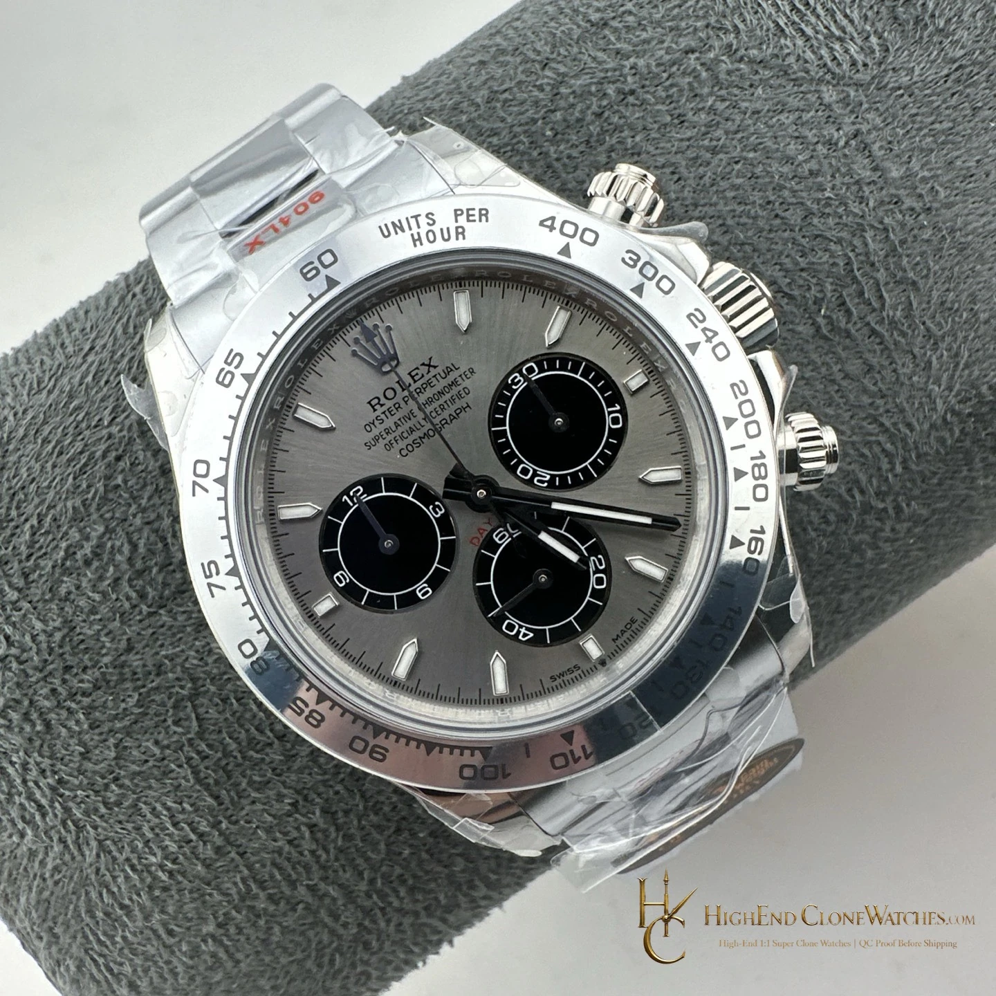
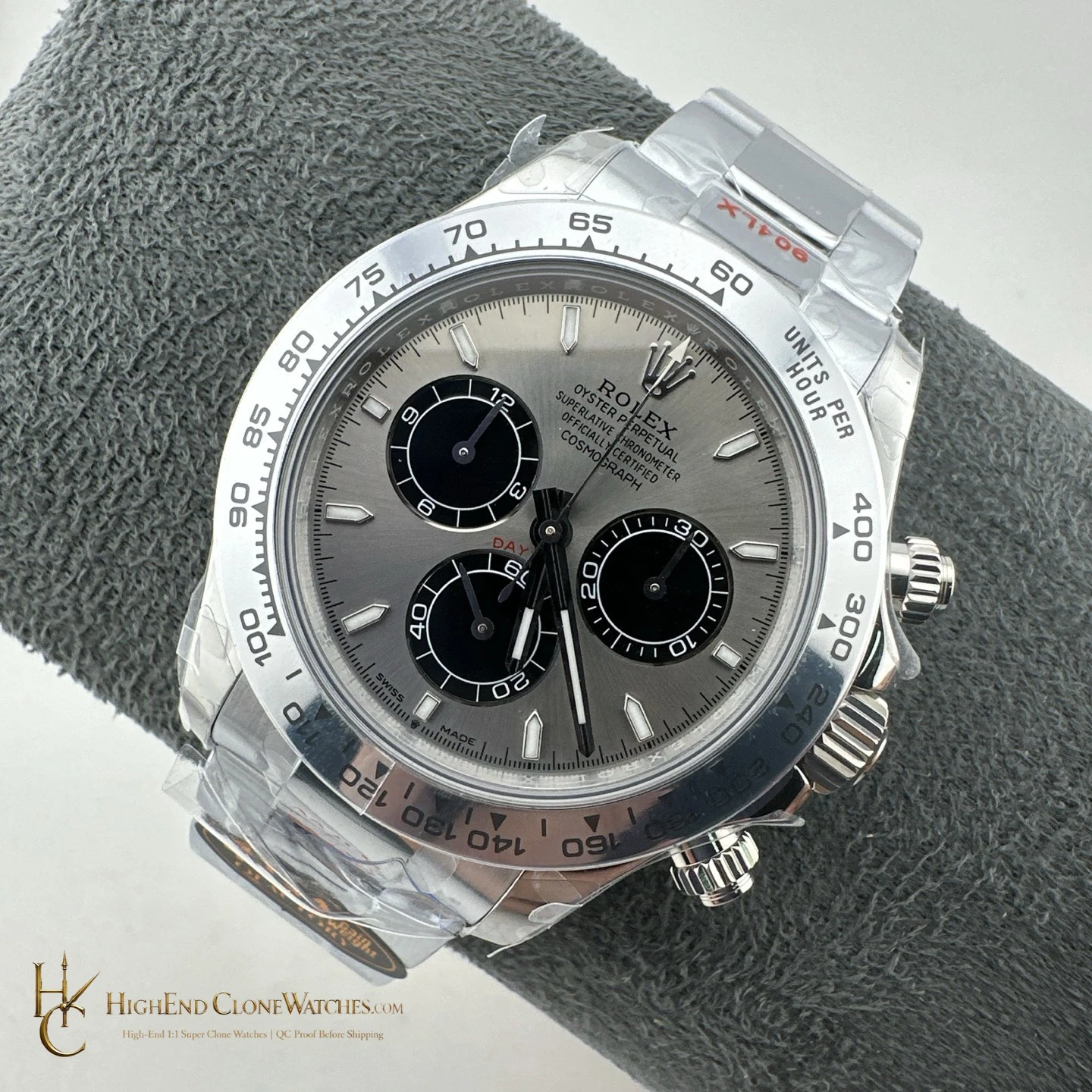
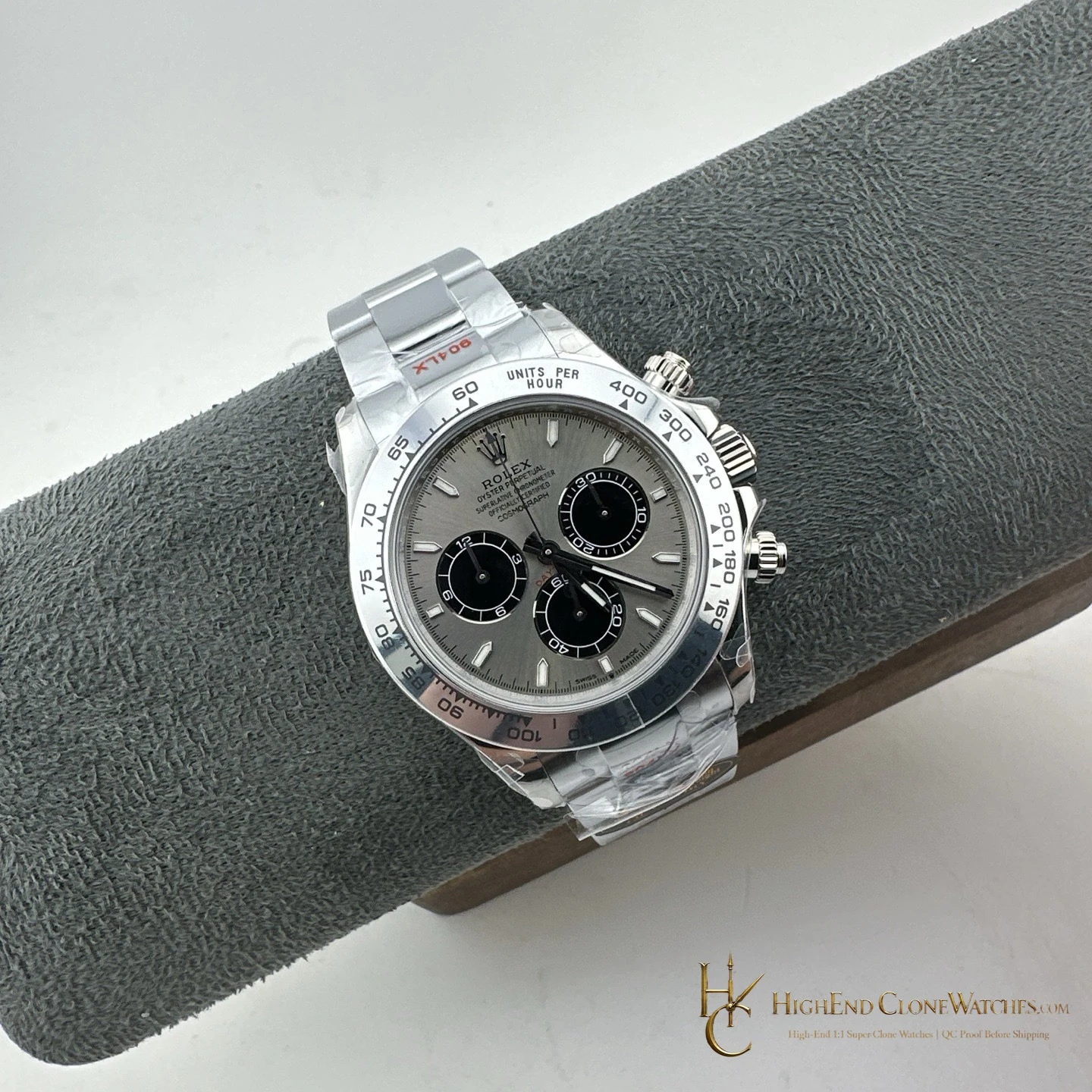
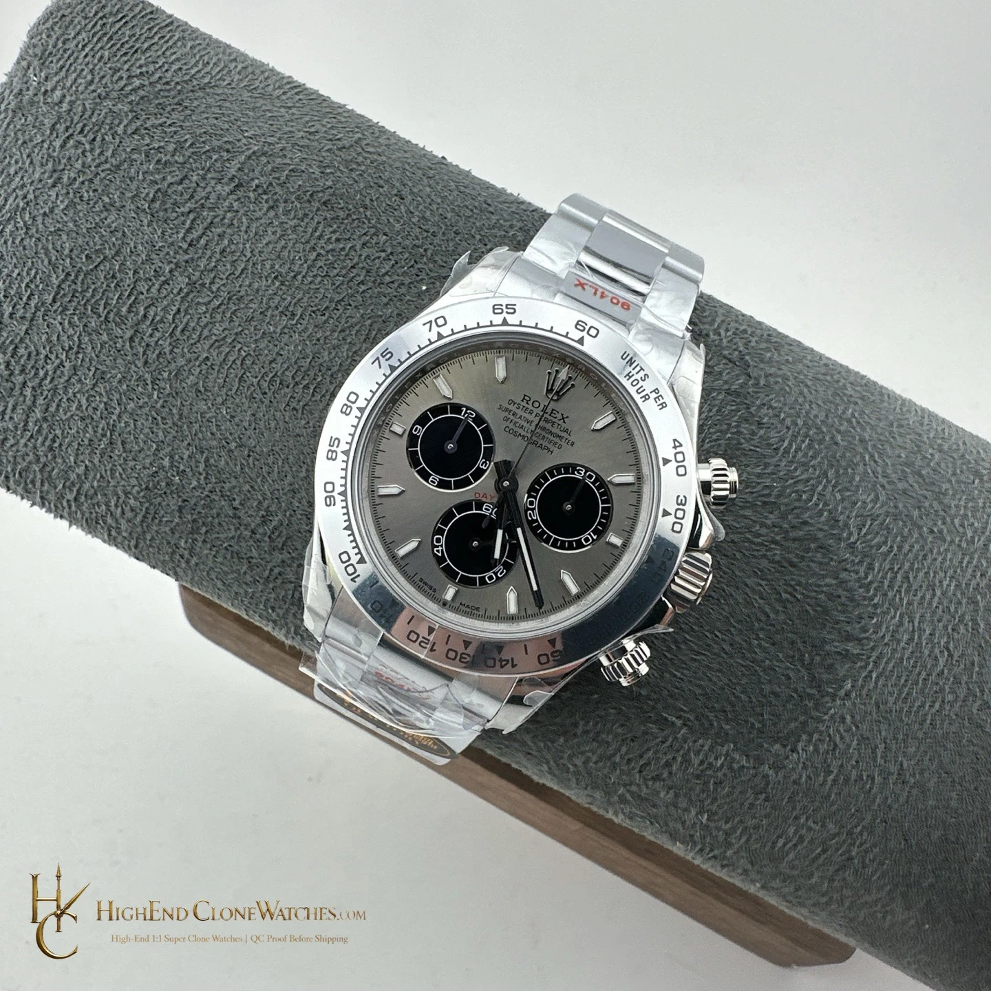
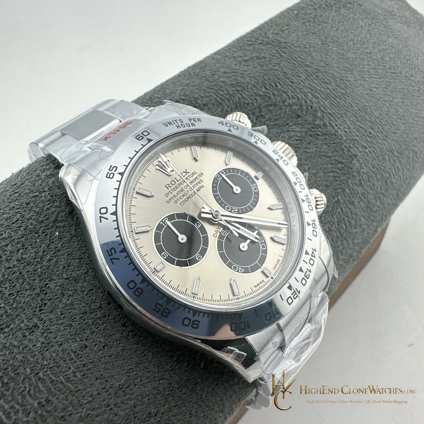
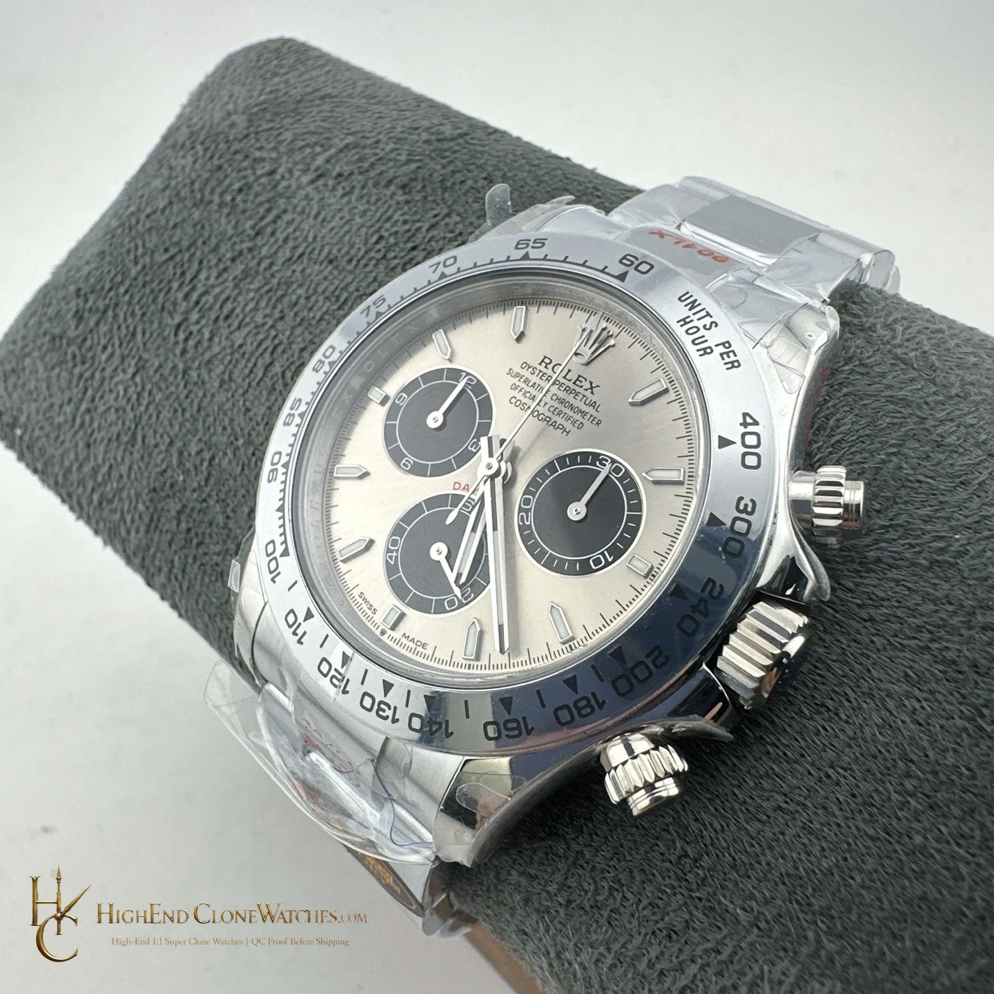
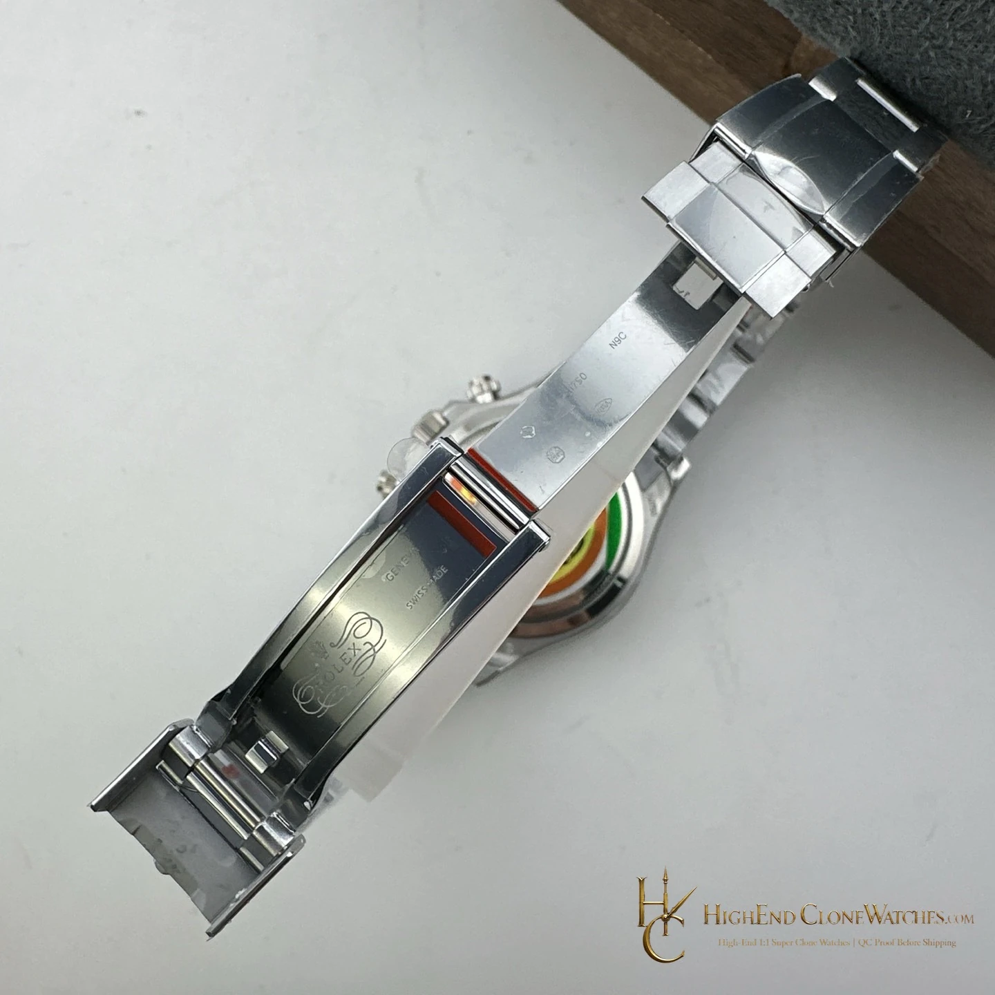
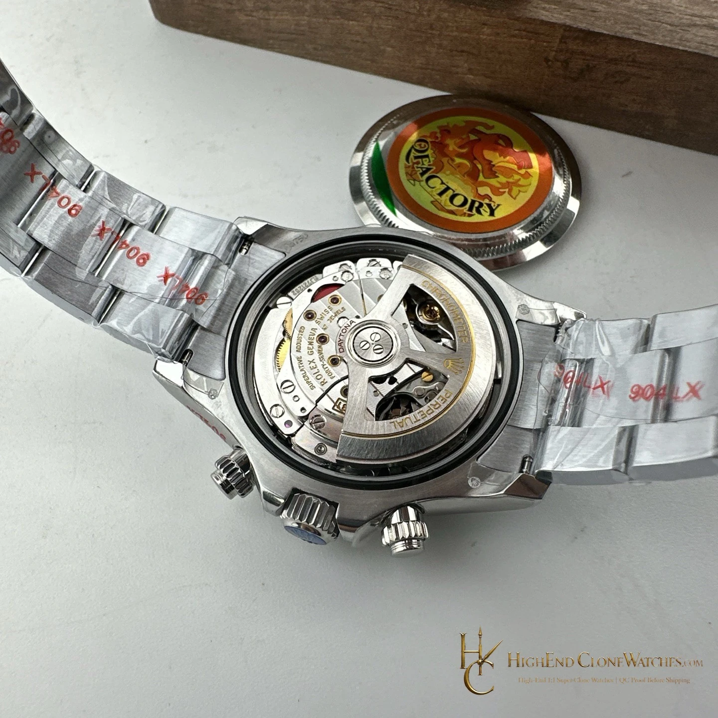
The appeal is the combination of a bright dial and a darker functional frame. It reads clearly with a shirt cuff, but the tungsten construction gives it the physical presence buyers usually seek from a precious-metal-style Daytona. Choose it when the exact wearing feel matters as much as the dial color.
That makes the weight and finish part of the decision rather than a background specification. The silver dial gives the watch an open front view, while the black registers and engraved bezel keep it from reading flat. Buyers comparing it with a warmer yellow-gold-tone Daytona should decide whether they want color to lead or prefer the cooler silver-and-black contrast. A final QC set should show the same balance in direct light, an angled case view, and a closed-clasp view.
When comparing it within a collection, the distinction carries into the way the watch works with clothing. Silver and black pair cleanly with cooler colors and darker tailoring, while the weighted case remains the defining change from a lighter steel presentation. A head-on image alone cannot explain that point. Ask for a side profile and bracelet view as well, so the case-to-link proportion, finish transition, and overall physical presence can be assessed before dispatch.
For day-to-day use, the silver-and-black layout stays clear without relying on a colored bezel or dial accent. The result is a configuration that can feel composed from the front yet deliberately substantial once it is handled.