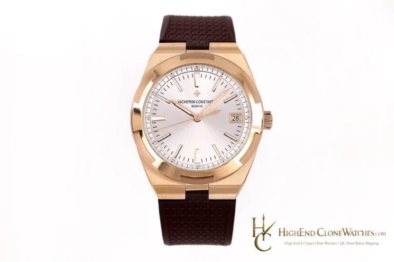
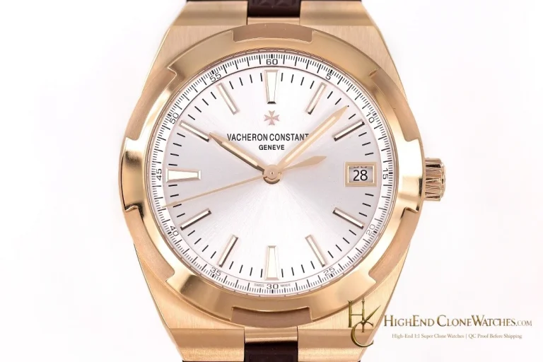
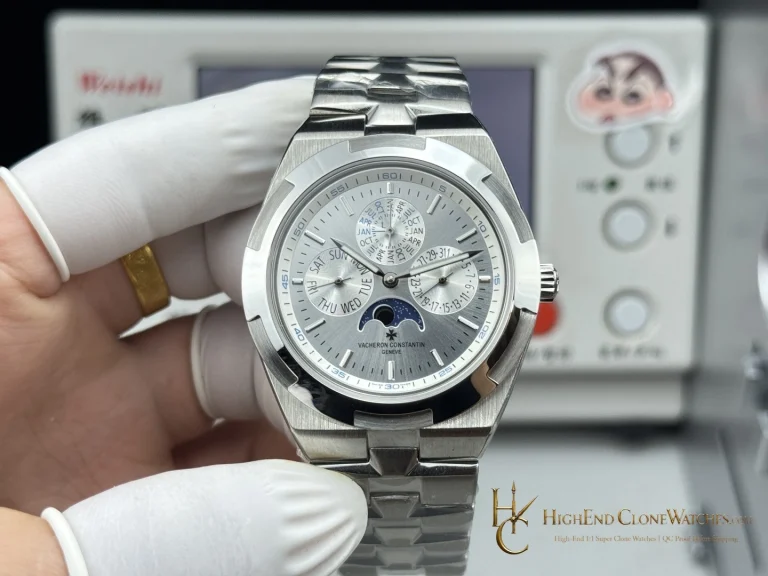
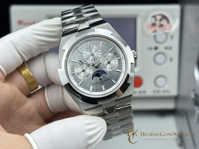
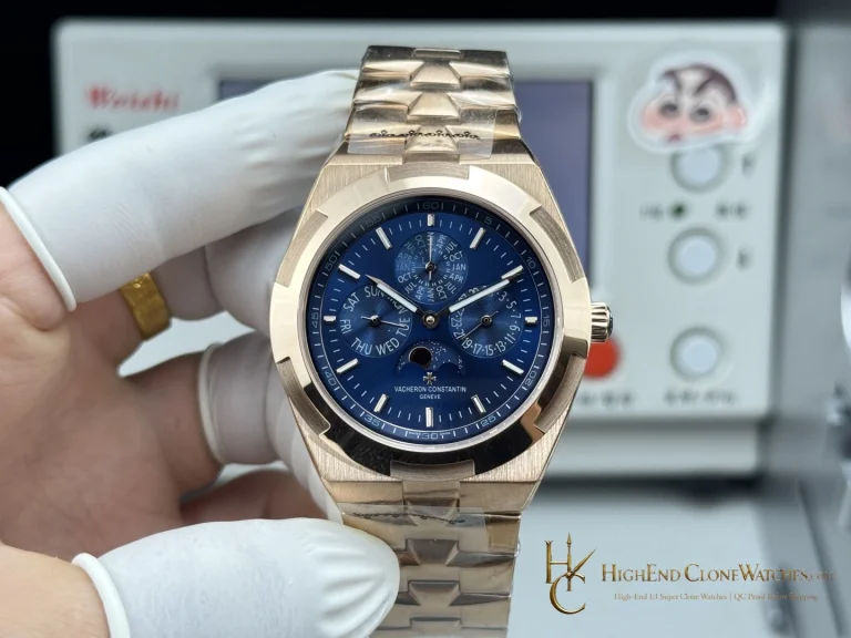
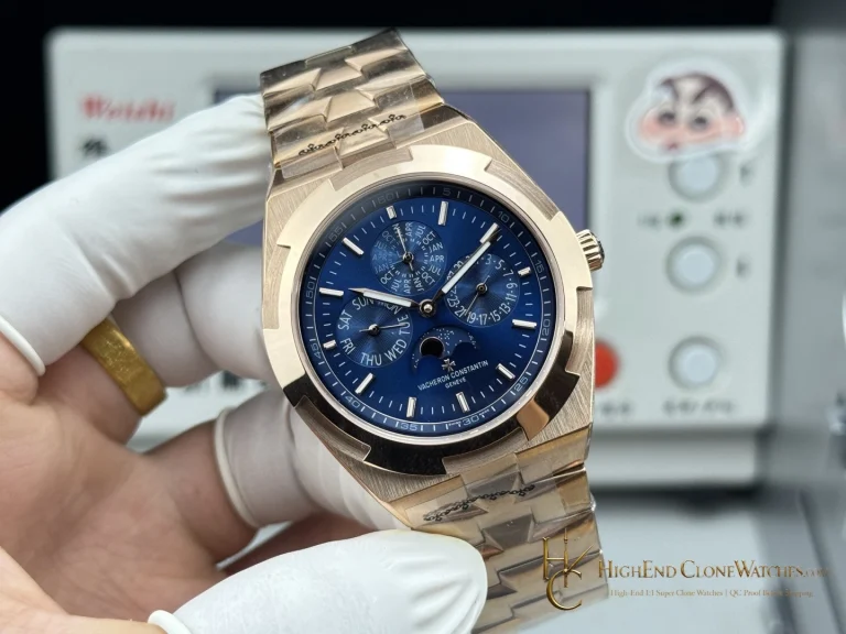
B934 adds matte blue and a cooler color note. 200ST is the clearer choice when marker spacing, bezel articulation, and the steel bracelet should remain the main visual story. The distinction is color and contrast, not a change to the family identity.
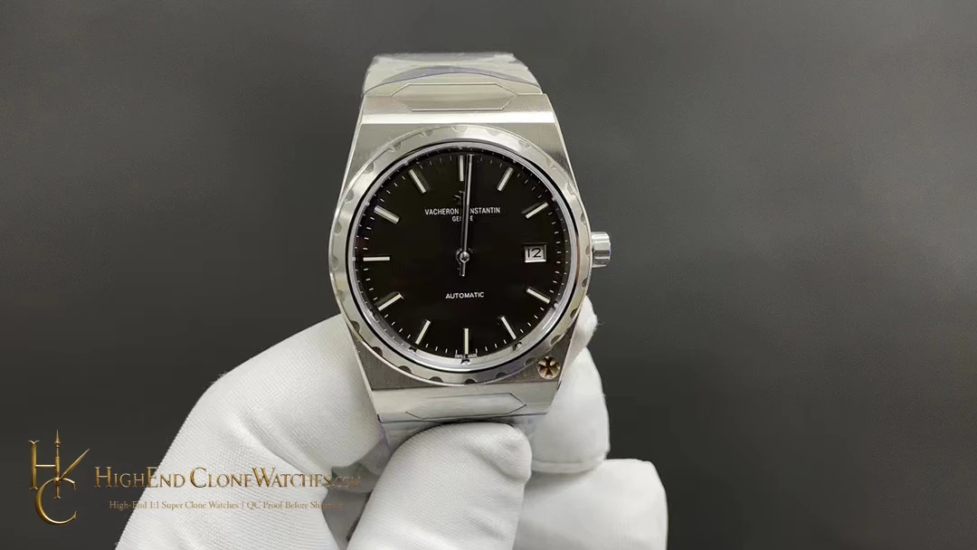
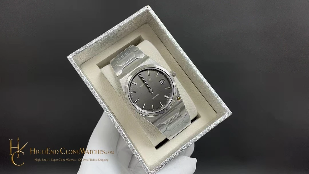
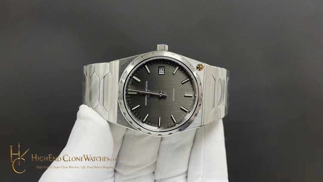
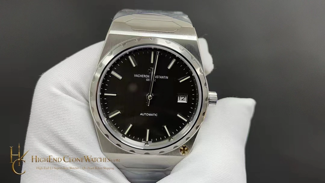
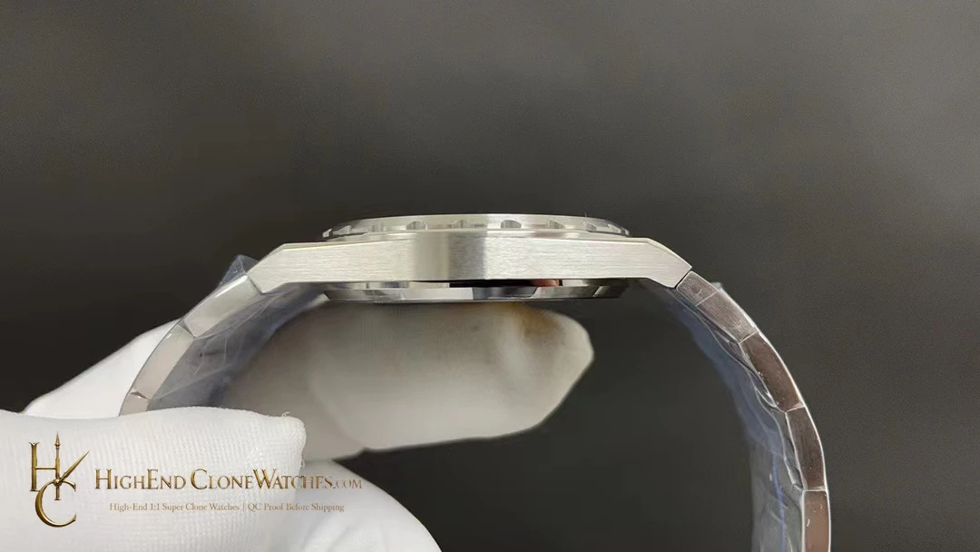
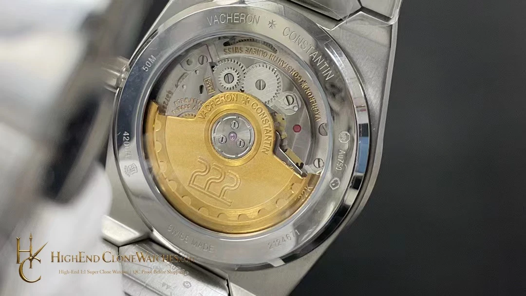
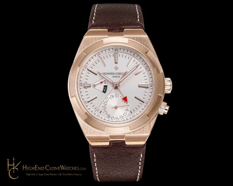
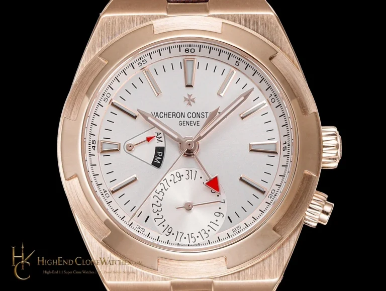
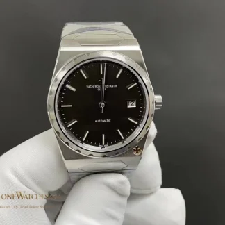
Use the front view to assess the defining dial surface, then use the angled and closure views for the case, bezel, and strap or bracelet details specific to this reference.
The 200ST earns its place through restraint and graphic clarity. Matte black reduces dial glare in the visual read, the baton markers create a measured rhythm, and the fluted steel bezel gives the compact case a defined edge. The integrated hexagonal bracelet keeps that language continuous, so the watch feels considered rather than decorated. This is the right 222 selection when black-and-steel contrast matters more than the blue color note of B934 or the warm case treatment of B935. The 37mm case, 8.6mm thickness, and 45mm lug-to-lug record describe the offered profile; the front and angled photographs should confirm how that profile is executed. Pay particular attention to the first bracelet links and the Maltese cross deployant.
The 200ST selection is strongest when a buyer wants the 222 design reduced to black, steel, and marker rhythm. That makes small execution details more visible: baton spacing, bezel articulation, and the first bracelet links all carry more weight than they would on a busier dial. Compare B934 only on the question of color emphasis. If the answer is a cooler blue accent rather than graphic restraint, B934 is the useful alternative; if the answer is contrast, 200ST remains the focused choice.
Keep the black dial and steel edges visually consistent in every QC view.