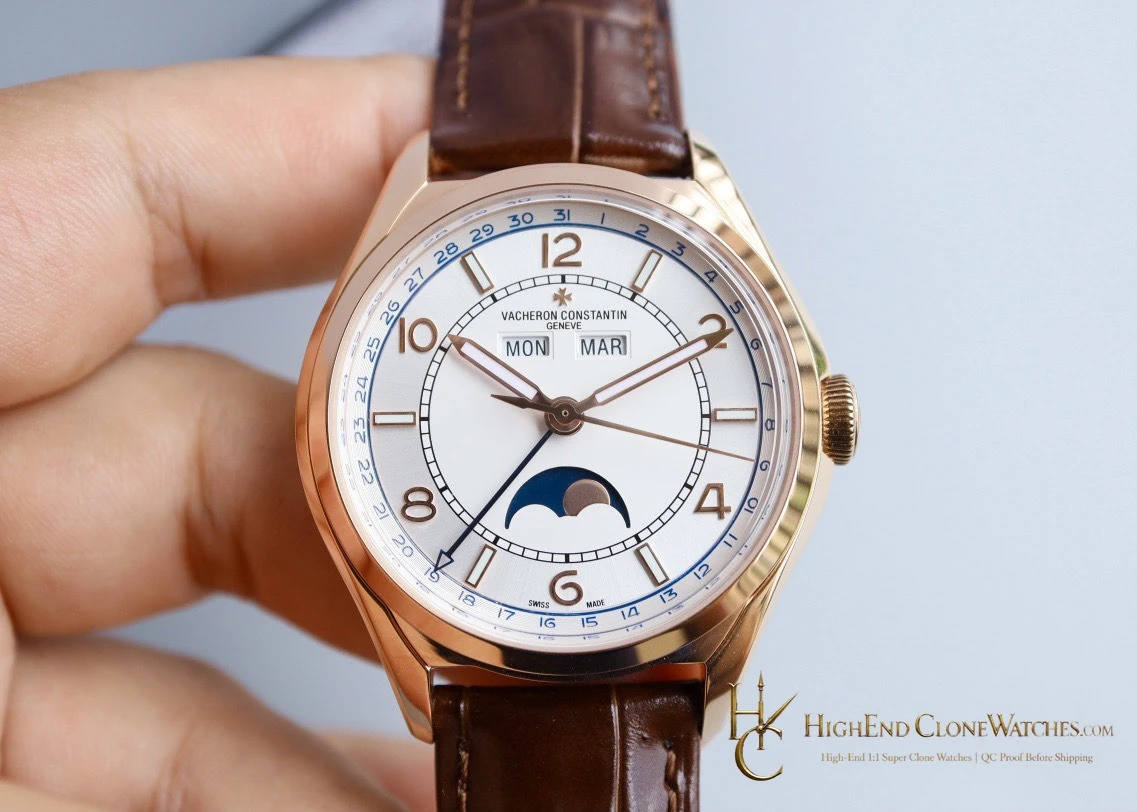
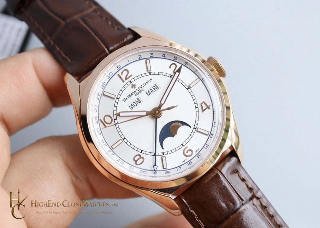
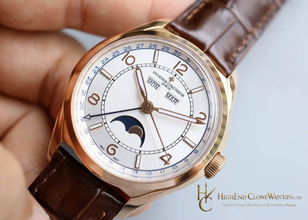
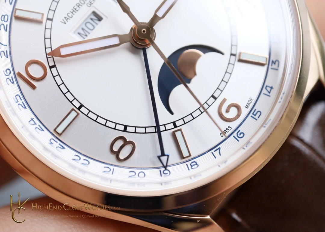
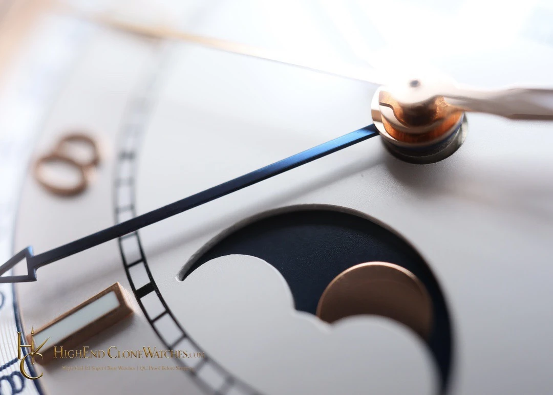
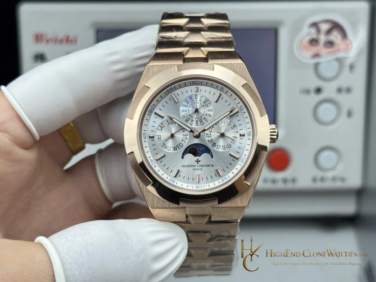
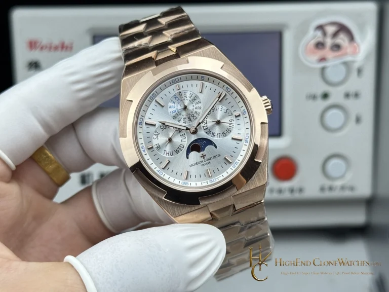
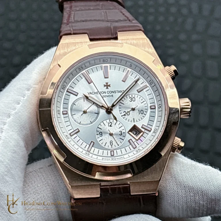
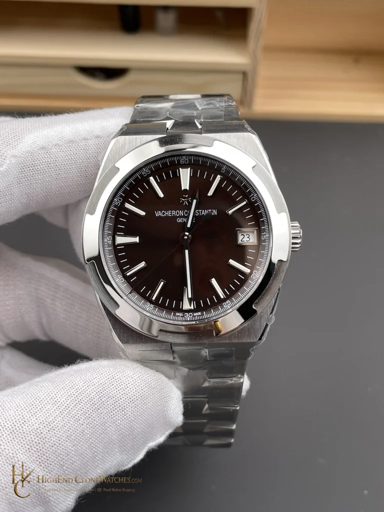
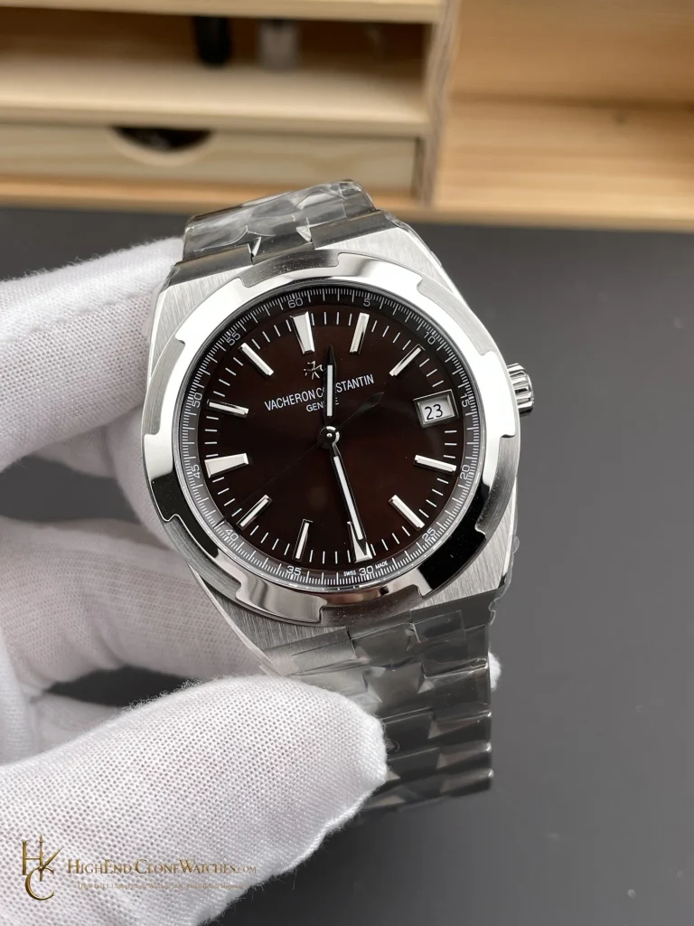
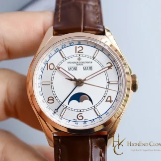
Compared with B065, this version places the emphasis on brightness and dial spacing. B065 is the warmer, sepia choice; B438 keeps the face pale so the sector geometry and case outline remain easy to read.
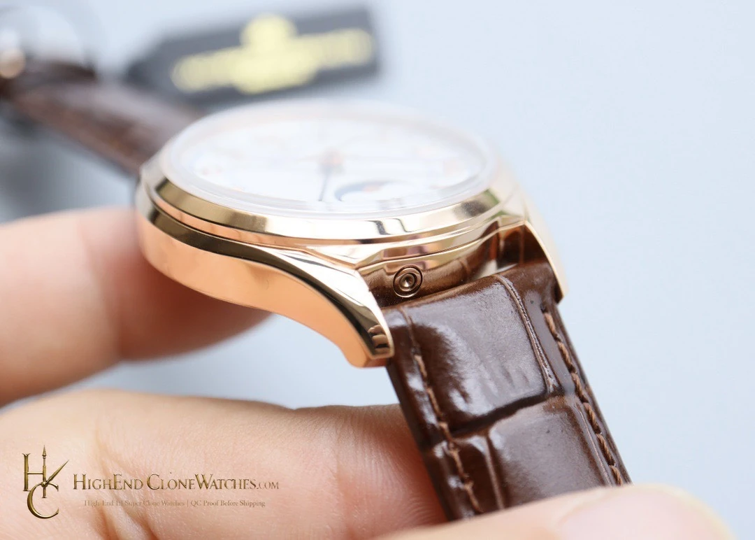
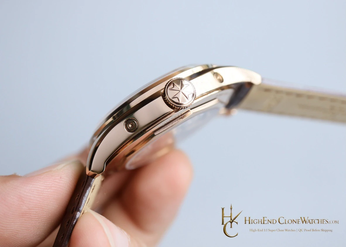
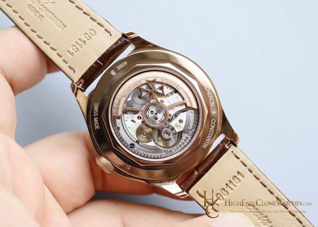
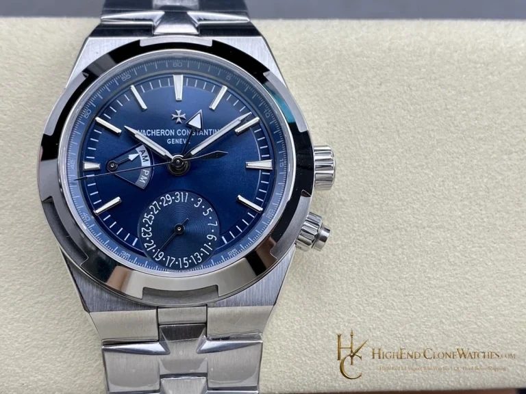
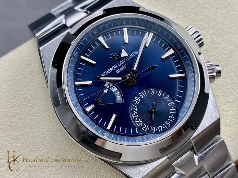
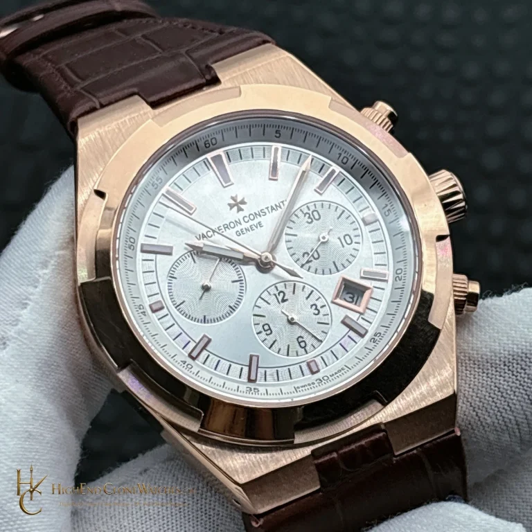
Use the front view to assess the defining dial surface, then use the angled and closure views for the case, bezel, and strap or bracelet details specific to this reference.
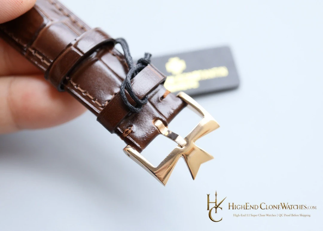
The B438 choice is clear in side-by-side viewing: the silver-white dial keeps the sector construction visible, while the warm case treatment supplies contrast without overpowering it. That balance suits a buyer who wants a formal outline with enough surface interest to reward close inspection. The leather strap leaves more visual space around the case than an integrated bracelet and keeps the watch from reading as a sports model. Review the clasp photographs for the Maltese cross detail and the strap connection before approving the final configuration. A clean front view should confirm the dial hierarchy, while the angled view should confirm that the bezel and case finish remain even from edge to edge.
A buyer comparing this reference should decide whether the pale sector construction is doing enough visual work without a stronger color. On B438, it is: the stepped rings provide structure, and the pink-gold case supplies the warmth that a darker dial would normally create. The leather presentation keeps the watch suitable for a quieter wardrobe. Confirm the front alignment first, then inspect the strap and clasp details as one practical sequence. That keeps the final decision tied to this silver-white configuration.